Harness OpenAI's visual intelligence with GPT Image 2, GPT Image 2.5 Flare, and Sunburst. Generate and edit photorealistic scenes with up to 9 reference photos, 3 selectable quality tiers, and up to 4K resolution on one credit balance.
10 free credits on sign-up. No credit card required.
Powered by OpenAI's deep visual reasoning, GPT Image bridges linguistic nuance with spatial execution: multi-reference photo conditioning, granular quality controls, and non-destructive canvas iteration.
Provide up to 9 reference photos to guide character features, composition layout, environment lighting, and style transfer.
Control your credit spend: Low (3 credits for drafting), Medium (5 credits for production), or High (10 credits for maximum fidelity).
Accurately comprehends complex spatial instructions, multi-subject interactions, and subtle stylistic references without prompting hacks.
Seamlessly move GPT Image generations into the Infinite Canvas for non-destructive edits or animate them with Seedance 2.5 and Kling.
Explore OpenAI's visual model lineup. Switch engines on the fly to match your creative objective and budget.
OpenAI's foundational visual model. Features 3 distinct quality tiers starting at just 3 credits, with up to 9 reference photos.
High-speed visual generation tuned for rapid daily creativity, vibrant concept art, and responsive design ideation.
Precision image editing and detail tuning. Specialized for nuanced lighting corrections, texture preservation, and localized edits.
We don't lock you into a single proprietary generator. Every model declares its real, unadulterated runtime capabilities directly in the cockpit.
| Model Engine | Reference Limits | Aspect Ratio Options | Specialized Strength | Studio Direct |
|---|---|---|---|---|
GPT Image 2gpt-image-2 | Up to 9 refs | 39 dimensionsSquare, landscape & portrait | Foundation visual intelligence, 3 quality modes & up to 9 references | Try |
Gemini 2.5 Flash Imagegemini-2.5-flash-image | Up to 4 refs | 3 dimensionsSquare, landscape & portrait | Frontier general-purpose visual synthesis | Try |
Grok Imaginegrok-imagine-image | Up to 1 refs | 3 dimensionsSquare, landscape & portrait | Frontier general-purpose visual synthesis | Try |
GPT Image 2.5 Flaregpt-image-2-5-flare | Up to 9 refs | 39 dimensionsSquare, landscape & portrait | High-speed daily creative generation & vibrant visuals | Try |
GPT Image 2.5 Sunburstgpt-image-2-5-sunburst | Up to 9 refs | 39 dimensionsSquare, landscape & portrait | Fine photographic editing, detail tuning & localized adjustments | Try |
S Seedream 5.0 Flashseedream-5-flash | Up to 10 refs | 22 dimensionsSquare, landscape & portrait | Frontier general-purpose visual synthesis | Try |
Nano Banana 2 Litenano-banana-2-lite | Up to 14 refs | 10 dimensionsSquare, landscape & portrait | Rapid concept iteration & layout sketching | Try |
Nano Banana Pronano-banana-pro | Up to 14 refs | 30 dimensionsSquare, landscape & portrait | Extreme multi-reference consistency & character identity | Try |
Nano Banana 2nano-banana-2 | Up to 14 refs | 30 dimensionsSquare, landscape & portrait | High-fidelity photorealism & composition fidelity | Try |
Nano Banana 2.1nano-banana-2-1 | Up to 14 refs | 30 dimensionsSquare, landscape & portrait | Configurable reasoning thinking levels & sharp rendering | Try |
Grok Imagine Image 2.0grok-imagine-image-2 | Up to 3 refs | 18 dimensionsSquare, landscape & portrait | Frontier general-purpose visual synthesis | Try |
Enjoy direct browser generation with transparent credit costs and full commercial rights.
Write your creative prompt in natural language, or upload up to 9 reference photos to guide character identity, background details, and aesthetic mood.
Select GPT Image 2, Flare, or Sunburst. Pick Low for fast prototyping, Medium for standard assets, or High for maximum detail, with clear credit previews.
Open your render on the Infinite Canvas to branch prompt variations, composite layers, or feed the still image into Seedance 2.5 for cinematic video motion.
Explore community prompts optimized for GPT Image engines: surreal concepts, commercial packshots, and cinematic compositions.
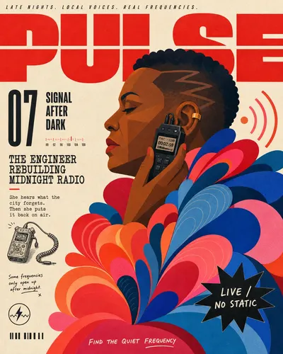
Create a finished independent magazine cover in the "Signal Red Petal Profile Editorial Cover" visual style. Style priority: preserve these observable anchors before introducing new content: A warm off-white uncoated-paper field supports an asymmetric independent-magazine cover rather than a centered poster or clean card layout. A giant signal-red geometric masthead spans at least ninety percent of the top width, occupies roughly eighteen to twenty-two percent of the height, is cropped by the frame, and is split by one or two white horizontal cuts. One monumental strict side-profile figure occupies the center-right and extends beyond the right and bottom edges; the head sits near the upper-middle rather than the center. A narrow exposed-paper editorial rail occupies roughly one quarter to one third of the left side and carries several irregularly stacked text clusters rather than boxed modules. The entire portrait is built from crisp flat vector or cut-paper color planes with no photoreal skin, modeled shading, cast shadows, glossy light, or universal black outline. The garment creates a huge right-heavy silhouette from at least thirty overlapping teardrop, petal, scallop, wave, or ribbon lobes at three scales, with warm small lobes nearer the torso and larger cool lobes expanding rightward. The palette uses about forty to forty-eight percent signal red, coral, pink, and orange; eighteen to twenty-four percent cobalt, royal blue, and dark teal; twenty-four to thirty-one percent warm paper; and five to nine percent black. Five typographic registers coexist: widely tracked narrow italic kicker, fragmented geometric masthead, oversized condensed issue marker with stacked black sans, rough slab or typewriter feature heads with mono decks, and loose handwritten marginal notes. The subject occludes roughly one quarter of the red masthead, while organic lobes invade the left rail below mid-height so the copy and illustration collide instead of forming separate columns. One irregular black starburst with short reverse-white copy overlaps the colored lower-right mass; it never floats in unused paper space. Supporting editorial ephemera stay deliberate and sparse: one case-specific pen-and-ink vignette, one fictional mini-emblem, one short non-scannable registration strip, and one baseline handwritten note. The finish resembles clean spot inks on toothy stock with faint grain, subtle ink modulation, and mildly softened printed edges, never heavy grunge, noisy halftone, or distressed photocopy damage. Do not reproduce any of this literal source content: any recognizable real person, athlete, celebrity, or likeness; the source hairstyle, sunglasses, costume, feather boa, crest, shoe sketch, badge, barcode, or starburst joke; football, stadium, jersey, trophy, World Cup, sports statistics, or national-identity cues; the numeral nine as a dominant issue marker; any real magazine or media brand, masthead letterforms, or cover line; any watermark, username, platform logo, QR code, real scannable barcode, brand mark, creator ID, or signature; any near-identical element-by-element reconstruction, including the same copy line breaks, doodle positions, accessory, or national identity cues. Subject: a middle-aged Black woman radio engineer with a shaved temple and one gold ear cuff, shown in strict left-facing profile Action: holding a compact field recorder near her ear as if isolating a hidden frequency Case-specific prop or line vignette: a tiny black pen-and-ink field recorder with one coiled cable Thematic context: an abstract late-night community broadcast studio expressed only through two signal arcs Marginal background details: two simplified radio-wave arcs, a tiny frequency scale, and one narrow calibration note Text package: MASTHEAD: PULSE; FEATURE: SIGNAL AFTER DARK Supporting text package: DECK: THE ENGINEER REBUILDING MIDNIGHT RADIO; BURST: LIVE / NO STATIC; ISSUE: 07; FOOTER: FIND THE QUIET FREQUENCY Fictional emblem: a fictional lightning-wave emblem inside a small shieldless circle Wardrobe and mantle direction: a coral work jacket with a monumental cobalt and hot-pink waveform-lobe collar; abstract audio ribbons, never feathers Make the artwork itself fill the raster edge to edge on warm off-white uncoated paper, with no outer mat, frame, wall, mockup, book, or device. Build an asymmetric cover, not a centered poster. Across the top, render the labeled fictional masthead from the text package in gigantic signal-red geometric grotesk letters spanning at least ninety percent of the width and eighteen to twenty-two percent of the height. Crop the masthead at the side edges, split it with one or two paper-white horizontal channels, and let the portrait obscure twenty to thirty-five percent of it. Above it, add one tiny widely tracked italic uppercase kicker. Never imitate a real magazine logo. Reserve an exposed-paper editorial rail at the left: twenty-nine to thirty-four percent of a portrait frame or twenty-four to thirty percent of a landscape frame. Do not outline or box the rail. Place a large condensed black issue marker other than nine beside a compact stacked black sans feature title, then two unevenly spaced rough slab-serif feature heads with narrow monospaced decks. Render the labeled masthead, feature headline, issue marker, and burst label exactly and legibly; do not render the labels, separators, or instructions themselves. Add one small hand-drawn vignette of the case prop, one short handwritten note, one tiny fictional emblem, and one non-scannable strip of short registration bars. Render one monumental strict side-profile figure in crisp flat vector or cut-paper spot-color planes. The figure faces into the left rail, begins behind the masthead near the upper middle, and extends beyond both the right and bottom edges; never shrink it to fit and never center it.
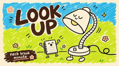
Create a image in the Playful Marker Grounding Poster Style. Subject: a giant smiling refillable water bottle mascot with simple white fill and thick black outline. Action: tilting sideways and waving one rounded cap-arm while droplets bounce around it. Prop/Product: tiny cup with two splash marks. Location: sunny kitchen corner drawn as a few symbolic counter lines. Background: cyan scribble patch above, lime scribble patch below, tiny lemon dots, little motion ticks. Main text: DRINK UP. Secondary text: tiny sips today. Accent symbol: small yellow star. Wardrobe/styling: simple white gloves and tiny sneaker loops on the bottle mascot. Style fidelity anchors: Cream poster-paper border with the artwork sitting inside a slightly inset field rather than bleeding to the edge. Loose childlike marker-scribble background blocks, mostly bright sky cyan and sour lime green, with uneven white gaps. Flat illustration with no realistic depth, no cast shadows, no gradients, and no polished vector smoothing. Thick imperfect black or dark-brown outlines with variable pressure, rounded ends, and visibly wobbly hand-drawn edges. One oversized simple subject dominates the lower middle of the poster, with tiny supporting props or characters as scale contrast. Large hand-lettered headline at the top, irregular baseline, chunky brush-marker shapes, and dense casual spacing. Small secondary text sits in a corner as a compact block, often over a dark marker swash or rough underline. Palette is intentionally limited: cream base, cyan field, lime field, dark brown type, black keylines, white character fill, and one or two candy accents. Decorative grammar uses tiny flowers, grass ticks, curved motion marks, small stars, butterflies, and doodle dots, never dense scenery. Mood is playful, naive, poster-like, and lightly absurd, with a handmade school-notice energy. Source content to avoid: Do not recreate a white human-shaped figure lying or spreading limbs across grass. Do not show a dog, puppy, or pet leaping toward the main figure. Do not use the premise of touching the ground, touching grass, grounding, or outdoor grass contact. Do not reuse the original Chinese or English text, dates, slogan structure, or any close translation of it. Do not copy the exact diagonal body pose, outstretched fingers, limb silhouette, or source layout proportions. Do not include a pink butterfly in the same upper-right placement as the reference. Do not include signatures, creator marks, platform marks, usernames, watermarks, or QR codes. Apply these style rules: cream poster-paper border around an inset artwork field; loose sky-cyan and sour-lime marker-scribble background blocks with uneven white gaps; one oversized flat simple subject dominating the center-lower area; one tiny supporting prop or character for scale; thick imperfect black or dark-brown hand-drawn outlines with rounded wobbly ends; oversized hand-lettered dark-brown headline in the top zone; small lower-corner supporting text over or near a rough marker swash; tiny doodle accents such as flowers, dots, stars, motion ticks, and grass marks; flat even color with no shadows, no gradients, no realistic depth, no polished vector smoothing. Important content rule: match the reference style first, then change the source content. Use new subjects, new scene details, new props, and new text while preserving the style fidelity anchors. Avoid photorealism, 3D render, airbrush, glossy finish, dense scene clutter, exact source text, exact source pose, dog, butterfly, ground-touching premise, watermarks, signatures, platform marks, QR codes, and brand logos.
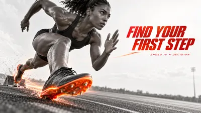
Create a finished editorial sports advertising poster in the Chromatic Impact Athlete visual system. Apply these prioritized style anchors exactly as a coherent system: [CORE] High-contrast monochrome athletic photography or photoreal cutout with deep charcoal blacks, pale gray whites and crisp anatomical form. [CORE] A single vivid vermilion-to-orange accent is reserved for the featured object, impact zone or directional energy trail. [CORE] Extreme wide-angle or close-perspective cropping makes one body part or sport object dominate the frame and creates visceral depth. [CORE] Clean near-white negative space isolates the athlete and lets the action silhouette read immediately at poster scale. [CORE] Motion is expressed by controlled warm glow, directional blur or heat haze attached to the action, never by random decorative clutter. [CORE] Typography is compact, bold, condensed and italic, usually in red, with short legible copy integrated into the empty space. [FLEX] Let the sport determine the dominant crop, diagonal, suspension point and interaction between the subject, prop and accent trail. [FLEX] Vary the headline placement, scale and lockup so each case feels art-directed while retaining the same restrained poster grammar. Design a new image about a female track sprinter performing exploding out of the starting blocks, one knee driving toward the camera, wearing a minimal charcoal racing singlet and shorts, with a pair of streamlined racing spikes with a glowing orange sole plate. Case direction: Make the closest spike and forward knee form a low diagonal spear from the lower left into the open headline space; let a thin orange heat trail trace the first stride. Render a decisive, anatomically believable frozen moment with a clear silhouette, extreme perspective or scale contrast, and useful near-white negative space. Use mostly charcoal-and-pale-gray monochrome photography, reserving vivid vermilion and hot orange for the featured object, impact zone or directional energy trail. Add the short headline FIND YOUR FIRST STEP in bold condensed italic red typography, placed wherever the composition gives it maximum hierarchy; add SPEED IS A DECISION only if it remains crisp and subordinate. Replace all source-specific content with this new subject and concept. Avoid: The exact Nike swoosh or any recognizable brand logo from the reference; The exact phrase BORN FOR THE LEAP and any direct reuse of the reference wording; The reference athlete's identity, body pose, clothing, facial features and exact shoe design; The exact reference layout of a giant sole at top, seated jumper in the center and shoe at bottom; A Nike campaign, brand claim or copied commercial story premise. Preserve the specified reference-style texture, edge character and intentional softness at their described scale, intensity and locations. Avoid artifacts that are absent from the intended style; do not automatically denoise, sharpen, polish or distress the image.
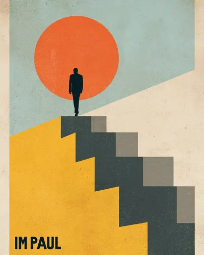
A vintage poster in the style of Saul Bass: abstract silhouette of a man climbing an endless staircase toward a giant orange sun. Bold geometric composition with minimal forms and a retro pastel palette. Strong metaphorical concept, with the text "IM PAUL" in bold vintage sans-serif. Rough paper texture, minimalist tension, mid-century modern design.
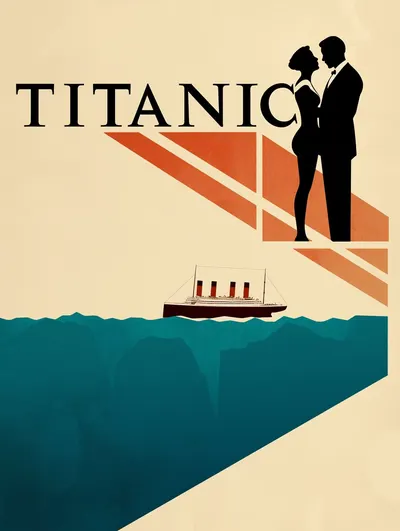
A minimalist movie poster design in the style of Saul Bass. Abstract silhouettes, clean lines, simple geometric shapes, bold flat colors, minimal details. Vector illustration with a vintage look reminiscent of classic Hollywood cinema. Strong typographic composition, high contrast, elegant and iconic.
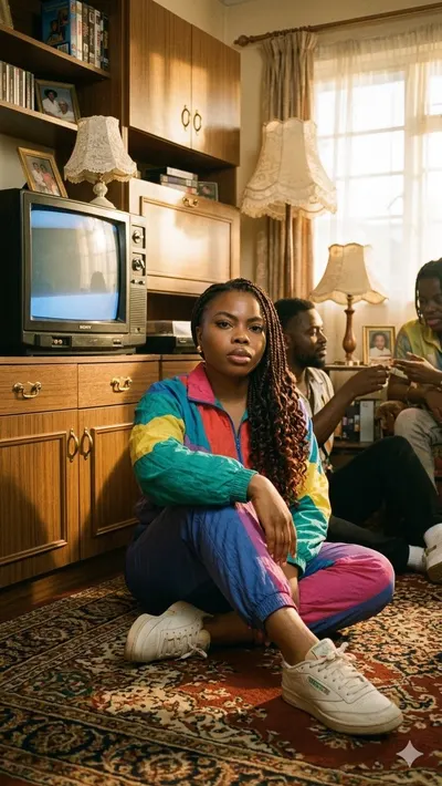
Create a retro 1980s-1990s living-room portrait using the provided photo as the base. Keep the person's original face, hair, and pose exactly. Place them on a patterned carpet in a vintage living room filled with era-appropriate props: a CRT television, wooden cabinets, lace lampshades, and old framed photos. Dress the person in a colorful retro tracksuit and vintage sneakers. Use warm golden afternoon light streaming through the room, soft film grain, muted tones, and warm highlights to create a nostalgic look. Photorealistic rendering, natural proportions, coherent lighting and shadows, no changes to the face, hair, or pose.
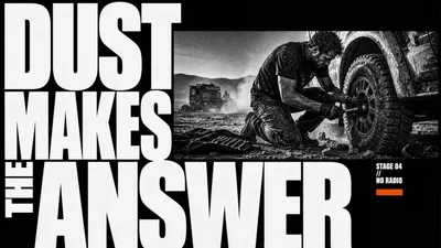
Create an image in the "Monochrome Grid Sneaker Tech Spec" visual style. Subject: a logo-free elite carbon-plate road running shoe with aerodynamic foam geometry and knit upper cues associated with modern race footwear Action: presented as a floating technical hero product with the outsole and midsole structure analyzed through callout panels Prop/Product: carbon plate slice diagram, knit mesh closeup, foam sidewall macro crop, and rubber forefoot traction detail Location: clean monochrome product-spec poster field on pale engineering grid paper Background: top strip of runner stride crops without visible brand marks, halftone outsole macro panels, thin callout lines, crosshair registration ticks Main text: AEROFOAM R-01 Secondary text: carbon response / knit lock / race day traction / lab grid Accent symbol: L-shaped bracket and small crosshair ticks Wardrobe/styling: cropped anonymous runner legs in plain black socks within the top strip only, no logos Style fidelity anchors: Pale white or off-white grid-paper background with faint square guides. Oversized sneaker hero in a three-quarter product angle, floating on the page with a soft contact shadow. Coarse black-and-white halftone dots across all photography, product surfaces, and inset images. Top horizontal strip of small action or texture frames separated by thin white gutters. Rectangular macro inset panels that crop into shoe materials, outsole tread, foam, stitching, or mesh. Thin black connector lines, L-shaped brackets, registration crosses, and tiny measurement ticks. Sparse editorial layout with large negative space around the central shoe. Pixelated uppercase headline near the lower-left or lower-third area. Tiny condensed technical captions, feature tags, and repeated microtype blocks. High-contrast monochrome lighting with deep black shadows and blown-out paper whites. Product-first hierarchy where the hero shoe dominates and evidence panels support it. Flat diagrammatic page system surrounding a tactile photographic product cutout. Source content to avoid: Do not recreate the exact PEAK FLASH 2 shoe design, wavy podded outsole silhouette, or original panel arrangement. Do not use the words PEAK, PEAK SPORTS, PEAK FLASH 2, SNAKE PATTERN, or the original feature caption. Do not include the PEAK triangle logo or any copied brand mark from the reference. Do not repeat the original top-strip running poses, seated athlete frame, or exact crop sequence. Do not reuse the original quote block wording or question-mark filler typography. Do not show visible Nike swoosh, adidas three-stripe mark, Puma cat/logo, or any other recognizable trademark. Do not add watermarks, usernames, QR codes, app marks, creator signatures, or platform identity. Apply these style rules as concrete visual requirements: - Composition: one oversized logo-free footwear product in a three-quarter product angle, floating on a pale engineering grid; a narrow top band of small black-and-white evidence panels; two to four macro inset boxes connected by thin technical lines; sparse negative space and asymmetric editorial balance. - Typography: pixelated uppercase product headline near the lower-left or lower-third area; tiny condensed uppercase feature captions; compact microtype; no copied slogans, no real brand marks, no social UI. - Color: strict black, white, and gray palette; off-white paper field, deep black shadows, mid-gray halftone texture, pale grid lines; no color accent. - Texture and lighting: coarse newspaper halftone, photocopy grain, scanner softness, hard monochrome product lighting, crisp shoe edges, soft contact shadow under the hero product. - Graphic elements: crop marks, registration crosses, L-shaped brackets, measurement ticks, rectangular macro panels, fine connector lines, and small technical labels aligned to the grid. Important content rule: match the style fidelity anchors first, then change the source content. Keep every sample about footwear, but use a new shoe silhouette, new product text, new material story, new top-strip panels, and new macro details. Do not include any visible Nike swoosh, adidas three-stripe mark, Puma logo, PEAK mark, watermark, QR code, username, or copied reference text.
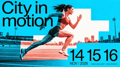
Design a finished full-bleed contemporary cultural-event poster. Use giant tightly set regular-weight neo-grotesk typography, one dynamic continuous duotone photograph, saturated flat ink fields and a hard-edged stepped white window. Rules: [CORE] An oversized regular-to-medium weight neo-grotesk headline and emphatic date numerals build an asymmetric, tightly set editorial hierarchy; no heavy condensed display, serif, outline or hand-lettered headline. [CORE] One continuous action photograph crosses hard rectangular or stepped masks: outside the light window it is black-on-saturated-base duotone, inside it is contrasting spot-ink-on-neutral-white. Image geometry remains aligned through every boundary. [CORE] Flat vivid color fields, white windows and restrained photographic print grain create a sharp graphic/photographic contrast; no natural-color portrait inset or photorealistic paper mockup. [FLEX] Design the stepped window to answer the action: its scale, position, contour and number of turns can change; the reference's exact silhouette and cyclist diagonal are not fixed. [FLEX] Choose a vivid base and a contrasting spot ink for each theme, keeping black text and light-window contrast strong. Blue and red are a valid example, not a compulsory universal palette. [FLEX] Recompose headline line breaks, date stack and photo crop for each ratio; all required wording remains readable while purposeful photographic edge cropping is allowed. [FLEX] Use sparse factual-looking event metadata, rules or open space as needed; do not replicate source sponsors, venues, footer density or brand signage. Subject photograph: A fictional adult woman sprinting on an urban athletics track, side-on low-angle photo, rear leg extending back and forward knee lifted, dynamic but natural anatomy, simple unbranded running kit; sparse lane lines visible. Required complete large title: "City in motion". Required large date numerals: "14 15 16". Date label: "NOV / 2026". Small clear footer: "URBAN TRACK MEET / OPEN SESSIONS". These are fictional event samples. Palette: Electric cyan base with black outside-window photography; hot vermilion red photographic ink on neutral-white window. Design intention: The white stepped field opens ahead of the runner like successive strides. The sprinting body crosses its risers while the date numerals become a pacing sequence. Preserve photographic leg motion; do not draw literal stairs., consider: Title occupies a broad compact upper zone; body cuts across an ascending off-center window through the middle, dates form a lower vertical beat. instead: Runner stretches across the full middle width through a long stepped corridor; title anchors one upper side and large date numerals pace the opposite lower edge. Choose the final composition intelligently, using open space and typography rather than adding decorative clutter. IMPORTANT: the action photo is ONE geometrically continuous image. Across the stepped window seam, the same body/object contour stays aligned. Inside the neutral-white window, render photo shadows and grain ONLY in the contrasting spot ink; outside, render the same photo in black on the saturated base ink. Subject and relevant environmental details visibly traverse at least one color boundary. The masks are flat graphic color separations, not separate printed photos pasted on top. Headline and numerals are clean regular-to-medium sans, large and readable, no serif or condensed heavy lettering. Fine ink grain belongs chiefly to the photo; flat fields remain vivid. Opaque full rectangular canvas. Exclude Les Six Jours de Saint Quentin en Yvelines event identity and original title; Original July/August 2017 dates, addresses, telephone numbers and social handles; Cyclist identity, cycling kit sponsors and Tissot advertising signs; Exact original stepped-window outline, title line breaks and photographic crop. No sponsor lettering, extra filler copy, full-color skin, gradients, 3D shadows, border mockup, beige aging or all-over distress.
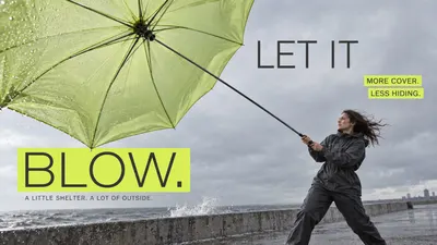
Create one full-bleed finished photographic advertising poster. [CORE] Constructed regular-weight rounded sans uppercase headline with even lean strokes and precise counters; supporting type is plain regular neo-grotesk. No marker, brush or extra-bold display lettering. [CORE] Bright sharp-corner flat rectangular highlights and dark type form an asymmetric editorial hierarchy: large headline, medium annotations, compact body. Place bands in content-shaped negative space, not a mandatory top stack. [CORE] Oblique wide-angle product photography with purposeful near/far scale, subdued grey environment and fine photographic print grain. Product function and believable human interaction lead the visual composition. [FLEX] Use the particular product geometry as the organizing device: broad protective plane, handle opening, travel route or folding support structure. A new color alone is not a new composition. [FLEX] Accent hue can vary but its brightness must stand out against restrained photographic colors; echo the hue selectively in the product. [FLEX] Recompose each ratio around the same product idea; text placement, camera orientation and figure scale may change. No repeated airborne pose or generic giant-object/small-person formula. Subject and action: One adult woman in charcoal rainwear grounded on a windswept concrete embankment, side profile leaning against wind, both hands holding an umbrella shaft. Large near translucent pale-lime canopy at upper left, smaller woman lower right. The straight central shaft must visibly run from her hands all the way to the central umbrella hub where every rib radiates; do not attach the shaft to a rim rib. Muted grey sky and narrow wet concrete ground. Exact headline: "LET IT BLOW.". Exact annotations: "MORE COVER." / "LESS HIDING.". Exact body: "A LITTLE SHELTER. A LOT OF OUTSIDE.". Palette: Acid lime highlights, softly translucent olive-lime canopy, charcoal rainwear and cool grey surroundings. Portrait creative direction: Preserve the approved wind-candidate composition: expansive canopy clipped at upper left, small grounded woman lower right, a strong connecting diagonal. LET IT upper right in grey space and BLOW. on lime rectangle lower left. BLOW must have visibly REGULAR weight, much lighter strokes than the candidate. Correct pole-to-central-hub connection. Keep other placement and mood. instead: Canopy broad at left and woman braced at far right with the straight central shaft clearly reaching the hub; title split across central grey pocket, annotations placed asymmetrically along the shelter edge. Keep whole action grounded and headline regular weight. Keep typography constructed REGULAR weight, not heavy bold; sharp flat colored rectangles with no shadow. Integrate text with the product-led geometry, maintain physical connections and readable wording. Fine print grain, subdued photographic palette, deliberate breathing room. No extra copy or creator mark. Fictional product concepts. Exclude Original sneaker branding and sock logos; WE MADE A SNEAKER FOR PEOPLE WHO HATE SNEAKERS wording; Original female jumping pose and exact rocky crop; Original NO HYPE and NO HEEL claims and supporting copy.
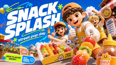
Create a high-energy social campaign poster in Sunny 3D Avatar Campaign Style. Preserve these style anchors: Glossy stylized 3D avatar rendering with smooth doll-like faces, rounded hands, soft plastic skin, and simplified expressive eyes. Extreme sunny outdoor campaign lighting with crisp highlights, clean shadows, and a clear vacation-day atmosphere. Deep saturated sky-blue upper field balanced by vivid green or fresh outdoor color in the lower field. Wide-angle near-camera perspective with the lead avatar or prop cropped large in the foreground and secondary elements stepping backward. Oversized bold white headline typography, angled slightly, stacked over the sky area with a dimensional poster feel. Neon green or cyan hand-drawn swoops, loops, underlines, and motion strokes weaving around the headline. Playful commercial density: many visible props and background details, but arranged in clear foreground, midground, and headline zones. Rounded consumer-campaign graphic language: sticker labels, search-bar-like captions, small badge blocks, and clean rectangular callouts. High-chroma palette with white typography, electric blue sky, lime/cyan accents, warm orange or yellow focal clothing, and soft neutral props. Slight fisheye poster composition that feels like a mobile social ad, with the main character close enough to feel immersive. Avoid this source content: No platform logo, app watermark, username, creator mark, QR code, or social platform search branding. Do not recreate the original Chinese summer-party headline or any exact source wording. Do not use the same camping-chair lawn scene, tent, lantern, suitcase, drink cup cluster, or identical picnic story premise. Do not copy the two original avatar identities, facial styling, hats, sunglasses, poses, clothing combinations, or foreground peace sign. Avoid palm-leaf frame placement that duplicates the reference layout exactly. Avoid using white bird silhouettes and the same airplane motif in the same position as the source. Do not preserve the source's exact foreground sitting pose, raised hand, or cup-holding action. Do not imitate any distinctive brand campaign lockup from the reference image. Scene content: two cheerful toy-like 3D avatars are unboxing a compact smart planter while leaning toward the viewer with a glossy mint-green smart planter with sprouting herbs in a sunny rooftop garden above a clean modern city. Include soft skyline shapes, bright umbrellas, tiny herb labels, white clouds, and floating pollen-like sparkles. Wardrobe and character styling: one avatar in warm coral utility vest and bucket hat, one in cream knit top and sporty shorts. Composition: bright saturated sky-blue upper field reserved for huge angled bold white headline typography; wide-angle low camera perspective; oversized foreground subject or prop cropped close to camera; supporting details recede into the midground; lower campaign callout label. Typography: set the main replacement headline as "GROW MODE" in large bold white slanted geometric display letters, with smaller supporting text "fresh kit drop" in rounded sans-serif. Graphic accents: add neon lime and cyan hand-drawn loops, swoops, underlines, and the accent symbol "+" around the headline without using any real platform logo. Rendering: glossy stylized 3D avatars, smooth toy-like faces and rounded hands, tactile fabric and prop textures, crisp sunny outdoor lighting, vivid blue-green commercial palette, polished high-resolution raster finish.
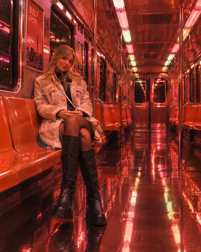
Cinematic, retro-style photograph evoking a liminal aesthetic and 1980s neorealist cinema. A lone woman stands inside an empty train carriage. The entire interior is bathed in vibrant, monochromatic lighting in warm red, salmon pink, and coral. The highly polished, reflective metal floor acts as a perfect mirror, sharply capturing the silhouette of the woman, the orange seats, and the overhead lights. Rows of dim, fluorescent light panels line the ceiling. The color palette is dominated by red, orange, and metallic pink, with subtle flashes of pale green. The image carries the texture of 35mm analog film grain, a high-definition finish, and a melancholic, solitary atmosphere.
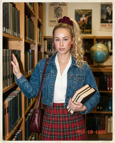
Ultra-realistic 1985 library candid portrait of a young woman. Maintain exact facial structure, proportions, features, and expression with consistent identity. She stands between tall wooden bookshelves, touching a book spine while holding several books against her waist, calmly facing the camera. Long blonde hair in a high ponytail with a large burgundy scrunchie, loose curls, red hoop earrings, soft 80s glam makeup, rosy cheeks and glossy nude lips. She wears a white collared blouse, high-waisted red-and-green plaid skirt, cropped blue denim jacket and burgundy shoulder bag. Warm library lighting, vintage books, a globe and posters create the 1980s setting. 35mm snapshot, subtle flash, analog grain, faded warm colors, dust, scratches, soft focus, worn border and red date stamp "MAR 10 1985".
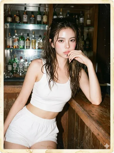
Hyper-realistic late-1980s point-and-shoot flash photo of a young woman leaning on a wooden bar counter in front of glass shelves filled with bottles, resting one hand near her mouth, looking directly at the camera with a bored candid expression. Outfit: plain white cropped tank top, white high-waist cotton shorts, sunglasses resting on top of her head, simple black nail polish, small earrings. Hair: messy 1980s beachy waves with slightly damp texture, loose blonde-brown highlights, natural frizz. Makeup: minimal 1980s daytime makeup, soft blush, thin eyeliner, pale pink lipstick, natural skin texture. Camera and era look: direct flash, bright skin highlights, darkened background falloff, warm beige wood tones, faded colors, soft focus, uneven exposure, visible film grain. Old damage artifacts: scanned aged photo print with paper fibers, a small vertical crease near the subject, subtle glossy cracks around bright areas, dust specks, a faint coffee stain near the bottom border, worn corners, yellowed edge discoloration, tiny scratches, scanner noise, mild color fading, imperfect old-photo surface. Avoid a modern cocktail bar, clean digital photo, DSLR sharpness, HDR, cinematic lighting, flawless retouch, modern outfit, perfect composition, or AI smoothness.
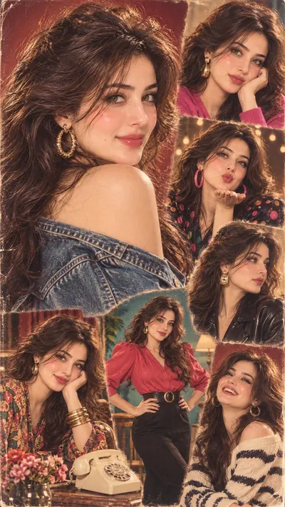
Create a single vintage portrait collage in the style of a 1980s magazine poster. Use the uploaded photo as the identity reference: study the person's face, skin tone, eye shape, hair texture, and features, and infer the most likely country or cultural region they belong to. Recreate this exact same person as a star of that country's 1980s pop culture — its cinema, TV, music, and fashion magazines of that decade — across 6 to 8 different poses in one image. Identity lock (most important): the face must be the same real person in every pose — same bone structure, nose, lips, eyes, eyebrows, skin tone, any moles or marks, same facial proportions. Only the hairstyle, outfit, jewellery, pose, expression, and background change. Keep the person's natural gender and apparent age. Layout: one large hero pose fills roughly the left 60% of the frame — a three-quarter over-the-shoulder look back at camera with a confident smile. Around it, 5 to 7 smaller pose panels overlap each other with soft feathered edges like a hand-made 80s poster: close-up beauty portrait, playful blowing a kiss, side-profile glance, hands-on-hips full standing pose, seated pose leaning on an elbow, laughing candid, and a moody looking-away pose. Faces stay large and clearly visible in every panel. Era styling — pick everything from that country's real 1980s look: authentic 80s hairstyle of that region (big voluminous blow-dried curls, feathered layers, or a bouffant with a side clip for women; layered longer hair, moustache-era grooming, or wet-look side part for men), and period-correct outfits from that culture — traditional dress of the region as it was worn in the 80s, plus one denim or leather jacket, bold geometric or floral prints, puff sleeves or wide lapels, oversized hoop or drop earrings, stacked bangles or a chunky watch, bright lipstick or era-correct makeup. Each pose wears a different outfit. Include small era props from that country: a cassette player, a rotary phone, a film magazine, vintage sunglasses, a vase of fresh flowers. Backgrounds: warm 80s photo-studio backdrops in maroon, teal, and mustard, a velvet curtain, a wall of period posters, string lights, wooden furniture — all from that country's 80s aesthetic. Photography: shot on 1980s colour negative film, warm golden tungsten key light with soft fill, gentle halation on highlights, slightly soft focus, visible fine film grain, rich saturated but faded reds and teals, mild vignette, glossy magazine print finish. Photorealistic, high detail, faces sharp and clean. Palette: 60% warm amber and maroon tones, 30% deep teal and emerald, 10% hot pink accents. No text, no captions, no logos, no watermark.
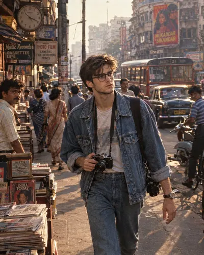
Ultra-realistic cinematic photograph of a young street photographer walking through a busy urban city street in the mid-1980s, captured as if shot on a professional 35mm analog camera. The photographer is a young man in his early 20s, naturally handsome, with thick slightly messy dark hair, subtle facial hair, expressive eyes, and realistic natural skin texture. He wears authentic 1980s casual fashion: a slightly oversized denim jacket, plain vintage T-shirt, relaxed-fit jeans, classic sneakers, and a simple wristwatch. A genuine analog film camera hangs around his neck, with another camera strap crossing his shoulder. He walks through a crowded city street holding the camera in one hand, looking around for the perfect photograph, his expression focused and curious as he documents everyday life. The street feels completely authentic to the 1980s, with no modern technology: vintage cars and taxis, classic motorcycles and scooters, old buses, newspaper stands, small record and cassette shops, street vendors, people wearing authentic 1980s clothing, payphones, hand-painted shop signs, analog clocks, posters on concrete walls, old storefronts, wires and utility poles, film-camera shops, newspapers being sold on the sidewalk, bicycles and pedestrians moving through the street. Some pedestrians naturally look toward the photographer while others completely ignore him, creating the feeling of a real candid street photograph. The image should feel like an actual photograph taken in 1985, not a modern image with a retro filter: 35mm Kodak-style analog film aesthetic, realistic film grain, subtle halation, natural color response, slight lens imperfections, authentic exposure, gentle contrast, soft highlight roll-off, realistic shadows, subtle motion blur on passing pedestrians and vehicles, shallow but believable depth of field. The photographer remains sharply detailed while the busy background gradually falls into natural atmospheric softness. Late afternoon transitioning into early evening: warm sunlight reflects from old buildings and vintage cars while shop lights begin turning on, with subtle atmospheric haze between buildings, realistic reflections on car windows, and natural shadows across the pavement. Cinematic documentary composition, camera positioned slightly below eye level, following the photographer as he walks through the crowded street. Strong leading lines from the road, buildings, vehicles and storefronts toward the photographer. The frame contains plenty of environmental storytelling while keeping the photographer as the primary subject. 35mm lens, f/2.8, natural perspective, realistic depth of field, cinematic framing, subtle handheld documentary feeling. Nostalgic, authentic, youthful, adventurous and documentary-like, evoking the feeling of discovering a city for the first time in 1985, before smartphones, social media and digital cameras existed. Ultra-photorealistic, extremely detailed, realistic human anatomy, authentic skin pores, realistic hair strands, detailed denim and fabric fibers, physically accurate materials, natural facial expression, realistic reflections, cinematic atmospheric depth, professional editorial photography, 8K detail, HDR, high dynamic range, photochemical film look. No smartphones, no modern cars, no LED screens, no modern clothing, no digital cameras, no contemporary buildings, no modern advertisements, no futuristic elements, no CGI appearance, no cartoon style, no plastic skin, no excessive sharpening, no distorted hands, no extra fingers, no duplicated people, no artificial-looking faces, no oversaturated colors, no modern typography.
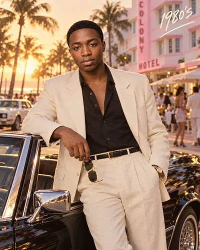
Photorealistic 1980s-inspired Miami lifestyle fashion portrait of an adult man standing beside a glossy black vintage convertible during golden hour. Frame him from approximately mid-thigh upward, leaning casually against the open driver-side door with a relaxed, confident expression while looking toward the camera. One hand rests naturally near the car while holding a pair of classic aviator sunglasses, and the other hand is casually tucked into his trouser pocket. Dress him in an elegant cream/off-white linen suit with a relaxed tailored blazer and high-waisted pleated trousers. Underneath, add a black open-collar shirt with the top buttons undone for a sophisticated retro look. Add a slim black leather belt with a polished gold buckle and a classic gold-tone wristwatch. Keep the styling refined, masculine, minimal, and authentic to the 1980s. Place the scene on a glamorous Miami Beach–inspired boulevard, surrounded by tall palm trees, pastel Art Deco architecture, outdoor cafés, vintage cars, and softly blurred pedestrians in the distance. Position a pastel pink-and-white Art Deco hotel building in the background to enhance the vintage South Beach atmosphere. Use warm late-afternoon sunlight, golden rim lighting around the subject, soft shadows, subtle lens flare, cinematic highlights reflecting across the black car, and a warm nostalgic film color grade. Add realistic skin texture, natural facial details, crisp linen fabric texture, shallow depth of field, soft atmospheric bokeh, subtle film grain, and premium editorial photography. Add handwritten cream-colored text “1980’s” in the upper-right corner with a loose underline stroke. Style: vintage luxury fashion campaign, 1980s Miami aesthetic, cinematic editorial photography, warm analog film look, realistic DSLR quality, 50mm lens, shallow depth of field, ultra-detailed, natural proportions, photorealistic.
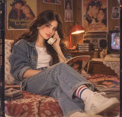
Create an ultra-realistic cinematic photograph inspired by an authentic 1980s Indian Bollywood bedroom. Preserve the subject's recognizable facial identity while styling her face and hair authentically for the 80s: thick, voluminous feathered dark hair with natural waves, side volume and soft face-framing layers, defined eyebrows, youthful feminine features, and a naturally polished 80s look. She wears a white crew-neck T-shirt, an oversized faded denim jacket, high-waisted loose-fit jeans, striped athletic socks, and vintage white sneakers. She lounges casually with one leg extended toward the foreground, holding a cream vintage landline telephone receiver to her ear and a magazine on her lap. Surround her with wooden walls, vintage Bollywood movie posters, cassette tapes, a retro boombox, CRT television, glowing red desk lamp, Filmfare magazines, and nostalgic bedroom clutter. Use warm tungsten lighting, rich brown and amber tones, soft cinematic shadows, shallow depth of field, and authentic 35mm analog film grain, subtle halation, faded colors, mild scratches, gentle vignette, and slight old-camera distortion. Photorealistic, nostalgic, stylish, natural anatomy, realistic skin and fabric textures, authentic late-80s Indian cinematic aesthetic.
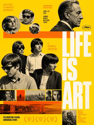
Sophisticated mid-century modern graphic design collage for a prestige film festival poster. The composition layers flat, saturated canary yellow and vibrant tangerine orange geometric blocks — horizontal strips and circular cutouts — over a solid yellow background, intercut with high-contrast, desaturated monochrome and sepia film photography. The aesthetic blends 1960s avant-garde editorial layouts with iconic pop-culture imagery, using sharp geometric cutouts (circles, horizontal strips) to frame diverse cinematic moments. Central subject: a group of four to five early-20s men styled like a 1960s rock band in casual period attire — collared button-down shirts, textured knitwear, dark sunglasses on some, mop-top and shoulder-length natural waves typical of 1965 fashion. They are arranged on different planes in a non-linear scattered composition, standing and leaning, hands in pockets or resting casually, with relaxed cool confidence and spontaneous candid gazes — one member tilted down-left looking directly down, others facing right or center looking into the distance. Skin rendered with monochrome desaturated texture, rich analog grain, and soft shadows. Upper-right subject: a distinguished older man in his 50s shown in 90-degree profile to the right, neatly combed grey-tinged short hair, warm sepia-toned skin with soft film grain, stoic and thoughtful expression, gaze fixed far right, upright bust pose. Additional fragments: over ten small photographic snippets of candid street photography, coastal snapshots, and cinematic moments, layered as horizontal strips and circles across the layout. Massive white bold typography reading 'LIFE IS ART' stacked vertically on the right side. Geometric circles at the top left contain monochrome portraits. Lighting: mixed analog film lighting — soft side-front key lighting on subjects at approximately 4500K, flat graphic lighting on background blocks, medium contrast within desaturated photos, minimal drop shadows creating a slight paper-layering effect. Camera simulation: full-frame 35mm analog film with 35mm and 50mm primes, eye-level and subtle low-angle knee vantage for the main group, deep focus across graphic planes with shallow focus within specific portraits, rule of thirds for portrait placement, front-facing angle, strong negative space. Color palette: saturated yellow, vibrant tangerine orange, charcoal grey, and creamy white, graded with a 60s avant-garde poster look. Post-processing: high-fidelity sharpening for typography and facial detail, subtle analog grain overlay, minimal paper texture, crisp vector edges for color blocks, rich film grain, slight lens blur on edges of snapshots, vintage ink density variation. Mood: energetic, sophisticated, nostalgic, creative, cinematic, atmospheric. Overall theme: 'Life Is Art: A Cinematic Anthology'. The result should look 100% like a professionally designed physical collage with maximum visual impact and zero AI feel. Avoid blurry, noisy, 3D-rendered, smooth plastic skin, neon, messy, low-contrast, dark, cluttered, smiling modern subjects, modern technology, casual hoodies, warped text, extra fingers, malformed hair, pixelated text, and blurry graphics.
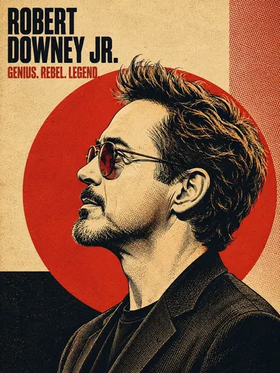
Create a vintage halftone poster-art portrait illustration of the subject. Render as a digital illustration mimicking screen-printed / offset-lithograph poster art, influenced by 1960s-70s bold political/protest poster art, Shepard Fairey-style bold stencil illustration, risograph print texture, vintage magazine cover design, and retro concert/album poster art. Use high-contrast ink linework with fine cross-hatching and stippling for shading; visible pen/brush strokes in hair strands. Rendering is flat color blocking combined with engraving-style fine line shading — not photorealistic, not airbrushed, not smooth gradient shading. Composition: subject's head and upper shoulders/chest in a strict 90-degree side profile facing left, eyes looking straight ahead in profile, chin slightly lifted, neutral/confident expression. Subject fills roughly 70-85% of the vertical frame, cropped at mid-chest/shoulder. A large solid-color circle (sun/halo motif) is centered behind the subject's head, with the subject's hair and shoulders slightly overlapping and breaking the circle's edge. Hair is rendered as one of the most detailed elements — individual flowing strands, wind-swept or voluminous movement, strong directional lighting creating highlight streaks within the dark mass of hair. Background: coarse woven linen/canvas paper texture overlaid across the entire composition at low opacity; asymmetric geometric color-block panels behind/around the circle — e.g. a solid dark rectangle in one lower corner, a contrasting stripe or panel along one edge, sometimes a fine halftone dot-pattern or crosshatch pattern filling one quadrant. Visible CMYK-style halftone dot pattern subtly overlaid on background panels and occasionally bleeding into the portrait's shadow areas. Fine analog print grain/noise across the whole image for an aged, screen-printed look. Color palette: select ONE cohesive limited palette (2-4 colors max) per poster, high contrast, no photographic gradients. Classic scheme: warm cream / aged paper beige background, bold poster red accent circle, near-black ink linework/shadow, cream highlights for lit skin/hair. Alternate dark scheme: black or deep charcoal background, poster red or burnt orange circle, black ink, warm cream/tan highlights. Alternate cool scheme: deep navy blue background, muted brick-red/orange circle, navy/black ink, warm cream highlights, with the subject's true eye color kept naturally visible as the one full-color accent. Duotone option: for a graphic pop-art variant, render the entire subject in a single duotone (e.g. mustard-yellow and black, or gold and black). Typography: headline is the subject's name (first name, or first+last stacked on two lines) placed top-left corner of the poster, inset from edges, in extra-bold condensed slab-serif or grotesque sans-serif, all caps, tightly kerned, stacked on 1-2 lines, large scale (dominant typographic element), matching the linework/shadow ink color, occasionally with a subtle drop shadow or outline for depth. Subheadline: a short 2-4 word tagline/epithet related to the subject (an evocative title, nickname, or descriptor), directly below the headline, smaller scale, bold condensed sans-serif or slab-serif, all caps, single line, in the poster's accent color (matches the circle color). Clothing and accessories: simple, era-appropriate or modern minimal clothing rendered in flat color with the same halftone/linework shading as the rest of the piece — collared shirts, blazers, off-shoulder tops, or textured jackets with visible fabric-fold linework. Accessories kept minimal — small jewelry (earrings, necklace) can be included if present in reference, rendered as simple line-art shapes. Lighting: single hard directional light source as if raking across the side profile, creating strong graphic shadow shapes rather than realistic soft shading. Shadows built from crosshatching, stippling, and halftone dot density rather than smooth gradients. Quality and fidelity: preserve accurate, recognizable facial proportions and features of the subject from the reference photo/name, translated into the illustrated line-art style — the illustration must be clearly identifiable as that specific person. Crisp, poster-print-ready quality, sharp linework, no blur, no photographic artifacts. Maintain identical composition, palette rules, and typography placement so the whole set reads as one unified poster series. Do NOT include a small circular/rounded-corner inset photo of the real reference image in the corner of the poster — the final output is the illustration ONLY, full-bleed, no reference thumbnail overlay.
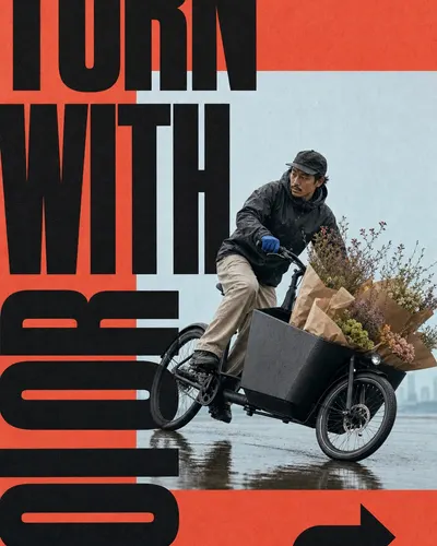
Create an editorial poster in the Coral Window Megatype Motion Poster style. First preserve this style fidelity lock exactly: A warm coral-red matte paper field dominates roughly two-thirds of the poster and acts as both border and graphic ground. One large rectangular pale powder-blue photographic window sits off-center with a clean hard edge and no visible frame stroke. A single realistic full-body subject is isolated against the quiet photo window and captured at a decisive moment of motion. The subject, photo window, and typography interlock through deliberate occlusion, with the body crossing over some letterforms and behind others. Colossal near-black ultra-heavy condensed sans-serif words run in opposing horizontal and vertical directions, exceed the canvas, and are cropped at the edges. The main headline behaves as abstract black architecture while retaining a short, forceful, readable phrase. Tiny black editorial credits, issue marks, dates, or technical labels sit sparsely near outer margins, often rotated ninety degrees. A single chunky geometric directional symbol anchors an otherwise open corner without decorative clutter. The palette stays tightly limited to coral red, pale cool blue, near-black, muted warm neutrals, and one restrained wardrobe accent. Soft natural daylight and moderate photographic contrast preserve believable skin, fabric, and prop detail without cinematic effects. Visible uncoated paper grain, subtle ink absorption, lightly softened photo contrast, and imperfect analog print texture unify photo and type. The mood is energetic, experimental, fashion-editorial, and Swiss-modernist with controlled asymmetry and generous breathing room. Explicitly avoid this literal source content: Do not recreate the young woman in a sleeveless beige dress or any identifiable face from the reference. Do not recreate the exact airborne side-leap, bent-knee silhouette, flying hair, or dropped sunglasses. Do not use the phrase SOME KINDA MOOD or any recognizable fragment of it. Do not copy the original photographer credit, layout experiments label, issue number, date, or vertical margin text. Do not recreate the exact red field, centered blue rectangle, three-word placement, and lower-right upward arrow as one-to-one geometry. Do not use the same white chunky sneaker emphasis or dress-and-sneaker styling combination. Do not repeat the story premise of a fashion model jumping across a minimal studio-sky window. Do not reproduce any signature, watermark, creator ID, platform mark, logo, or brand identity. Do not use an identifiable celebrity, model, performer, or copyrighted character likeness. Do not imitate exact source letter shapes or preserve the source word lengths as a recognizable typographic tracing. New content: show a city flower courier on a cargo bicycle leaning through a sharp wet-street turn while balancing a tall bundle of wrapped flowers with an unbranded matte-black cargo bicycle and paper-wrapped flowers in a quiet rain-washed city plaza; keep a pale misty sky and only a faint wet-ground reflection quiet and secondary. Wardrobe and styling: charcoal waterproof jacket, loose sand trousers, and one small cobalt glove accent. Build the poster on a full-bleed warm coral-red matte paper field. Insert one large off-center pale powder-blue rectangular photographic window, leaving broad coral bands on at least two sides. Show one realistic, nearly full-body subject at a decisive frozen-motion moment, crossing one edge of the photo window. Use soft natural daylight, a neutral or subtly low editorial camera, believable anatomy, gently subdued photo contrast, and no heavy motion blur. Set the main phrase TURN / WITH / COLOR in colossal near-black ultra-heavy condensed uppercase sans-serif. Split it into two or three architectural word blocks, rotate at least one block ninety degrees, crop letters beyond the canvas, and bridge the blue window and coral field. Interlock layers so the subject sits in front of some black letters and behind at least one non-critical letter stroke while remaining readable. Add sparse generic micro-editorial copy reading ROUTE 07 / FLOWER SHIFT / RAIN OR SHINE near two or three outer margins, including at least one rotated label. Place one chunky geometric right-turn arrow in an open coral corner. Keep the palette restricted to coral red, pale cool blue, near-black, warm muted neutrals, and at most one restrained accent on the prop or wardrobe. Unify everything with visible uncoated paper grain, slight ink absorption, subtle analog print softness, and clean hard-edged geometry. The mood is kinetic, experimental, fashion-editorial, and Swiss-modernist with controlled asymmetry and generous breathing room. Avoid conventional top-banner layouts, dense collage clutter, additional subjects, busy backgrounds, glossy gradients, neon glows, illustration, vector-only art, 3D rendering, real logos, watermarks, signatures, copied credits, random gibberish headline text, or any exact source composition. Important content rule: match the visual style first, then change the subject, action, prop, setting, text, identity, and story premise.
Create an image in the "Monochrome Grid Sneaker Tech Spec" visual style. Subject: a logo-free elite carbon-plate road running shoe with aerodynamic foam geometry and knit upper cues associated with modern race footwear Action: presented as a floating technical hero product with the outsole and midsole structure analyzed through callout panels Prop/Product: carbon plate slice diagram, knit mesh closeup, foam sidewall macro crop, and rubber forefoot traction detail Location: clean monochrome product-spec poster field on pale engineering grid paper Background: top strip of runner stride crops without visible brand marks, halftone outsole macro panels, thin callout lines, crosshair registration ticks Main text: AEROFOAM R-01 Secondary text: carbon response / knit lock / race day traction / lab grid Accent symbol: L-shaped bracket and small crosshair ticks Wardrobe/styling: cropped anonymous runner legs in plain black socks within the top strip only, no logos Style fidelity anchors: Pale white or off-white grid-paper background with faint square guides. Oversized sneaker hero in a three-quarter product angle, floating on the page with a soft contact shadow. Coarse black-and-white halftone dots across all photography, product surfaces, and inset images. Top horizontal strip of small action or texture frames separated by thin white gutters. Rectangular macro inset panels that crop into shoe materials, outsole tread, foam, stitching, or mesh. Thin black connector lines, L-shaped brackets, registration crosses, and tiny measurement ticks. Sparse editorial layout with large negative space around the central shoe. Pixelated uppercase headline near the lower-left or lower-third area. Tiny condensed technical captions, feature tags, and repeated microtype blocks. High-contrast monochrome lighting with deep black shadows and blown-out paper whites. Product-first hierarchy where the hero shoe dominates and evidence panels support it. Flat diagrammatic page system surrounding a tactile photographic product cutout. Source content to avoid: Do not recreate the exact PEAK FLASH 2 shoe design, wavy podded outsole silhouette, or original panel arrangement. Do not use the words PEAK, PEAK SPORTS, PEAK FLASH 2, SNAKE PATTERN, or the original feature caption. Do not include the PEAK triangle logo or any copied brand mark from the reference. Do not repeat the original top-strip running poses, seated athlete frame, or exact crop sequence. Do not reuse the original quote block wording or question-mark filler typography. Do not show visible Nike swoosh, adidas three-stripe mark, Puma cat/logo, or any other recognizable trademark. Do not add watermarks, usernames, QR codes, app marks, creator signatures, or platform identity. Apply these style rules as concrete visual requirements: - Composition: one oversized logo-free footwear product in a three-quarter product angle, floating on a pale engineering grid; a narrow top band of small black-and-white evidence panels; two to four macro inset boxes connected by thin technical lines; sparse negative space and asymmetric editorial balance. - Typography: pixelated uppercase product headline near the lower-left or lower-third area; tiny condensed uppercase feature captions; compact microtype; no copied slogans, no real brand marks, no social UI. - Color: strict black, white, and gray palette; off-white paper field, deep black shadows, mid-gray halftone texture, pale grid lines; no color accent. - Texture and lighting: coarse newspaper halftone, photocopy grain, scanner softness, hard monochrome product lighting, crisp shoe edges, soft contact shadow under the hero product. - Graphic elements: crop marks, registration crosses, L-shaped brackets, measurement ticks, rectangular macro panels, fine connector lines, and small technical labels aligned to the grid. Important content rule: match the style fidelity anchors first, then change the source content. Keep every sample about footwear, but use a new shoe silhouette, new product text, new material story, new top-strip panels, and new macro details. Do not include any visible Nike swoosh, adidas three-stripe mark, Puma logo, PEAK mark, watermark, QR code, username, or copied reference text.
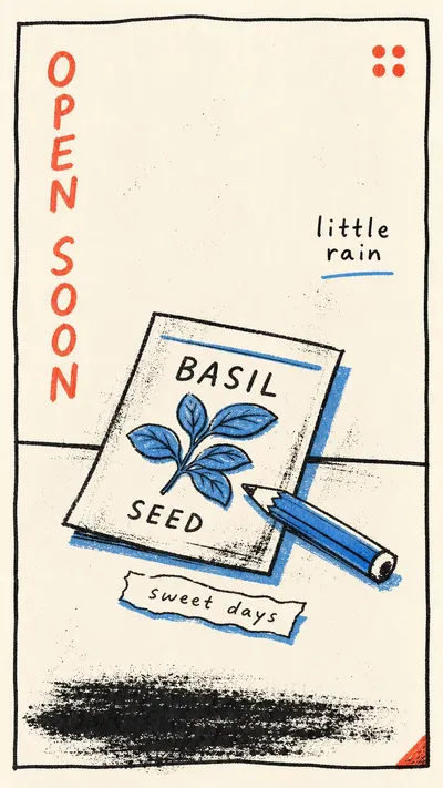
Create a image in the "Loose Scribble Riso Print Style" visual style. Subject: a flat basil seed packet with a stubby pencil crossing it, drawn as two loose rectangular shapes Action: lying quietly on a narrow window ledge, tilted a little to one side Prop/Product: one small torn paper label strip near the packet Location: minimal indoor windowsill with only a single ledge line Background: off-white paper, wavering border, a rough bottom ink smear, a tiny red corner mark, sparse dust speckles Main text: OPEN SOON Secondary text: little rain Accent symbol: small red four-dot stamp Wardrobe/styling: object-only still life, naive handmade contour, no character clothing Style fidelity anchors: Sparse single-subject composition with one large central object and generous off-white negative space. Handmade rectangular border with wavering black lines close to the page edge. Thick loose black contour strokes mixed with thin wandering scribble lines. Flat riso or screenprint color fields with slight registration offset and uneven ink coverage. Palette dominated by off-white paper, rough black ink, one sky or cornflower blue block, and one coral-red accent. Simplified object silhouette with playful distortion instead of realistic perspective. Casual handwritten uppercase side text, vertical or off-axis, in rough red or black marker. Visible paper grain, dust, ink speckles, dry-brush texture, and imperfect print edges. Low-detail tabletop or ground line anchoring the subject near the lower third. Quiet intimate art-print mood, like a small numbered print rather than a commercial advertisement. Source content to avoid: Do not recreate a blue vase or pitcher with a handle.; Do not include red flowers, arcing stems, or a bouquet emerging from the object.; Do not use the words FOR YOU or any close substitute that repeats the same gift-card premise.; Do not copy the bottom signature, artist name, edition number, watermark, or handwritten identity marks.; Do not duplicate the left-side tall black squiggle as the main graphic mark.; Do not repeat the exact central vase-on-table story or the same object proportions.; Do not use the original border, caption placement, or edition layout as a literal trace.; Do not include recognizable brand marks, creator IDs, QR codes, or platform marks. Apply these style rules: - Composition: one large simplified subject on warm off-white paper, generous empty margins, a low tabletop or ground line, and a wavering hand-drawn rectangular border close to the edge. - Typography: rough handwritten uppercase words with uneven stroke width, marker drag, and informal vertical, tilted, or margin-hugging placement. - Color: mostly off-white paper and rough black ink, with one flat sky or cornflower blue block and one coral-red accent, both slightly misregistered and unevenly printed. - Texture and lighting: scanned riso or screenprint texture, visible paper tooth, dust, speckles, dry-brush gaps, flat even contrast, no cast shadows, no modeled gradients. - Graphic elements: loose contour drawing, thin exploratory scribble lines, one small accent symbol, a rough bottom smear or ground patch, and imperfect ink edges. Avoid: photorealism, 3D render, glossy vector art, clean corporate poster design, dense collage, polished fonts, smooth gradients, watermarks, QR codes, logos, usernames, platform marks, exact source subject, exact source text, signature, or edition markings. Important content rule: match the reference style first, then change the source content. Use new subjects, new scene details, new props or products, and new text, while preserving the style fidelity anchors.
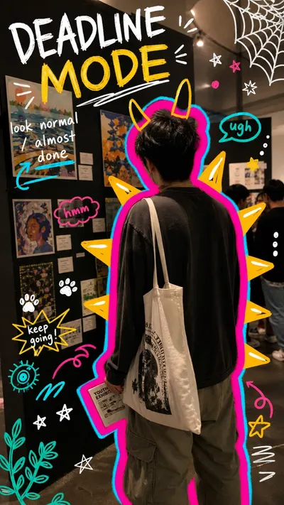
Create a "Neon Doodle Gallery Snapshot" style image. Subject: a tired art student seen from behind. Subject action: staring at exhibition panels during a campus gallery opening. Prop or product: a white tote bag and folded exhibition card. Location: small campus art gallery. Background elements: black display panels, colorful student artworks, tiny wall labels, warm indoor shadows, crowded opening-night edges, and phone-camera grain. Main handwritten text: "DEADLINE MODE". Secondary handwritten text: "look normal / almost done". Accent symbol: yellow monster spikes, white stars, paw prints, and cyan underlines. Wardrobe style: oversized dark shirt, loose trousers, tote bag, casual art-school layers. Use a realistic candid phone-photo as the base layer. The setting should feel specific and ordinary: visible walls, art, shelves, labels, tables, lamps, posters, people, bags, shadows, grain, and imperfect handheld framing. Draw a loud digital marker layer directly on top of the photo. Wrap the main subject with a thick hot-pink contour and a cyan offset glow. Add yellow-orange monster spikes, horns, rays, fins, or sunburst shapes around the silhouette. Scatter rough hand-drawn symbols around the frame: stars, paw prints, spiderweb corners, halos, abstract eyes, plants, flowers, scribble underlines, tally marks, arrows, hearts, and sticker-like blobs. Place rough uppercase handwritten marker text in open areas, using white, yellow, or lime green. The text should feel funny, personal, distracted, and student-made. Preserve the contrast between a real candid photo and chaotic handmade doodles. Avoid watermarks, usernames, platform logos, creator IDs, app marks, QR codes, clean vector-only illustration, fully illustrated backgrounds, polished ad layout, luxury editorial styling, perfect typography, empty sterile locations, identifiable celebrities, and tiny unreadable text.
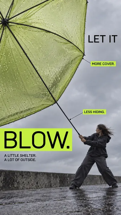
Create one full-bleed finished photographic advertising poster. [CORE] Constructed regular-weight rounded sans uppercase headline with even lean strokes and precise counters; supporting type is plain regular neo-grotesk. No marker, brush or extra-bold display lettering. [CORE] Bright sharp-corner flat rectangular highlights and dark type form an asymmetric editorial hierarchy: large headline, medium annotations, compact body. Place bands in content-shaped negative space, not a mandatory top stack. [CORE] Oblique wide-angle product photography with purposeful near/far scale, subdued grey environment and fine photographic print grain. Product function and believable human interaction lead the visual composition. [FLEX] Use the particular product geometry as the organizing device: broad protective plane, handle opening, travel route or folding support structure. A new color alone is not a new composition. [FLEX] Accent hue can vary but its brightness must stand out against restrained photographic colors; echo the hue selectively in the product. [FLEX] Recompose each ratio around the same product idea; text placement, camera orientation and figure scale may change. No repeated airborne pose or generic giant-object/small-person formula. Subject and action: One adult woman in charcoal rainwear grounded on a windswept concrete embankment, side profile leaning against wind, both hands holding an umbrella shaft. Large near translucent pale-lime canopy at upper left, smaller woman lower right. The straight central shaft must visibly run from her hands all the way to the central umbrella hub where every rib radiates; do not attach the shaft to a rim rib. Muted grey sky and narrow wet concrete ground. Exact headline: "LET IT BLOW." Exact annotations: "MORE COVER." / "LESS HIDING." Exact body: "A LITTLE SHELTER. A LOT OF OUTSIDE." Palette: Acid lime highlights, softly translucent olive-lime canopy, charcoal rainwear and cool grey surroundings. Portrait creative direction: Preserve the approved wind-candidate composition: expansive canopy clipped at upper left, small grounded woman lower right, a strong connecting diagonal. LET IT upper right in grey space and BLOW. on lime rectangle lower left. BLOW must have visibly REGULAR weight, much lighter strokes than the candidate. Correct pole-to-central-hub connection. Keep other placement and mood. instead: Canopy broad at left and woman braced at far right with the straight central shaft clearly reaching the hub; title split across central grey pocket, annotations placed asymmetrically along the shelter edge. Keep whole action grounded and headline regular weight. Keep typography constructed REGULAR weight, not heavy bold; sharp flat colored rectangles with no shadow. Integrate text with the product-led geometry, maintain physical connections and readable wording. Fine print grain, subdued photographic palette, deliberate breathing room. No extra copy or creator mark. Fictional product concepts. Exclude Original sneaker branding and sock logos; WE MADE A SNEAKER FOR PEOPLE WHO HATE SNEAKERS wording; Original female jumping pose and exact rocky crop; Original NO HYPE and NO HEEL claims and supporting copy.
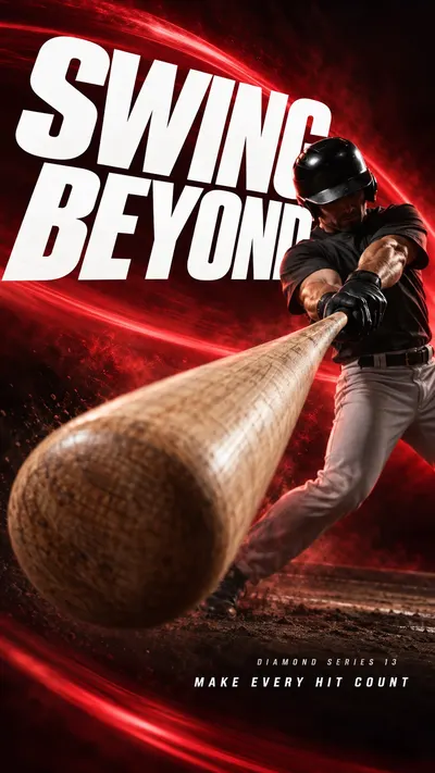
Use case: ads-marketing. Create one finished premium sports campaign poster as a full-bleed raster. The visual system is extreme near-to-far athletic photography, monumental white oblique typography and dark-to-luminous colored atmosphere. Prioritized visual anchors: [CORE] Photographic athletic action uses an extreme near-to-far scale jump: one physically connected piece of equipment or body part dominates the foreground while the athlete recedes into depth. [CORE] Monumental white heavyweight oblique sans-serif typography cuts through the composition; the athlete occludes selected letter areas without destroying the exact headline. [CORE] A near-black edge field opens into a luminous single-hue atmospheric band behind the action, producing sharp white-type contrast and dark sculptural human form. [CORE] Directional photographic motion softness and colored atmospheric streaks carry the force vector while the critical contact point or equipment retains selective detail. [FLEX] Let each sport determine the spatial structure: a wooden baseball bat foreshortened toward the lens, a near barbell weight plate framing a loaded lift, a surfboard nose inside a curling wave tunnel, or a continuous satin ribbon sweeping near the camera while its gymnast recedes. Continue the established series language with distinct subject, material and force geometry. [FLEX] Place, rotate, stagger or stretch the type around the movement; protect complete headline comprehension while allowing scale, selected edge cropping, and controlled overlap. [FLEX] Choose one dominant hue per case, with dark and pale related tones; hues may vary across the family. [FLEX] Recompose subject, title and negative space independently for portrait and landscape, preserving the same case concept rather than cropping the other ratio. Subject and action: An adult male baseball batter in an unmarked charcoal jersey, plain trousers and black protective batting helmet, executing a powerful two-handed swing with one plain wooden baseball bat. His legs are planted in a sparse dark batting area. Near-camera focal evidence: The blunt rounded barrel end of the wooden bat is extremely close to the camera, large in the foreground; the shaft foreshortens continuously back to two hands correctly stacked on the handle. Natural pale wood grain with no lettering or branding. Exactly one bat, no separate ball needed, no disconnected barrel. Design intention and ratio planning: The near rounded barrel becomes a compressed cylinder, while the long shaft and twisting torso reveal its actual depth. Use a broad cherry-red arc behind the swing and giant white typography around the bat trajectory. Portrait: barrel end occupies lower-left foreground, athlete recedes upper-right, headline uses upper-left and lower-right open areas in clear reading order. Landscape: near barrel at left-center and connected shaft leads diagonally to batter at right-center, enormous headline across the upper open field. Both hands and their contact with the handle must remain visible. Palette: Near-black burgundy, luminous cherry red and bright white; a restrained warm highlight on natural wood and red rim light on the athlete. Render exactly three text strings, each once, with no quotation marks: large headline "SWING BEYOND"; small series label "DIAMOND SERIES 13"; small supporting line "MAKE EVERY HIT COUNT". The headline must remain completely readable with correct letter order; choose line breaks and bounded overlap to serve the action. Keep small copy clear and comfortably inside the canvas. Image treatment: Clean commercial photographic compositing without paper grain or halftone. Keep focal texture on unprinted wood bat grain, plain rubber weight plates and brushed steel, wet surfboard resin and sculpted water, or a smooth satin ribbon. Directional blur belongs to moving surfaces and the background; the critical contact area stays legible. Chalk and sea spray stay local to grip or wave action. For the held lift use controlled atmospheric depth rather than invented speed streaks. Use dramatic sculptural lighting and physically plausible connected anatomy/equipment. Clothes and equipment are plain and unmarked: no logos, emblems, patches, numbers or decorative pseudo-lettering on clothing, bats, helmets, weight plates, bars, surfboards, ribbons or sticks. No extra words or symbols. Source content to replace entirely: The source Nike swoosh, Nike wordmark, JUST DO IT slogan and any recognizable sportswear brand logo; the PEGASUS42 or PEGASUS 42 model wording and the reference advertising paragraph; the white running shoe with a teal swoosh as a giant foreground product; the exact front-facing male runner, lifted knee, grey long-sleeve top and black shorts combination; the source arrangement of fragmented PEG, S42 and giant brand letters; do not trace its composition. Part 1 content: track bicycle wheel, chalked climbing hand on rock, freestyle swimming hand, fencing blade, and the headlines BREAK AWAY, HOLD FAST, CUT THROUGH and STRIKE FIRST. Part 2 content: raised basketball, snowboard underside, kayak paddle, boxing gloves, and the headlines RISE ABOVE, CARVE WILD, DRIVE DEEP and MAKE IMPACT. Part 3 content: tennis racket grid, wooden gymnastics rings, speed-skating blades, recurve bow and arrow; headlines TURN THE MATCH, DEFY GRAVITY, CHASE THE LINE and STAY TRUE. Deliver a polished, sparse campaign image with a clear sport-specific design contribution, not a mockup on a wall.
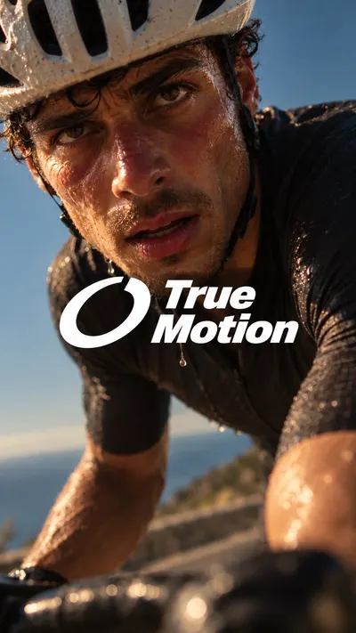
Create ONE finished premium sports campaign image. This is a faithful photographic and compositional transfer of the following language: [CORE] One full-bleed, physically believable sports photograph captures an intimate bodily state: exertion, breath, water, heat, pressure or recovery. The felt moment drives the image. [CORE] Bring the camera unusually close to the athlete, with an off-axis view and strong near/far scale. Use pronounced selective focus: the nearer eye and a small patch of skin or water are resolved, while the nearer forearm, farther shoulder and background melt into optical softness. Let a blurred foreground shape fill a meaningful part of the lower frame. [CORE] Create the atmospheric depth of an underexposed sunlit film photograph: warm amber skin highlights against substantial deep natural shadow, muted blue sky or water, a gentle bloom around wet highlights and restrained fine grain. Keep irregular real sweat, water, flushed skin and damp hair. Preserve shadow volume and smooth optical softness instead of uniform digital microdetail. [CORE] Overlay one prominent, tightly joined white logo-and-wordmark unit directly across the photograph optical center. Let it overlap the lower cheek or chin as well as the upper body, rather than sitting as a small label entirely below the face. Keep the important eye or eyes readable. [CORE] The original logo sits immediately beside a tightly stacked two-line heavy italic sans-serif wordmark. The lockup is one graphic unit, with the photograph visually dominant. Keep the letters clean white and the two exact words in title case. [FLEX] Change the sporting state, crop, perspective and physical textures while preserving the close photographic depth and central brand relationship requested by the user. [FLEX] Reframe around the body and its visual weight. In portrait, the joined logo and wordmark typically span 60 to 66 percent of canvas width; in landscape, 38 to 44 percent. Keep the unit visually dense and central while allowing the face scale to guide final placement. SUBJECT: an adult male road cyclist with short dark curls, an off-white vented helmet and a nearly black cycling jersey, against clear blue sky CAPTURED STATE: leaning heavily over the handlebars immediately after a punishing climb, breathing through parted lips, looking up toward the camera under the helmet shadow; irregular sweat beads and a few fresh drops of poured water run over flushed cheeks and hang under the chin The ONLY written words are exactly "True Motion". Stack the first word above the second in heavy compact italic title-case white lettering. Make this ORIGINAL LOGO: a bold solid-white tilted open ring, with a clean wedge missing at the upper-right and unequal thick terminals; a simple original aerodynamic loop, without letters or a checkmark. Place the white symbol immediately left of the two-line wordmark, tightly joined as ONE prominent tightly joined lockup at the photograph optical center. Do not separate the symbol from the words. The white group must read strongly at first glance and overlap the lower cheek/chin and upper body; it is not a small label below the face. The photograph continues fully behind the group. Use the layout plan matching the requested output ratio only. plan: camera almost at handlebar level and only an arm length from the face, slightly canted; brow and helmet crop into the top, the large diagonal face fills the upper two-thirds and the near shoulder sweeps across the lower foreground. Put the prominent white lockup across the lower cheek/upper chest at roughly the center of the frame, 60 to 66 percent of canvas width. Keep the lockup high enough to overlap the lower cheek/chin as well as the upper body, and make the near foreground visibly softer than the focused eye. plan: extreme near frontal three-quarter view from below the bars, face near the center with one shoulder and bent arm sweeping sideways across the full width, small blue-sky gaps between body and frame; keep the lockup across the lower-face/upper-chest visual center, 38 to 44 percent of canvas width, with no empty copy panel. Keep the lockup high enough to overlap the lower cheek/chin as well as the upper body, and make the near foreground visibly softer than the focused eye. Build a moody underexposed sunlit atmosphere with warm amber highlights, substantial natural shadow, muted blue sky/water and gentle bloom on wet highlights. Focus sharply only on the nearer eye and a small nearby skin plane; let the very near arm/hand, some droplets, farther shoulder and background dissolve with clearly visible optical softness. Keep real skin and water tactile while lowering digital microcontrast; avoid an evenly sharp clinical result. No digital effects, pixel blocks, colored gels, synthetic gradient background, extra type or side copy panel. Source details to replace: The exact source cyclist identity and facial likeness. The exact words Modern Human and its registered mark. The exact source logo silhouette; draw the supplied original logo instead. Any pixel fragmentation, scanlines, neon gel lighting or digital particles introduced by the rejected first version.
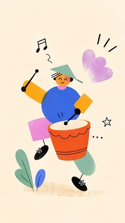
Create a illustration in the Kinetic Geometric Doodle Cutouts style. Subject: a cheerful bicycle courier made of abstract geometric parts. Action: coasting through a light drizzle while balancing a square delivery box. Prop or object: small cobalt delivery box with no logo. Setting: plain cream paper space suggesting a rainy street without buildings. Background details: three loose rain dashes, two puddle scribbles, and a tiny floating cloud mark. Wardrobe or styling: orange rain sleeve, mint torso block, pink wheel-like leg shapes, black ink shoes and handlebar lines. Optional text treatment: no headline, only a tiny unreadable hand-drawn route mark; secondary micro marks: two small abstract tick marks near the box; accent symbol: tiny black lightning squiggle. Style fidelity lock: Warm cream paper field with generous empty space around the subject. One central figure, object, or small scene built from a few oversized geometric blocks. Flat vector-like shapes with subtle printed grain, dry-brush speckle, and soft sprayed gradients. Asymmetric kinetic pose with limbs or parts angled diagonally as if mid-motion. Thick black hand-drawn contour strokes only on small details such as hands, shoes, hair, wheels, handles, or motion marks. Palette mixes saturated orange, cobalt blue, pink-lilac, mint green, golden yellow, and solid black in uneven proportions. Simplified face or object details are tiny compared with the large body or prop shapes. Edges are clean but imperfect, with cut-paper overlaps and occasional transparent color intersections. Loose scribble motion lines sit near moving parts without becoming dense or decorative wallpaper. No realistic anatomy, lighting, perspective depth, or polished 3D rendering. Content to avoid: Do not recreate the original jumping person with raised waving hands. Do not copy the original blue glasses face, black side ponytail, sneaker placement, or exact limb arrangement. Do not include the source signature, watermark, creator name, or any platform mark. Do not reuse the same orange L-shaped arm, blue belly circle, pink leg, and orange bent leg arrangement as a literal composition. Do not reproduce the original cream portrait layout with the same diagonal leap story. Do not include readable brand marks, QR codes, usernames, or labels that look like a watermark. Use a warm cream paper background with generous negative space. Construct the subject from five to nine oversized flat geometric color blocks: tomato orange, cobalt blue, magenta pink, lilac violet, mint green, golden yellow, black, and small white accents. Include subtle risograph grain, dry-brush speckle, and one or two soft sprayed gradients inside selected shapes. Add sparse loose black hand-drawn contour lines only for small expressive details and motion marks. Keep the image flat, airy, asymmetrical, buoyant, handmade, and print-like. Do not use realistic anatomy, 3D rendering, dense scenery, logos, signatures, watermarks, QR codes, or polished fonts.
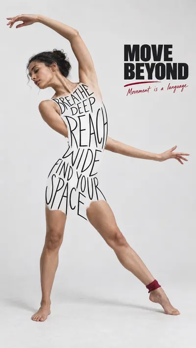
Create one finished editorial campaign poster. Prioritized visual system: [CORE] The central visual trick is a human body constructed from irregular black hand-lettered words. Remove the photographic torso and upper garment and replace that area with background-colored negative space filled by letters; the collective outer edges of the letters create the silhouette. It must not look like text printed on a white shirt, a rectangular sign, or a tattoo. [CORE] Keep the head, exposed arms, hands and lower legs photographic and anatomically connected to the letter-built silhouette, so the figure remains one coherent person. [CORE] Body lettering is slender, elongated, single-stroke black felt-tip handwriting, NOT bold brush lettering or a heavy display font. Stroke width roughly one fifteenth of letter height. Narrow irregular uppercase glyphs, varying heights and gently wavering baselines fit the body volume. Air between strokes is essential, every word legible. [CORE] A pale gray-white seamless photographic ground with generous quiet negative space supports almost-black ink and very limited muted crimson accents; no rich scene or colorful graphic backdrop. [CORE] A SMALL compact block of extra-bold wide uppercase sans-serif headline contrasts with the slender body handwriting. Keep headline clearly secondary to the figure, roughly a quarter of canvas width, with a short small crimson handwritten subline. [FLEX] Shape word rows to express the case action: stretch, slope, compression or rhythm; choose emphasis words and row arrangement freely without changing exact wording. [FLEX] Position the compact headline and figure for the aspect ratio and gesture, rather than always reproducing the source upper-left title and upright central body. [FLEX] One spare red underline, circle or short stroke may focus the headline or action; red also appears in one small practical subject detail. Keep accents sparse. Photographic subject and pose: An adult woman contemporary dancer with natural dark hair tied back, in an expressive standing side-bend, one arm curves overhead toward the left and the other opens sideways. Both feet grounded, one leg extended sideways with a small crimson ankle wrap; exposed arms, head, and lower legs are photographed. Compact block headline, verbatim: "MOVE BEYOND". Words building the body silhouette, verbatim in this reading order: "BREATHE DEEP REACH WIDE FIND YOUR SPACE". Small red handwritten supporting line, verbatim: "Movement is a language". Art direction: Stretch REACH and WIDE across the bending ribcage; narrow the words at the waist. Create an airy crescent of blank space inside the arm and torso bend. Portrait: figure rises in a sweeping arc on the left, compact headline in the open upper-right corner. Landscape: wide arm-and-leg gesture travels left to right, with headline nested in the open side of the arc. Typography constructs the torso and upper-thigh silhouette, never the arms. Source content exclusions: The football player, raised-knee celebration and backward-shouting pose; American football, red cleats and football camp story; IT ALL STARTS HERE and the source motivational body wording; Hugh Freeze name, camp dates, schedule and footer logos; Any Nike or other brand mark, QR code, creator credit or platform watermark The letters replace the torso rather than sitting on a photographed garment: no shirt seams, no fabric, no border or solid backing panel under them. Pale gaps between letters match the surrounding background. Facial anatomy, hands and feet remain photographic and coherent. Fine restrained photographic grain, natural skin, soft diffuse studio light, faint grounding shadow; slight organic marker edges. Keep every word readable. Borderless poster, no mockup, no additional copy. Critical execution: body words must be THIN, LONG, LOOSE HANDWRITING with open spaces, not solid fat black letter blocks. The ghost torso is the SAME gray-white photographic background visible between and outside letters, with no white fabric perimeter. Let outer letters taper and stagger individually. Preserve a coherent figurative collage, not a visibly cut-out white bodysuit. Keep a small compact headline and broad quiet margins; the person need not fill the entire frame.
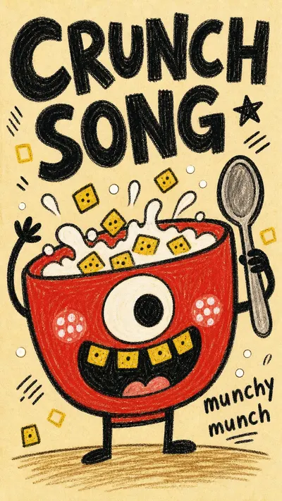
Create a raster poster in the Rough Marker Monster Poster Style. Subject: a huge teal kettle-character with one big white eye and a lopsided open mouth. Subject action: puffing steam while giggling at the viewer. Product or prop: a tiny red mug and three crooked steam curls. Location: empty cream paper poster with only an implied tabletop line. Background elements: small black steam hatches, white cheek dots, tiny orange rectangles, and faint paper speckle. Main text treatment: chunky black hand lettering reading SIP IT SLOW. Secondary text treatment: small uneven handwritten tag reading hot hot. Accent symbol: tiny orange burst mark. Wardrobe or object styling: object-character styling with blunt spout, round belly, and rough marker fill. Style fidelity anchors that must remain visible: Cream paper background with warm tint, subtle speckle, and no realistic environment. Thick black marker or oil-pastel keylines with scratchy edges, wobble, and uneven pressure. One huge simplified character or object-character fills most of the frame and is cropped boldly. Flat childlike construction with no realistic perspective, no 3D modeling, and no polished vector edges. Saturated marker fills show visible grain, small white gaps, and rough hand-colored texture. Limited palette uses one dominant bright body color, yellow-orange or warm accents, white eyes or mouth shapes, and black text. Goofy anatomy or object logic uses one big expressive eye, simple mouth, blocky silhouette, and playful imbalance. Hand-lettered black display text is large, chunky, uneven, and integrated into empty corners. Small repeated marks such as short hatch lines, dots, cheek spots, little rectangles, and scribble accents add rhythm. Composition is poster-like and sparse, with one central subject, a few decorative marks, and a short handwritten phrase. Mood is mischievous, naive, funny, and slightly absurd, like a children's warning poster. The finish remains analog and handmade rather than clean digital illustration. Source content to avoid: Do not recreate the green dinosaur or dragon head, long neck silhouette, yellow back spikes, or exact tooth arrangement. Do not copy the source phrases Look at me and eat it or Coky it or any close variant. Do not reproduce the same right-side stacked text block, lower-left word cluster, or source composition exactly. Do not include the source signature, watermark, creator name, username, platform mark, or identity mark. Do not use the same story premise of a dinosaur telling the viewer to look and eat. Do not copy the single nose patch, cheek dot pattern, eye angle, or jaw shape from the reference. Do not create a realistic dinosaur, polished mascot, clean vector icon, comic book panel, or digital cartoon render. Do not include real brand logos, QR codes, app marks, or photographic backgrounds. Apply these style rules: warm cream paper background with subtle speckle; one huge flat childlike creature or object-character dominating the poster; thick scratchy black marker outlines; rough saturated marker fills with visible grain and small white paper gaps; chunky irregular black hand-lettered text integrated into empty corners; tiny dots, hatch marks, cheek spots, rectangles, and scribble accents; limited palette with one dominant bright body color, warm yellow-orange accents, white eye or mouth shapes, and black text; flat handmade construction with no realistic perspective, no 3D, no clean vector polish, no photographic environment. Important content rule: preserve the visual style first, then change the content with a new subject, new action, new prop, new fictional text, and new story premise.
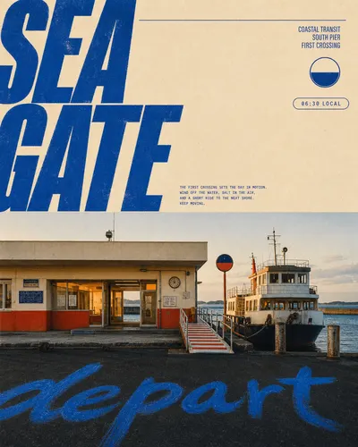
Create a raster poster in the Cobalt Megatype Roadside Travel Editorial visual style. Style fidelity anchors: A poster split into a cream editorial field above and a full-width documentary location photograph below, with the boundary near the middle. Two enormous stacked words in ultra-heavy italic condensed sans type occupy the upper-left and crop decisively beyond the left edge. The headline is printed in one saturated cobalt blue with tight spacing, hard silhouettes, and slightly weathered ink edges. The upper-right stays relatively open and carries a tiny locator system: thin horizontal rule, small label stack, circular icon, and outlined capsule. A short compact paragraph of cobalt microcopy sits low in the cream field, balancing the giant headline without filling the negative space. The photograph uses a straight-on, eye-level, wide architectural viewpoint with one low building or transport structure spanning most of the frame. Warm amber interior light or sunlit surfaces contrast with cool cobalt details and a deep petrol-charcoal foreground. One oversized loose hand-painted word appears in bright cobalt across the dark road, pavement, water, or ground at the bottom. The palette remains restrained to warm cream, saturated cobalt, faded amber-orange, petrol green, and soft charcoal. Fine analog grain, offset-print speckle, gentle color fading, lifted blacks, mild halftone, and subtle ink misregistration unify type and photograph. The mood is quiet, observant, slightly cinematic, and rooted in late-twentieth-century Japanese travel-magazine design without copying literal Japanese content. Strictly exclude this source content: Mount Fuji, a conical snowless volcanic mountain, or the exact mountain-behind-store composition; the LAWSON convenience store facade, blue-red retail stripe, convenience-store parking lot, storefront products, or any recognizable retail brand; the exact source headline MT. FUJI, the word LAWSON, the original Japanese captions, or close translations of that copy; the exact upper-right labels about Fuji-Hakone-Izu National Park, Honshu Island, Japan, or the source location-pin arrangement paired with that wording; the exact blue Japanese calligraphy painted across the source asphalt; any logo, trademark, watermark, username, signature, QR code, platform mark, or creator identity; a travel story centered on visiting Mount Fuji through a branded convenience-store forecourt. New subject: a low cream-and-vermilion public ferry terminal with a compact passenger ferry beside it. Action or state: opening for the first crossing while the ferry rests at the gangway. Prop or visual anchor: a striped boarding ramp, one circular harbor signal, and unbranded mooring posts. Location: a quiet windswept island harbor. Background elements: flat blue water, a long concrete breakwater, low distant islands, pale sky, and no mountains. Main headline text: SEA GATE. Supporting locator and microcopy: COASTAL TRANSIT / SOUTH PIER / FIRST CROSSING. Hand-painted foreground word or accent: depart. Human styling if incidental figures appear: if any incidental traveler appears, use a plain navy windbreaker and cream trousers with no marks. Apply these concrete style rules: split the poster near the middle into a warm cream uncoated-paper editorial field above and one uninterrupted full-width documentary location photograph below; place two enormous stacked words of ultra-heavy italic condensed grotesk in saturated cobalt at the upper-left, tightly spaced and cropped decisively beyond the left edge; extend a thin cobalt rule across the top toward a sparse upper-right locator cluster made from tiny narrow type, one circular symbol, a short right-aligned label stack, and one thin outlined capsule; place a compact paragraph of tiny cobalt microcopy low in the cream field; photograph one low public, transit, waterfront, or civic structure straight-on from eye level or slightly low with a moderate wide lens, level horizon, minimal perspective distortion, and few or no people; use warm amber sun or practical interior glow against cobalt details, petrol shadows, and lifted charcoal ground; preserve a dark uncluttered foreground and lay one oversized loose cobalt brush word directly across it; restrict the palette to warm cream, saturated cobalt, faded amber-orange, petrol green, dusty cyan, and soft charcoal; unify the entire design with fine analog film grain, uncoated paper fiber, mild halftone, tiny offset-print flecks, gentle pigment fading, subtle misregistration, and soft highlight bloom; keep the mood quiet, observant, nostalgic, and travel-editorial with sparse graphic density. Render all requested text as clean intentional poster lettering, but use only the new supplied wording. Avoid Mount Fuji, mountains dominating the scene, branded convenience stores, retail stripes, parking-lot recreations, source Japanese text, source wording, recognizable trademarks, logos, watermarks, signatures, QR codes, platform marks, glossy HDR, corporate brochure polish, neon night scenes, dense collage, price tags, UI, anime, illustration, vector-only scenery, painterly rendering, synthetic 3D architecture, plastic surfaces, crowds, featured faces, severe blur, heavy grunge, chromatic aberration, blocky compression, and excessive noise. Important content rule: match the style fidelity anchors first, then change the subject, structure, location, props, text, and story premise completely.
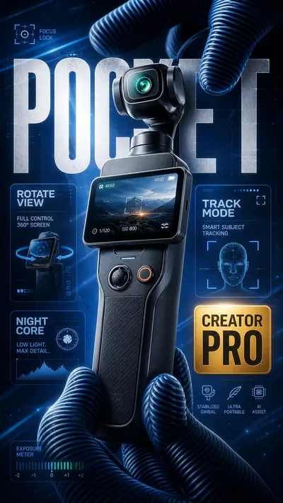
Create an image in the "Blue HUD Macro Creator Tech Poster" visual style. Subject: brandless premium pocket gimbal creator camera with tall black handle, rotating square touch screen, tiny stabilized camera head, teal lens glow, rubberized grip, and beveled metal accents Action: oversized ribbed blue-black gloves reveal the device as a launch hero product Prop/Product: compact pocket creator camera with generic design, no logo, no printed brand name, no official product geometry Main text: POCKET Secondary text: ROTATE VIEW, TRACK MODE, NIGHT CORE Style fidelity anchors: Macro product-hero composition with the object large, tilted, and centered or slightly off-center, filling the frame. Oversized ribbed gloves or flexible striped fingers crop in from the frame edges and physically frame the product. Deep glossy 3D rendering with rounded plastic, rubber, metal, and glass surfaces, not a flat poster or hand-drawn illustration. Cold electric-blue background with dark navy gradients, diagonal light streaks, faint grid lines, and misty volumetric glow. Large condensed block headline typography in white or icy gray, partially hidden behind the product or cropped by the frame. Layered translucent glass HUD cards with rounded rectangles, radial meters, small icons, and compact spec labels. One warm gold or amber performance badge as the dominant contrast accent against the blue palette. Sharp rim lighting on product edges, glowing cyan highlights, and high contrast between black shadows and luminous blue light. Dense commercial poster layout with little empty space, overlapping text, cards, badges, product, and hand forms. Tiny technical labels and microcopy used as texture, kept generic and brandless. Slight shallow-depth-of-field feeling: product and foreground fingers are crisp, background UI is softer. Premium creator-electronics mood: futuristic, dramatic, polished, feature-heavy, and made for launch advertising. Source content to avoid: Any DJI, Osmo, or other real brand logo, brand mark, app mark, watermark, product badge, or official wordmark. The exact original product silhouette, official DJI product geometry, exact button/screen/lens placement, or copied trade dress. The exact original hand pose and camera-gripping action. The exact source text, including Cyrillic words, 4K ULTRA HD badge, 120 frames per second, two-hour recording, sensor screen, and camera claims. The original blue-black striped glove arrangement copied exactly. Any layout that repeats the same left headline, right badge, and bottom-right camera word arrangement without modification. Official product names rendered in the poster art or printed on the product surface. Watermarks, QR codes, platform marks, usernames, pricing blocks, or store UI. Apply these style rules: - Macro 3D creator-tech product hero, large and tilted, physically framed by oversized ribbed gloves or striped synthetic fingers cropped by the frame. - Cold electric-blue and deep navy technology background with diagonal light streaks, faint grid lines, mist, bloom, and glass HUD panels. - Large extra-bold condensed all-caps headline in white or icy gray, cropped or partly occluded behind the product. - Translucent rounded feature cards with radial meters, pill bars, small icons, and compact technical labels. - One warm gold or amber performance badge, used as the only major warm contrast accent. - Glossy plastic, rubber, glass, brushed metal, beveled product edges, cyan rim light, and dramatic black shadows. - Dense commercial product poster hierarchy with overlapping product, gloves, type, badges, and interface graphics. - Use real-market creator hardware categories as inspiration only; do not render real brand marks or exact product replicas. Avoid: - No real brand logos, no DJI, no Osmo, no official product names, no exact product replica, no copied trade dress, no source Cyrillic text, no exact 4K ULTRA HD badge, no watermarks, no QR codes, no usernames, no platform UI, no flat vector style, no hand-drawn comic style, no minimal white-background catalog photo, no low-density layout, no copied source text, no copied source product silhouette. Important content rule: match the extracted style first, then change the exact source content. Product categories may be camera-adjacent when requested, but all outputs must stay brandless, non-identical, and newly worded.
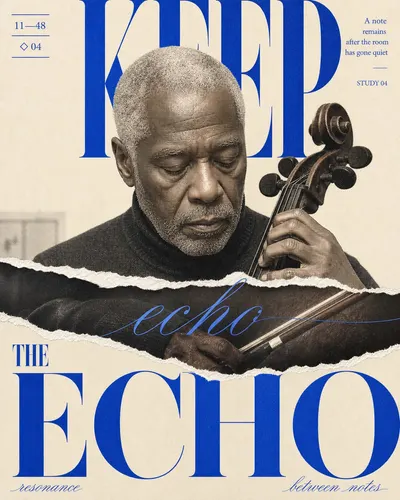
Create a finished editorial poster in the "cobalt-torn-didone-portrait-editorial-style" visual system. STYLE FIDELITY IS THE FIRST PRIORITY. These observable anchors are mandatory: A warm ivory paper field remains visibly open around the subject, with roughly one third of the design functioning as calm negative space rather than a full-bleed scene. One front-facing or gently turned chest-up subject dominates the center and lower field at near life-size scale, cropped by the bottom and sometimes by one side. One broad irregular horizontal torn-paper reveal slices across the central subject; bright fibrous white edges and a slightly displaced photographic strip make the physical rip unmistakable. The main headline uses monumental high-contrast Didone serif letterforms in saturated cobalt, split across upper and lower zones, extending beyond the canvas and passing both behind and in front of the subject. A single elegant hairline calligraphic word crosses the torn central band, while two smaller curved or diagonal script labels counterbalance the lower corners. A small numeric catalog or date notation with thin horizontal rules occupies the upper-left corner, balanced by a compact right-aligned four-line editorial note at upper right. The palette is tightly restricted to warm ivory, electric cobalt blue, photographic skin or material tones, carbon-black shadows, and torn-paper white. Photography carries visible newspaper halftone, scan grain, softened low-resolution edges, and lightly overprinted ink without becoming distressed beyond legibility. Layering is flat and editorial: photo, type, and torn paper occlude each other sharply, with no realistic drop shadows, bevels, glossy depth, or floating-card presentation. Lighting is soft, frontal, and low-contrast, preserving natural texture while the cobalt typography supplies nearly all graphic contrast. The mood is poised, introspective, fashion-forward, and slightly surreal, recalling an independent art magazine rather than a commercial product advertisement. LITERAL SOURCE CONTENT MUST CHANGE. Exclude all of the following: Do not recreate the identifiable young woman's face, sideways eye movement, expression, dark shaggy bob, or facial proportions from the reference. Do not use the same blue patterned collared shirt, the same bust crop, or the same exposed shoulders and neckline. Do not recreate a torn strip that specifically isolates and repeats the source woman's two eyes and eyebrows. Do not reuse the words HOLD, YOUR, VISION, PERCEPTION, REALITY, or the original forward-looking slogan. Do not reuse the source date, its exact top-corner copy arrangement, or the source line breaks and letter positions. Do not reproduce the same face-plus-eye-reveal story premise, exact tear contour, or exact foreground/background masking order. Do not include any source signature, watermark, username, logo, creator mark, QR code, or platform identity. NEW CONTENT Subject: an older Black male cellist with close-cropped silver hair and a weathered, calm face. Action or state: pausing between notes with his head gently lowered while one hand steadies the cello neck. Supporting prop: the dark wooden cello scroll and a slim bow entering the close portrait crop. Implied location: a nearly empty rehearsal studio after midnight. Minimal background details: one faint acoustic-panel seam and a soft fragment of a music stand, mostly lost into the ivory field. Main headline: KEEP THE ECHO. Secondary corner copy: 11—48 / A note remains after the room has gone quiet / STUDY 04. Small accent symbol: ◇ 04. Wardrobe or material styling: a plain charcoal wool turtleneck with no jewelry or branding. COMPOSITION Use a warm ivory paper field with roughly one third calm negative space. Place exactly one large central chest-up portrait or frontal sculptural hero form across the lower two thirds. Split the supplied main headline into two tiers of enormous cobalt high-contrast Didone serif letters, wider than the canvas, partially cropped and alternately passing behind and in front of the subject. Add one small ruled numeric block at upper left and one compact right-aligned three-to-five-line editorial note at upper right. Recompose the hierarchy for the requested format; do not rotate or letterbox it. TORN-PAPER STRUCTURE Create exactly one broad irregular horizontal physical tear across the middle third. The bright white fibrous edges must be unmistakable. Inside the displaced strip reveal a case-specific detail such as hands, strings, plans, fabric, material, or motion; do not isolate or repeat the source eyes. The ripped strip must interrupt both the central image and portions of the headline. TYPOGRAPHY Render the supplied main headline as legible monumental cobalt Didone lettering with extreme thick-thin contrast, sharp serifs, and elegant open counters. Choose one short keyword from that new headline and repeat it once as a delicate copperplate-like cobalt italic crossing the torn band. Add two brief case-specific script labels near opposing lower corners. Keep microcopy restrained and use only the supplied text; no extra cover lines, brands, logos, or random pseudo-text. COLOR, PHOTO, AND FINISH Restrict graphic ink to saturated cobalt blue on warm ivory and paper white. Keep the natural photographic tones muted, warm, and subordinate. Photograph the subject frontally with diffuse low-contrast light, minimal depth, and believable anatomy or material form. Apply visible controlled newspaper halftone, scan grain, paper tooth, and slight print softness without destroying text or facial detail. All layers are flat printed collage; use no realistic drop shadow, bevel, glossy depth, or presentation mockup. AVOID No copied face, eye strip, hairstyle, shirt, source words, source date, source layout coordinates, or future-vision premise.
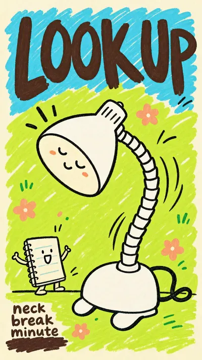
Create a image in the Playful Marker Grounding Poster Style. Subject: a giant smiling refillable water bottle mascot with simple white fill and thick black outline. Action: tilting sideways and waving one rounded cap-arm while droplets bounce around it. Prop/Product: tiny cup with two splash marks. Location: sunny kitchen corner drawn as a few symbolic counter lines. Background: cyan scribble patch above, lime scribble patch below, tiny lemon dots, little motion ticks. Main text: DRINK UP. Secondary text: tiny sips today. Accent symbol: small yellow star. Wardrobe/styling: simple white gloves and tiny sneaker loops on the bottle mascot. Style fidelity anchors: Cream poster-paper border with the artwork sitting inside a slightly inset field rather than bleeding to the edge. Loose childlike marker-scribble background blocks, mostly bright sky cyan and sour lime green, with uneven white gaps. Flat illustration with no realistic depth, no cast shadows, no gradients, and no polished vector smoothing. Thick imperfect black or dark-brown outlines with variable pressure, rounded ends, and visibly wobbly hand-drawn edges. One oversized simple subject dominates the lower middle of the poster, with tiny supporting props or characters as scale contrast. Large hand-lettered headline at the top, irregular baseline, chunky brush-marker shapes, and dense casual spacing. Small secondary text sits in a corner as a compact block, often over a dark marker swash or rough underline. Palette is intentionally limited: cream base, cyan field, lime field, dark brown type, black keylines, white character fill, and one or two candy accents. Decorative grammar uses tiny flowers, grass ticks, curved motion marks, small stars, butterflies, and doodle dots, never dense scenery. Mood is playful, naive, poster-like, and lightly absurd, with a handmade school-notice energy. Source content to avoid: Do not recreate a white human-shaped figure lying or spreading limbs across grass. Do not show a dog, puppy, or pet leaping toward the main figure. Do not use the premise of touching the ground, touching grass, grounding, or outdoor grass contact. Do not reuse the original Chinese or English text, dates, slogan structure, or any close translation of it. Do not copy the exact diagonal body pose, outstretched fingers, limb silhouette, or source layout proportions. Do not include a pink butterfly in the same upper-right placement as the reference. Do not include signatures, creator marks, platform marks, usernames, watermarks, or QR codes. Apply these style rules: cream poster-paper border around an inset artwork field; loose sky-cyan and sour-lime marker-scribble background blocks with uneven white gaps; one oversized flat simple subject dominating the center-lower area; one tiny supporting prop or character for scale; thick imperfect black or dark-brown hand-drawn outlines with rounded wobbly ends; oversized hand-lettered dark-brown headline in the top zone; small lower-corner supporting text over or near a rough marker swash; tiny doodle accents such as flowers, dots, stars, motion ticks, and grass marks; flat even color with no shadows, no gradients, no realistic depth, no polished vector smoothing. Important content rule: match the reference style first, then change the source content. Use new subjects, new scene details, new props, and new text while preserving the style fidelity anchors. Avoid photorealism, 3D render, airbrush, glossy finish, dense scene clutter, exact source text, exact source pose, dog, butterfly, ground-touching premise, watermarks, signatures, platform marks, QR codes, and brand logos.
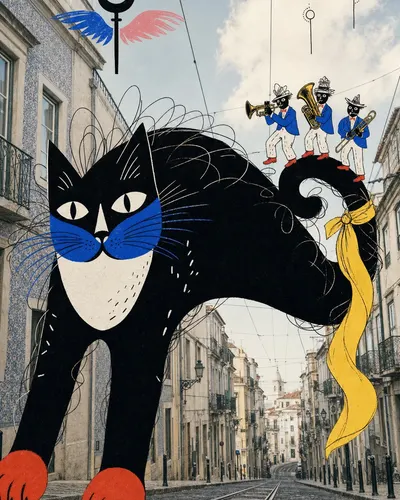
Create a image in the "urban-photo-ink-beast-collage-style" visual style. Subject: a monumental black alley cat with a paper-white crescent chest, cobalt whisker mask, vermilion paws, and long looping ink hairs Action: arching across the street like a bridge while a tiny brass trio performs cheerfully along its curled tail Prop/Product: three small unbranded brass instruments and one sweeping lemon-yellow scarf tied loosely around the cat's tail Location: a softly faded low-angle photograph of a steep Lisbon tram street with tiled facades and pale sky Background: quiet windows, overhead tram wires, distant empty rails, soft cloud patches, and two tiny abstract loop-and-target sky glyphs Main text: none Secondary text: none Accent symbol: a black rod-and-loop moon glyph with cobalt and blush wing strokes Wardrobe/styling: the trio wears mismatched cobalt jackets, paper-white trousers, vermilion shoes, and scribbled hats Style fidelity anchors: A softly faded real architectural photograph forms the full-bleed background, while all narrative subjects are unmistakably flat hand-drawn collage layers. One monumental black-dominant beast occupies roughly half the frame and breaks across the photographic perspective as an impossible foreground cutout. A much smaller theatrical human or creature creates an asymmetrical two-character interaction with the giant subject. Creature bodies use broad near-solid black and paper-white masses, abrupt cut-paper silhouettes, and minimal gray modeling instead of realistic volume. Contours are thick, wobbly, uneven, and visibly hand-inked, with wiry scribbles, loops, ticks, and short dash textures inside hair, feathers, clothing, or skin. The illustration palette is tightly controlled: black and white dominate, cobalt blue and vermilion red punctuate faces or props, lemon yellow creates one sweeping accent, and blush pink appears sparingly. The background keeps photographic depth and upward-looking architectural perspective, while the illustrated figures remain front-facing, flattened, and optically pasted on top. Facial features are mask-like and exaggerated, with graphic eyes, teeth, tongues, noses, and hands simplified into bold emblematic shapes. Small abstract airborne glyphs combine thin black rods, loops, circles, colored wing-like strokes, and motion curls to animate otherwise open sky. No headline typography is required; rhythm comes from silhouette, scale contrast, repeated ink marks, and color accents rather than a poster text grid. The finish feels like a 1960s to 1980s experimental magazine photomontage: slightly faded photo color, clean opaque ink overlays, playful menace, and absurd theatrical humor. Source content to avoid: A giant gorilla, ape, King Kong-like monster, or any matching black primate anatomy, roaring pose, open fanged mouth, or outstretched grasping arm.; A frightened or screaming woman in a white dress being grabbed, lifted, trapped, attacked, or placed in a damsel-in-distress scenario.; The Empire State Building, recognizable Manhattan canyon, New York landmark skyline, or the exact upward-looking street composition of the reference.; Biplanes, propeller aircraft, fighter planes, aircraft attacks, or matching red-yellow-blue airplane-like glyphs.; The exact black beast and white-dressed figure overlap, identical gestures, matching costume, or the same monster-versus-captive story premise.; Copied facial expressions, teeth arrangement, blue nose, yellow eye shapes, red heels, yellow hair plume, or other distinctive character anatomy from the source.; Copied slogans, names, signatures, artist marks, watermarks, usernames, platform logos, app marks, QR codes, or brand marks.; Photorealistic monsters, cinematic creature effects, comic-book panels, manga rendering, polished vector mascots, 3D characters, or children's-book softness. Apply these style rules: - Composition: place a softly faded full-bleed architectural photograph behind one monumental black-dominant illustrated beast occupying roughly half the frame. Pair it asymmetrically with one much smaller theatrical figure. Use a low street-level or upward-looking photographic perspective, keep 15 to 25 percent open sky or pale architecture, boldly crop the giant form, and place no more than three tiny abstract glyphs in the open area. - Material split: the city must look genuinely photographed with analog grain and natural daylight, while every narrative subject, costume, prop, and symbol must look like opaque flat paper and hand ink pasted on top. Preserve the deliberate mismatch; do not blend the illustration into the photo. - Drawing: use broad near-solid black and paper-white masses, thick uneven wobbling contours, abrupt cut-paper silhouettes, mask-like eyes and mouths, and wiry loops, hairs, curls, ticks, and short dash textures. Keep volume flat with almost no cast shadows. - Typography: use no main headline and no secondary copy unless the case explicitly requests it. Never create a headline band, speech bubble, or editorial text grid. - Color: keep the photograph faded blue-gray, tan, and brick. Let black and white dominate the illustrated area; use cobalt blue and vermilion red sparingly, plus one sweeping lemon-yellow accent and only a trace of blush pink. - Graphic elements: add up to three small hand-drawn rod-and-loop glyphs, circular targets, motion curls, or wing-like strokes in the sky. These marks must remain abstract and must not resemble aircraft. - Mood: experimental editorial photomontage, absurd theatrical humor, playful menace, and late-20th-century underground magazine energy. Avoid: giant apes or gorillas, captive or screaming women, aircraft, New York landmarks, the source pose or story, photoreal monsters, cinematic integration, 3D rendering, clean vector art, manga, comic panels, children's-book softness, large typography, logos, QR codes, watermarks, usernames, platform marks, app UI, famous characters, and copied identity marks.
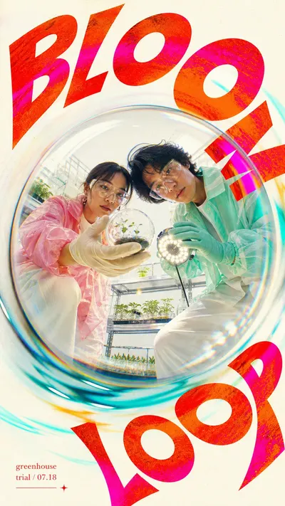
Create an image in chromatic-fisheye-orbit-pop-poster-style. Scene: two adult greenhouse researchers leaning over a fisheye lens and presenting a seed capsule, featuring clear seed capsule and tiny grow light, in bright white plant lab. Include central convex glass-dome distortion, warm off-white negative space, aqua cyan light arcs, prism smears, and subtle screenprint grain. Style the subject with translucent pink and mint utility jackets, oversized soft pants, clean gloves, and realistic photographic faces. Photography: build a finished high-key pop culture poster, not a sketch. Use an extreme fisheye or convex glass-dome viewpoint from below, with the subject centered inside a circular lens bubble. Keep people, props, hair, fabric, and hands photographic and realistic while allowing wide-angle edge distortion. Layout: keep the surrounding field mostly warm off-white and pale grey so the graphic system has open space. Hold the subject in a central circular dome and let the composition feel off-axis, kinetic, and orbiting without cluttering the center. Typography: set "BLOOM LOOP" as huge heavy display typography warped around the circular lens. Crop the headline at multiple frame edges and fill the letters with hot vermilion, orange, red, and fluorescent magenta ink texture. Add "greenhouse trial / 07.18" only as a small red editorial caption block in a quiet corner. Graphic system: include thin aqua cyan orbit arc, aqua/cyan light arcs, prism smears, faint chromatic aberration, radial motion blur near the rim, subtle analog grain, screenprint speckle, and slight color bleed. The result should feel like a contemporary music, fashion, or culture campaign viewed through a warped circular lens. Avoid: watermarks, usernames, creator IDs, QR codes, platform logos, app interface marks, copied reference people, copied event text, copied venue text, copied exact pose, exact YOASOBI text, exact anniversary wording, long paragraph text, tiny crowded text, flat vector substitutes, SVG look, HTML mockup, canvas drawing, corporate minimalist poster, muted beige-only palette, dark nightclub scene, cyberpunk darkness, luxury studio calm, fake brand logos, distorted unreadable faces, extra limbs, and misshapen hands.
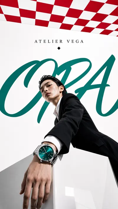
Create a polished international luxury editorial poster in the Luxury Perspective Checkerboard Editorial style. Subject: a poised couture model in a sculptural black satin coat beside an oversized crystal perfume bottle. Action or presentation: stepping forward on a red-and-white checkerboard runway while one hand hovers near the bottle. Hero product or prop: faceted emerald perfume bottle with minimal gold cap and no visible logo. Location: white studio runway set with a single checkerboard floor plane receding toward the camera. Background elements: large white void, red checkerboard perspective floor, one small emerald dot in the upper right. Wardrobe and styling: black satin couture coat, polished emerald gloves, clean high-fashion silhouette. Typography: place the invented large script word "VELA" as an oversized sweeping background graphic behind the subject, and place the small uppercase editorial text "MAISON NOVA" near the upper field; add the restrained accent symbol "emerald dot" only once. Preserve these style fidelity anchors: Low-angle luxury editorial photography with a monumental subject scale. Red-and-white checkerboard or tiled graphic plane in extreme perspective. Large white negative space as the primary background field. One oversized custom script word spanning behind the subject. Small centered serif maison-style wordmark area near the upper field. Black tailored wardrobe or premium product silhouette with glossy highlights. Emerald or deep teal accent on shoes, accessories, props, or graphic dots. Clean cutout-like subject edges against a bright studio field. Strong depth from floor or ceiling geometry, balanced by flat poster typography. Minimal copy with no price tags, retail badges, or crowded object clusters. High-fashion magazine lighting with crisp contrast and polished material finish. Slight surreal scale tension between real subject, product, and graphic typography. Avoid this source content: Do not use Gucci, its logo, monogram, exact script word, or any real luxury brand mark. Do not recreate the same woman, face, pose, black dress, handbag, or green pointed heels. Do not duplicate the exact red checkerboard floor-and-ceiling arrangement from the source. Do not use a black dress plus chain handbag as the central product story. Do not copy the exact source camera crop, diagonal body silhouette, or advertising premise. Do not include watermarks, creator IDs, QR codes, platform marks, or social media UI. Use a low-angle high-fashion photographic camera, crisp studio lighting, generous white space, a red-and-white checkerboard perspective plane, deep black structure, emerald or teal accent details, clean cutout subject edges, glossy premium material highlights, and sparse typography. Do not use any real brand logos, real fashion house names, monograms, watermarks, QR codes, social media UI, price labels, or copied campaign identities.
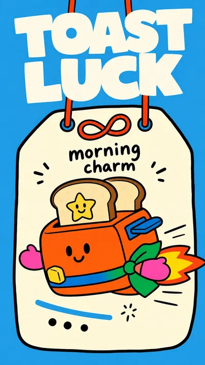
Create an original flat doodle poster in the Sky Blue Lucky Tag Doodle Poster style. Preserve these style anchors: Saturated sky-blue background fills the whole poster with no gradients or realistic depth. A large off-white hanging lucky-tag plaque sits centered, slightly irregular, with a thick black outline and rounded clipped corners. Two narrow red-orange cords or loops enter from the top and connect to a simple decorative knot or loop motif near the tag top. The top headline is oversized white block lettering, chunky, uneven, tightly spaced, and partly pressed near the upper edge. A short black handwritten label sits on the off-white tag surface, casual and marker-like rather than typeset. One oversized simplified mascot or prop dominates the lower tag area and can spill outside the plaque edge. Shapes are toy-like, flat, and icon-simple with thick black contour lines and minimal internal detail. Color fills are high-contrast flat blocks: sky blue, off-white, orange-red, green, yellow, pink, blue, brown, and black. Linework is wobbly and hand-drawn, with rounded corners, blunt stroke endings, and imperfect alignment. The composition is sparse and poster-like, with one main figure, a few small accents, and generous blue negative space. Perspective is naive and flattened; object parts stack as graphic shapes instead of using realistic depth. Mood is cheerful, lucky, handmade, childlike, and light, with a souvenir-card or charm-tag feeling. Avoid this source content: Do not recreate the orange horse, rider, pig-like pink face, striped yellow scarf, green body, brown leg shape, or the exact side-facing horse pose. Do not copy the source headline, Japanese kana, bottom creator text, names, marks, watermarks, or any exact source lettering. Do not repeat the exact omamori charm premise, red knot shape, cord placement, plaque silhouette, and horse-riding story as a literal replica. Do not include usernames, signatures, creator IDs, platform logos, QR codes, real brand marks, or watermark-like footer copy. Do not use photorealism, polished vector corporate illustration, anime detail, 3D toy rendering, airbrushed shading, or realistic fabric texture. Do not make the scene dense, scenic, perspective-heavy, or filled with many small objects that overwhelm the simple tag-poster structure. Use a saturated sky-blue full background, a large off-white hanging lucky-tag plaque with thick wobbly black outline, two narrow red-orange cords or loops from the top, and a simple knot or loop accent that is clearly different from the reference. Put huge chunky uneven white block-letter headline text reading TOAST LUCK across the top. On the tag face, add a short black handwritten marker label reading morning charm. Show a cheerful orange toaster mascot with a tiny star face on one slice gliding sideways as if it is a little rocket with two toast slices, a blue handle stripe, and a small yellow butter square in the center of a minimal off-white hanging tag plaque. Add only sparse supporting details: three black dot marks, one small blue stripe, tiny spark ticks, and a loose red loop accent. Style or accessorize the subject with simple green scarf band and pink mitten-like side tabs. Use flat toy-like shapes, thick black contours, rounded corners, bright solid color fills, naive front-facing perspective, minimal detail, no gradients, no realistic shadows, cheerful handmade charm-card mood, and no watermark or creator mark. All subject matter, text, props, symbols, and story details must be original and must not copy the reference.
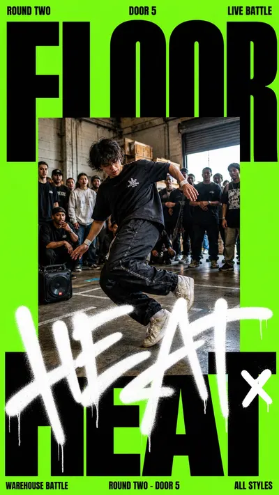
Create a image in the Neon Type Photo Scribble Poster visual style. Subject: a young bicycle courier Action: leaning forward while pushing off into traffic Prop/Product: bright insulated delivery bag and handlebar light Location: downtown curb outside a late-night food window Background: blurred pedestrians, shop shutters, traffic cones, wet pavement reflections Main text: MIDNIGHT RUN Secondary text: route 07 - open late Accent symbol: /// Wardrobe/styling: black windbreaker, reflective strap, work gloves, worn sneakers Style fidelity anchors: Single flat neon green field fills nearly the entire poster with no gradient and no scenic background outside the photo. Massive black condensed sans-serif headline type is cropped by the canvas edges and dominates the top and bottom thirds. Small all-caps metadata sits along the top margin with tight spacing and a blunt event-flyer tone. A centered rectangular documentary photo block interrupts the typography and covers roughly half of the composition. The photo uses gritty outdoor flash or hard daylight realism, shallow compression, and visible background bystanders or scene clutter. The foreground subject is cropped large inside the photo block, with the body partly intersecting the lower handwritten layer. A thick white aerosol or paint-marker handwritten word sits across the middle-lower area, overlapping both the photo and black type. The white gesture has soft spray bloom, uneven opacity, fast strokes, and occasional paint drips. The layout feels like a street-sports event flyer: loud, direct, posterized, and compressed for social sharing. Palette stays extremely limited: neon green background, black type, white scribble, and realistic photo colors only. Source content to avoid: Do not recreate a basketball player, basketball court, dribbling pose, or ball-centered story. Do not use the exact source words PLAYER, OF, THE, WEEK, NY vs NY, Week 1, June 27, Gersh, Chris Jeffrey, Basketball, or any similar sports-award phrase. Do not include Nike marks, league marks, sponsor marks, watermarks, creator signatures, or platform UI. Do not copy the same central athlete silhouette, facial expression, shirt graphic, or street-court crowd arrangement. Do not reproduce the exact neon green and black text layout as the same words in the same positions. Do not use a white graffiti word that reads like the original source text. Apply these style rules: - Composition: edge-to-edge toxic neon green poster field, huge black ultra-condensed all-caps words cropped by the canvas edges, one centered rectangular documentary photo block pasted over the type, one large white aerosol handwriting layer crossing the lower middle of the photo and headline. - Typography: blunt event-flyer typography, black heavy condensed grotesk headline, tight all-caps metadata along the top and bottom margins, handwritten overlay made from thick white spray-marker strokes with soft overspray and small drips. - Color: neon green is the dominant field, black is used for all large type, white is used only for the handwritten gesture, and realistic photo color appears only inside the central photo rectangle. - Photography: central photo should look like candid live-event photography, eye-level or slightly low, gritty daylight or flash contrast, visible bystanders or environmental clutter, subject cropped large and immediate. - Graphic elements: keep a flat poster base, hard rectangular photo edges, no decorative frame, no gradients, no UI, no logo marks, no platform marks. Important content rule: preserve the visual style first, then change the source content. Use the new subject, action, prop, location, background details, and text supplied above. Do not recreate the source content listed above.
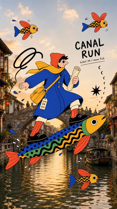
Create an image in the "Surreal Fish Doodle Landmark Photo Collage" style. Scene: a giant flat illustrated courier with a cobalt raincoat and lemon-yellow scarf balancing on a long folk-art fish above a canal bridge, using rolled map, waterproof satchel, and dangling delivery ticket, at old canal city at golden-hour daylight. Include stone bridge, canal water, old buildings, small boats, warm sky, windows, and rippled reflections. Wardrobe styling: cobalt raincoat, lemon-yellow scarf, coral socks, flat black shoes, and burnt-orange hood. Photo base: use a realistic bright travel photograph with clear natural daylight, postcard-like scenic depth, readable sky and water or architecture, and a believable tourist-view perspective. Keep the landmark recognizable. Illustration layer: overlay one oversized flat 2D illustrated subject across the foreground and middle ground. The subject should look pasted or screen-printed on top of the photo, with opaque flat color fills, thick black hand-drawn outlines, simplified hands or face, exaggerated scale, playful anatomy, and bold graphic wardrobe colors. Creature layer: add two to five fantastical folk-art fish or flying fish around the main subject. Give them mismatched fins, wing-like shapes, round eyes, black tiger-like body stripes, red coral fins, cobalt-blue sections, yellow bodies, and simple black outlines. Let some creatures float in the sky, skim the waterline, or pass behind the main subject. Doodle layer: add black ink loop, blue droplets, tiny splash dashes, and crescent-shaped fish trail plus loose black marker loops, ink starbursts, blue water drops, curved strings, short splash dashes, and motion ticks as an independent graphic layer. Use these marks to create playful movement and connect the illustrated characters to the travel photo. Text: keep typography minimal. If text is requested, use "CANAL RUN" only as a tiny hand-lettered travel note and "ticket 04 / moon fish" only as a sparse doodle label. Do not make large poster headlines. Derive only the visual language from the style. Change the landmark, subject pose, outfit, props, and creature arrangement for every new image. Do not include watermarks, usernames, creator IDs, signatures, QR codes, platform marks, app UI, copied reference characters, exact reference poses, brand logos, readable brand marks, full vector-only backgrounds, glossy 3D cartoon rendering, photorealistic animals, dense text, or dark cyberpunk mood.
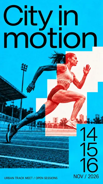
Design a finished full-bleed contemporary cultural-event poster. Use giant tightly set regular-weight neo-grotesk typography, one dynamic continuous duotone photograph, saturated flat ink fields and a hard-edged stepped white window. Rules: [CORE] An oversized regular-to-medium weight neo-grotesk headline and emphatic date numerals build an asymmetric, tightly set editorial hierarchy; no heavy condensed display, serif, outline or hand-lettered headline. [CORE] One continuous action photograph crosses hard rectangular or stepped masks: outside the light window it is black-on-saturated-base duotone, inside it is contrasting spot-ink-on-neutral-white. Image geometry remains aligned through every boundary. [CORE] Flat vivid color fields, white windows and restrained photographic print grain create a sharp graphic/photographic contrast; no natural-color portrait inset or photorealistic paper mockup. [FLEX] Design the stepped window to answer the action: its scale, position, contour and number of turns can change; the reference's exact silhouette and cyclist diagonal are not fixed. [FLEX] Choose a vivid base and a contrasting spot ink for each theme, keeping black text and light-window contrast strong. Blue and red are a valid example, not a compulsory universal palette. [FLEX] Recompose headline line breaks, date stack and photo crop for each ratio; all required wording remains readable while purposeful photographic edge cropping is allowed. [FLEX] Use sparse factual-looking event metadata, rules or open space as needed; do not replicate source sponsors, venues, footer density or brand signage. Subject photograph: A fictional adult woman sprinting on an urban athletics track, side-on low-angle photo, rear leg extending back and forward knee lifted, dynamic but natural anatomy, simple unbranded running kit; sparse lane lines visible. Required complete large title: "City in motion". Required large date numerals: "14 15 16". Date label: "NOV / 2026". Small clear footer: "URBAN TRACK MEET / OPEN SESSIONS". These are fictional event samples. Palette: Electric cyan base with black outside-window photography; hot vermilion red photographic ink on neutral-white window. Design intention: The white stepped field opens ahead of the runner like successive strides. The sprinting body crosses its risers while the date numerals become a pacing sequence. Preserve photographic leg motion; do not draw literal stairs., consider: Title occupies a broad compact upper zone; body cuts across an ascending off-center window through the middle, dates form a lower vertical beat. instead: Runner stretches across the full middle width through a long stepped corridor; title anchors one upper side and large date numerals pace the opposite lower edge. Choose the final composition intelligently, using open space and typography rather than adding decorative clutter. IMPORTANT: the action photo is ONE geometrically continuous image. Across the stepped window seam, the same body/object contour stays aligned. Inside the neutral-white window, render photo shadows and grain ONLY in the contrasting spot ink; outside, render the same photo in black on the saturated base ink. Subject and relevant environmental details visibly traverse at least one color boundary. The masks are flat graphic color separations, not separate printed photos pasted on top. Headline and numerals are clean regular-to-medium sans, large and readable, no serif or condensed heavy lettering. Fine ink grain belongs chiefly to the photo; flat fields remain vivid. Opaque full rectangular canvas. Exclude Les Six Jours de Saint Quentin en Yvelines event identity and original title; Original July/August 2017 dates, addresses, telephone numbers and social handles; Cyclist identity, cycling kit sponsors and Tissot advertising signs; Exact original stepped-window outline, title line breaks and photographic crop. No sponsor lettering, extra filler copy, full-color skin, gradients, 3D shadows, border mockup, beige aging or all-over distress.
New accounts receive 10 free starter credits. Add permanent credit packs starting at $10 (800 credits) that never expire, or subscribe to monthly plans with exact cost estimates previewed before every run.