
AI Photo Editor
Upload your photo, describe what to change, and let generative AI inpaint, swap backgrounds, eliminate clutter, and restore 4K details without starting over.
PNG, JPEG, WebP
Curated Prompt Showcase
Production-ready prompt engineering templates sourced directly from the creative community. Filter by category, inspect syntax, or remix directly.
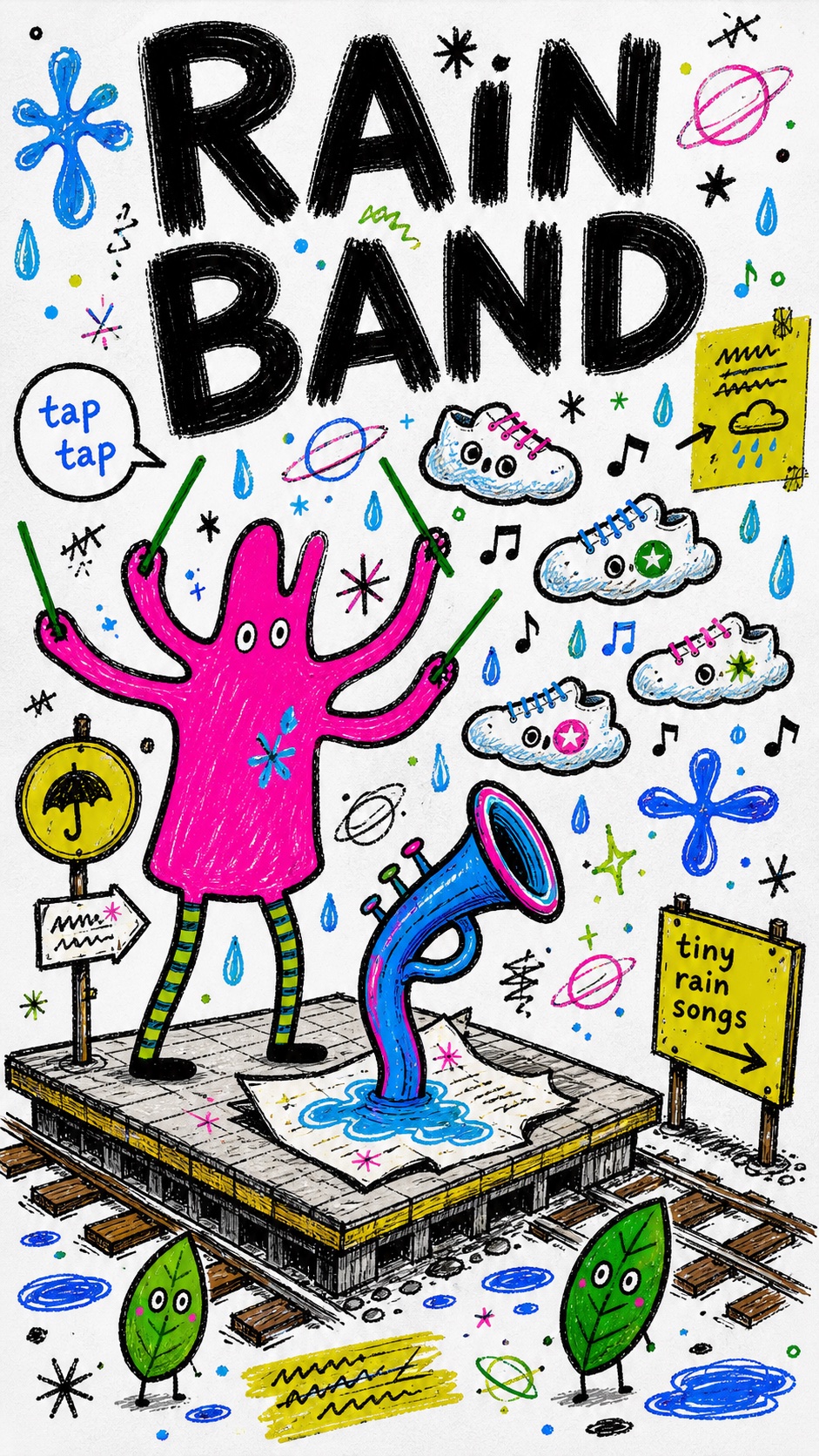
Fantasy Scribble Mascot Poster Style
Illustration and artFantasy Scribble Mascot Poster Style
"Create an image in the "Fantasy Scribble Mascot Poster Style" visual style. Subject: a crooked turquoise rocket-bird mascot with three tiny window eyes and noodle legs Action: marching sideways while releasing little seed comets Prop/Product: a hand-drawn watering can shaped like a crescent moon Location: an imaginary garden parade drawn on blank white paper Background: tiny sprouts, orbit rings, loose stars, bent arrows, two small pebble creatures, and scribbled blue puddles Main text: MOON SEEDS Secondary text: plant the small bright noise Accent symbol: wobbly spiral star Wardrobe/styling: raw mascot body with hot pink patches, green striped legs, and no realistic clothing Style fidelity anchors: White paper field with the image treated like a scanned handmade poster rather than a polished digital illustration. Huge irregular hand-painted headline letters occupying the top or one dominant edge of the composition. Thick, uneven, dry-brush black outlines around characters, props, text, and many decorative marks. Flat marker-fill color blocks using electric cyan, saturated blue, hot pink, neon lime, deep green, and small brown or purple accents. Childlike fantasy mascot anatomy with playful distortion, blunt legs, long ears, floating eyes, and simplified facial dots. Dense doodle collage hierarchy with one oversized mascot and several smaller companion shapes clustered around it. Rough handwritten micro-text, intentionally wobbly baselines, and imperfect spacing used as graphic texture. Scribbled stars, loops, plant stems, orbit rings, arrows, patch shapes, and hand-drawn symbols scattered through open space. Flat frontal or shallow side-view perspective with almost no realistic depth, cast shadows, gradients, or light modeling. Visible marker streaks, naive scribble fills, slightly dirty scan texture, and rough line registration. Playful dream-diary mood that feels invented, personal, and slightly nonsensical rather than commercially polished. Source content to avoid: Do not recreate the original blue long-eared animal shape. Do not recreate the yellow bear-like figure, pink star figure, green heart emblem, or plant-in-mouth motif. Do not use the original words, including fantasy, dream, fancy, whisper, magic words, or the bottom caption. Do not include the social app header, username, follow button, phone status bar, watermark, creator signature, or platform UI. Do not copy the exact character arrangement with a huge blue creature on the left and smaller figures on the right. Do not recreate the original heart-and-globe symbol, brown step base, or exact bottom slogan placement. Do not imitate a specific artist identity or add any creator attribution. Do not turn the style into polished cartoon vector art, 3D mascot art, anime, comic panels, or photoreal illustration. Apply these style rules as concrete visual direction: - Composition: one oversized flat mascot or object anchors the poster, with two or three smaller companion doodles orbiting it; use a white paper field, dense handmade collage balance, and visible open gaps filled by stars, rings, arrows, loops, plant stems, and tiny handwritten callouts. - Typography: create a huge irregular hand-painted headline as part of the drawing; use thick black dry-brush letters, wobbly baselines, uneven spacing, and smaller handwritten phrases as graphic texture. - Color: use high-saturation marker blocks with electric cyan, saturated blue, hot pink, neon lime, deep green, and small brown or purple accents; keep black outlines dominant and the white paper visible. - Texture and lighting: flat scanned marker-and-ink treatment with marker streaks, scratchy overdraw, dirty paper texture, pressure changes, and no realistic lighting, no shadows, no gradients, and no glossy finish. - Graphic elements: use naive fantasy mascot shapes, blunt limbs, floating eyes, patch symbols, orbit rings, starbursts, scribble fills, and intentionally awkward handmade registration. Avoid polished vector art, anime, 3D rendering, photorealism, platform UI, watermarks, logos, creator signatures, QR codes, exact source wording, exact source character silhouettes, and the original source story arrangement. Important content rule: match the reference style first, then change the source content. Use new subjects, new scene details, new props or products, and new text while preserving the style fidelity anchors."
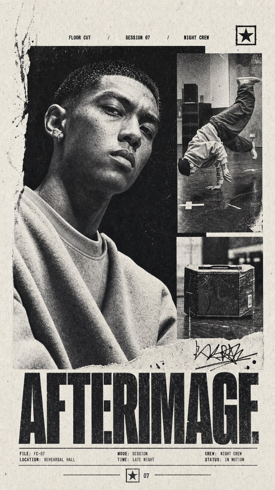
Monochrome Xerox Sports Dossier
Content coversMonochrome Xerox Sports Dossier
"Create a image in the "Monochrome Xerox Sports Dossier" visual style. Subject: a fictional night courier with an intense cropped portrait and a second action view Action: sprinting through an empty transit underpass while gripping a folded route map Prop/Product: folded paper route map and worn messenger bag strap Location: concrete transit underpass after midnight Background: fluorescent ceiling strips, tiled wall fragments, blurred stair rail, empty platform signage with fictional glyphs Main text: NOCTURNE Secondary text: CITY RUN / MIDNIGHT FILE / CASE 004 Accent symbol: thin circle-cross emblem Wardrobe/styling: black windbreaker, reflective tape, fingerless gloves, scuffed messenger bag Style fidelity anchors: Black-and-white photocopy palette with warm off-white paper, dense ink blacks, and compressed grayscale midtones. One oversized cropped portrait or action figure occupying the main hierarchy, often cut off by the frame. Two or three smaller rectangular inset photo panels overlapping the main image asymmetrically. Heavy condensed uppercase sans headline spanning the lower third or lower edge. Tiny uppercase dossier labels spaced across the top and bottom margins. Visible halftone, xerox grain, paper fibers, dust, scratches, and ink drag across photos and blank paper. Flat editorial collage depth with hard rectangular panel edges, limited shadow, and no cinematic perspective. High contrast facial, fabric, or object detail with crushed blacks and blown paper whites. Sparse marker-like accent marks, thin rules, small symbols, rough scribbles, or autograph-like strokes. Tight poster margins with a large white border and a centered emblem-like micro mark near the bottom. Source content to avoid: Do not depict Dennis Schroder, his likeness, his name, his jersey number, his facial expression, or his pose. Do not include Brooklyn Nets, NBA, Jordan, Nike, sponsor patches, or any real team or league branding. Do not use a basketball guard story, basketball jersey identity, basketball court action, or arm-extension pose from the source. Do not use source text such as BROOKLYN, NETS, NUMBER, SEVENTEEN, SCHRODER, BRAUNSCHWEIG, GERMANY, GUARD, or THE MENACE. Do not copy the autograph, circular bottom logo, watermark, signature, or creator mark. Do not recreate the same three-photo arrangement, exact panel positions, or exact lower-nameplate structure. Do not depict a recognizable public figure, celebrity athlete, real uniform, or existing sports campaign. Do not include platform UI, QR code, username, app watermark, or social-media overlay. Apply these style rules: - Composition: build a black-and-white editorial collage from one oversized cropped main photo block plus two or three smaller rectangular inset photo panels, with asymmetrical overlap, hard panel edges, wide off-white paper border, tiny top and bottom metadata labels, and a huge lower-third condensed headline. - Typography: use distressed extra-bold condensed uppercase sans lettering for the main text, very small uppercase condensed labels for secondary text, tight spacing, ink roughness, and type that appears printed into the paper. - Color: strictly monochrome warm off-white paper, charcoal gray, dirty mid-gray, dense black ink, crushed shadows, clipped highlights, and no colored accent. - Texture and lighting: harsh high-contrast editorial photography flattened through xerox grain, halftone dots, scanner noise, paper fibers, dust, scratches, scuffs, and ink drag. - Graphic elements: use sparse thin rules, small emblem-like symbols, rough marker strokes, and one loose fictional signature-like scribble; keep all marks non-identifying. Avoid: no real people, no real teams, no real leagues, no sponsor logos, no basketball identity, no copied source names, no copied source text, no jersey branding, no watermark, no QR code, no username, no clean vector art, no glossy color advertising, no 3D render, no UI mockup, no exact recreation of the reference panel layout. Important content rule: match the reference style first, then change the source content. Use new subjects, new scene details, new props or products, and new text, while preserving the style fidelity anchors."
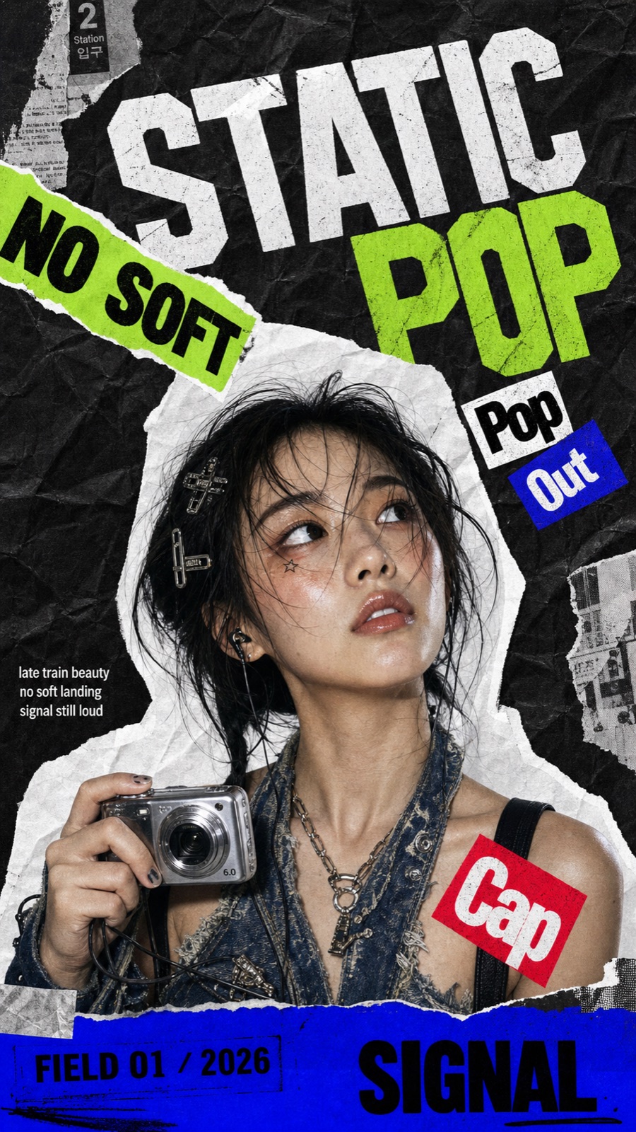
K-Pop Apocalypse Ransom Zine Style
Illustration and artK-Pop Apocalypse Ransom Zine Style
"Create a K-pop apocalypse ransom zine poster featuring a silver-haired idol in a torn black jacket holding a cracked emergency radio toward the camera, styled in K-pop stagewear mixed with survival straps, glossy boots, and messy silver hair, with spray-painted portable radio with neon tape. Use a dark crumpled black paper background with crumpled monochrome paper, warning labels, torn tape, sticker arrows, lime scan bars, and red editorial blocks. Place the subject as a large central portrait cutout with a thick irregular torn white paper border. Add oversized warped display typography reading "SIGNAL DROP" as a tilted collage layer, plus smaller sticker blocks and side editorial captions reading "after midnight broadcast". Use acid lime, electric blue, alert red, paper white, and ink black. Add lime hazard star and blue tape strip near the portrait. Finish with a saturated bottom masthead strip, rough photocopy grain, halftone speckles, scan noise, uneven paper shadows, and DIY magazine collage energy. Do not include watermarks, usernames, creator IDs, QR codes, platform logos, app marks, copied publication logos, or exact source text."
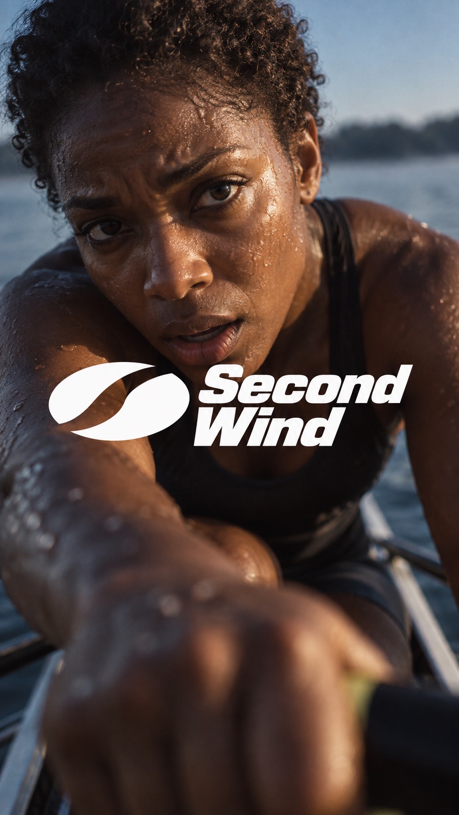
Felt Motion Brand Campaign — Set 02
Brand and marketing designFelt Motion Brand Campaign — Set 02
"Create ONE finished premium sports campaign image. This is a faithful photographic and compositional transfer of the following language: [CORE] One full-bleed, physically believable sports photograph captures an intimate bodily state: exertion, breath, water, heat, pressure or recovery. The felt moment drives the image. [CORE] Bring the camera unusually close to the athlete, with an off-axis view and strong near/far scale. Use pronounced selective focus: the nearer eye and a small patch of skin or water are resolved, while the nearer forearm, farther shoulder and background melt into optical softness. Let a blurred foreground shape fill a meaningful part of the lower frame. [CORE] Create the atmospheric depth of an underexposed sunlit film photograph: warm amber skin highlights against substantial deep natural shadow, muted blue sky or water, a gentle bloom around wet highlights and restrained fine grain. Keep irregular real sweat, water, flushed skin and damp hair. Preserve shadow volume and smooth optical softness instead of uniform digital microdetail. [CORE] Overlay one prominent, tightly joined white logo-and-wordmark unit directly across the photograph optical center. Let it overlap the lower cheek or chin as well as the upper body, rather than sitting as a small label entirely below the face. Keep the important eye or eyes readable. [CORE] The original logo sits immediately beside a tightly stacked two-line heavy italic sans-serif wordmark. The lockup is one graphic unit, with the photograph visually dominant. Keep the letters clean white and the two exact words in title case. [FLEX] Change the sporting state, crop, perspective and physical textures while preserving the close photographic depth and central brand relationship requested by the user. [FLEX] Reframe each ratio around the body and its visual weight. In portrait, the joined logo and wordmark typically span 60 to 66 percent of canvas width; in landscape, 38 to 44 percent. Keep the unit visually dense and central while allowing the face scale to guide final placement. SUBJECT: an adult woman sculler with deep brown skin and short natural curls, wearing a plain nearly black sleeveless rowing suit, sitting low in a narrow rowing shell on muted blue water after dawn CAPTURED STATE: the exhausted pause just after a hard interval; she folds forward over the oar handles, looks up under a furrowed brow and draws breath through parted lips; irregular sweat and a few lake-water beads glow on her face, shoulders tense and one large damp forearm is much nearer the lens than her eyes The ONLY written words are exactly "Second Wind". Stack the first word above the second in heavy compact italic title-case white lettering. Make this ORIGINAL LOGO: a bold compact white oval formed by two unequal curved solid blade shapes, separated by a narrow sweeping S-shaped negative channel; the two white pieces form one original asymmetrical rowing emblem without letters. Place the white symbol immediately left of the two-line wordmark, tightly joined as ONE prominent tightly joined lockup at the photograph optical center. Do not separate the symbol from the words. The white group must read strongly at first glance and overlap the lower cheek/chin and upper body; it is not a small label below the face. The photograph continues fully behind the group. Use the layout plan matching the requested output ratio only. plan: photograph from the very low front of the rowing shell at arm length, camera canted with the athlete leaning directly toward it; close diagonal face occupies the upper half, warm shoulder and a very blurred near forearm with the oar handle sweep across the lower third. Only slivers of defocused blue water remain. Center the tightly joined white emblem and two-line wordmark over the lower chin-to-upper-body mass around the middle of the canvas, spanning about 64 percent of canvas width. Preserve the eye as the focus anchor and allow the emblem top to overlap the lower jaw. plan: intimate view from just above the bow, the diagonal face large at the central upper region and near shoulder and blurred oar-gripping forearm crossing the lower width. The shell and muted water extend naturally to both edges. Place the same white logo-wordmark unit over the central lower jaw and upper chest, about 42 percent of canvas width; keep both eyes uncovered and do not create an empty side panel. Build a moody underexposed sunlit atmosphere with warm amber highlights, substantial natural shadow, muted blue sky/water and gentle bloom on wet highlights. Focus sharply only on the nearer eye and a small nearby skin plane; let the very near arm/hand, some droplets, farther shoulder and background dissolve with clearly visible optical softness. Keep real skin and water tactile while lowering digital microcontrast; avoid an evenly sharp clinical result. No digital effects, pixel blocks, colored gels, synthetic gradient background, extra type or side copy panel. Source details to replace: The exact source cyclist identity and facial likeness.; The exact words Modern Human and its registered mark.; The exact source logo silhouette; draw the supplied original logo instead.; Any pixel fragmentation, scanlines, neon gel lighting or digital particles introduced by the rejected first version."
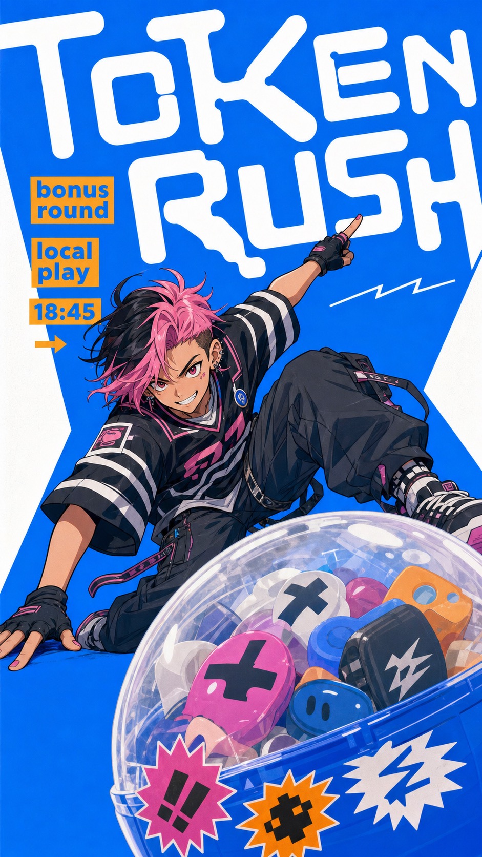
Electric Blue Cutout Manga Poster Style
Brand and marketing designElectric Blue Cutout Manga Poster Style
"Create a raster poster in the Electric Blue Cutout Manga Poster Style. Subject: a teenage bike courier with short silver hair and a confident sideways glance. Action: twisting mid-step while holding a matte bicycle helmet and bracing one knee forward. Foreground prop or product: an oversized cube-shaped insulated bento delivery box covered with abstract non-logo decals. Location or event context: a simplified late-night snack route outside a tiny corner food window. Background elements: electric-blue field, hard white diagonal cutouts, compact orange route labels, one thin white speed line. Main text: NOVA DROP. Secondary text: late bite / city route / 20:00. Accent symbol: solid dot. Wardrobe and styling: oversized black parka, neon green gloves, loose cargo shorts, sport socks, clean manga linework. Style fidelity anchors: Dominant saturated electric-blue field with hard white cutout geometry at the edges. Huge rounded modular white display letterforms cropped beyond the frame and used as poster architecture. Warm orange-yellow supporting type in compact labels, tilted subheads, and small information blocks. One cel-shaded manga or anime subject with clean dark keylines and simplified blocked shadows. Large foreground prop or product in exaggerated three-quarter perspective, overlapping the lower edge. Sparse graphic-stage composition with only a few background cues rather than a detailed environment. Sharp angular white negative-space wedges that cut into the blue field. Thin white motion lines, scribbles, or waveform marks used sparingly across the blue area. Palette hierarchy of electric blue and white first, orange accents second, muted figure and prop colors third. Clean high-resolution digital print finish with only controlled light poster texture. Slight low-angle or three-quarter perspective that makes the prop feel closer than the subject. Playful independent-culture mood that feels musical, urban, youthful, and handmade without becoming messy. Source content to avoid: The original party flyer, date, venue, contact email, ticket price, and music-event lineup structure. The words KISEI, ALL GENRE PARTY, Music Space, 7th HEAVEN, guest live, DJ live, door price, or any visible performer names. The same traveler character pulling a sticker-covered rolling suitcase. The lace head covering, goggles or glasses, blue top, black outerwear, baggy jeans, exact pose, and body silhouette. The suitcase stickers, penguin-like mark, orange mascot sticker, QR-like marks, signatures, or brand-like identity marks. The travel-arrival story, foreground luggage prop, venue flyer information hierarchy, and exact cropped title layout. Watermarks, usernames, creator marks, platform logos, QR codes, emails, and exact Japanese source text. Apply these concrete style rules: dominant saturated electric-blue background; hard white angular cutout wedges; huge rounded modular white display letterforms cropped past the canvas; compact warm orange-yellow label typography; one cel-shaded manga subject with crisp dark keylines; one oversized foreground prop in exaggerated three-quarter perspective; sparse graphic-stage composition; thin white motion or waveform lines; clean high-resolution digital print finish with only subtle controlled poster texture. Match the visual family first, then change the literal content. Do not reproduce the original flyer, original character, original luggage prop, original names, original venue information, watermarks, QR codes, platform marks, or real logos."
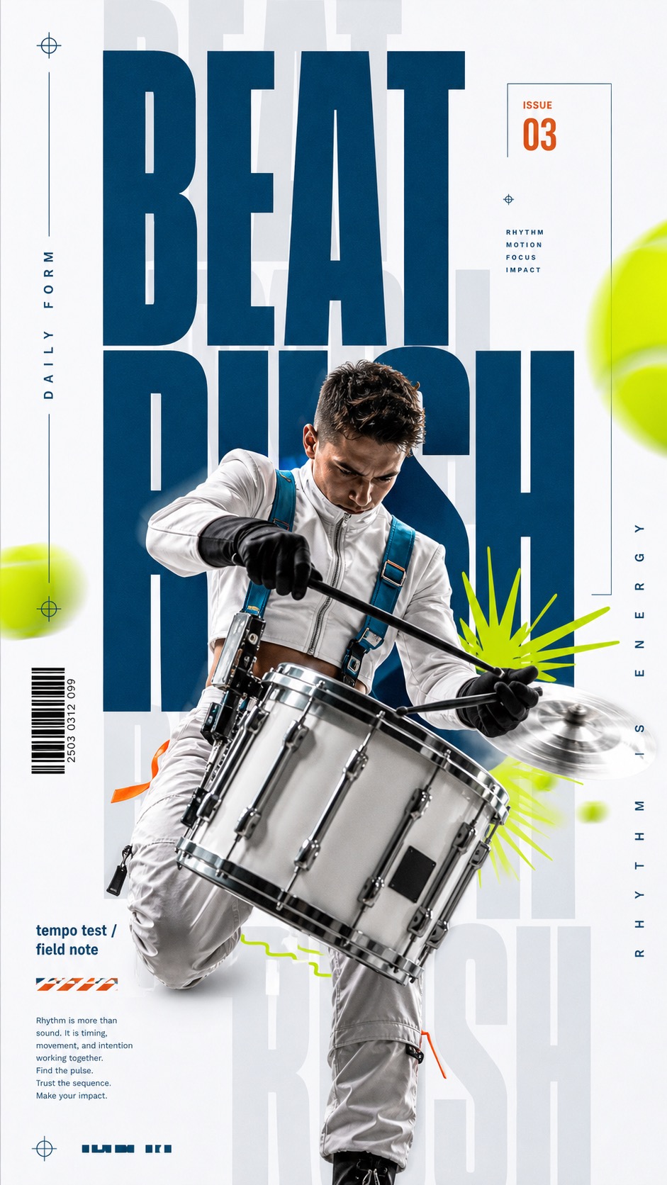
Ice Cyan Megatype Action Poster Style
Brand and marketing designIce Cyan Megatype Action Poster Style
"Create an image in the "Ice Cyan Megatype Action Poster Style" visual style. Subject: a contemporary dancer suspended mid-leap with arms extended and both feet angled away from the camera Action: twisting diagonally through the type stack while a ribbon streamer and sleeve sweep toward the viewer Prop/Product: translucent ribbon streamer trailing from the wrist Location: minimal ice-white rehearsal studio treated as a poster field Background: pale gray ghost words, cropped deep-cyan headline blocks, abstract chartreuse motion blurs, tiny barcode strip Main text: MOVE LOUD Secondary text: rhythm issue / daily form Accent symbol: lime radial burst with a short wavy underline Wardrobe/styling: silver-white technical warmup set with cyan seam trim and a small burnt-orange sleeve tab, no orange socks Style fidelity anchors: Ice-white or very pale gray poster field with generous clean negative space around the action stack. Huge ultra-condensed all-caps typography in deep petrol cyan, cropped by the frame and partially hidden behind the subject. Very large pale gray ghost words repeat behind the main headline as translucent vertical and horizontal background structure. One central photographic cutout action subject overlaps the type, with dramatic foreshortening and a limb, tool, or prop pushing toward the viewer. Layered collage depth: ghost type at the rear, deep-cyan headline in the middle, subject cutout in front, and small graphic marks above all layers. Neon chartreuse motion blurs appear as soft abstract disks or streaks near the edges, never as literal copied balls. Small editorial print details: barcode strip, fine outline boxes, tiny footer paragraph, spaced vertical side label, and a compact burnt-orange date or issue tag. Sharp high-contrast commercial action photography with rim light, clean cutout edges, controlled shadow, and no gritty distress. Sparse lime doodle grammar: radial bursts, small wavy underline, short zigzag, or speed mark used as punctuation around the subject. Palette stays restrained: mostly ice white and cool gray, heavy deep cyan type, chartreuse accents, and tiny warm orange details. Source content to avoid: Do not recreate a tennis player, tennis racket, tennis ball, or tennis match premise. Do not copy the exact seated swing pose, raised racket silhouette, visible shoe sole crop, white tennis outfit, headband, or orange socks. Do not reuse the headline words Challenge Yourself, Yourself, Daily Poster Design, or the year 2025. Do not copy the exact bottom motivational paragraph or its line breaks. Do not recreate the same chartreuse tennis balls as literal sports balls; use abstract motion blurs instead. Do not include recognizable athletes, brand marks, tournament logos, club logos, QR codes, watermarks, usernames, or platform marks. Do not duplicate the exact reference layout as a tennis poster with the same text stack and same body silhouette. Do not add dense retail labels, price tags, UI chrome, or unrelated decorative clutter. Apply these style rules as concrete visual requirements: - Composition: finished editorial action poster on an ice-white field with pale gray ghost words in the rear, deep-cyan oversized condensed headline through the center, a cutout photographic subject in front, and sparse chartreuse motion marks above all layers. - Subject scale: one dominant subject should be centered slightly off-axis, enlarged, foreshortened, and cropped so a limb, tool, or prop projects toward the viewer and overlaps the headline. - Typography: use ultra-condensed all-caps sans-serif type, deep petrol cyan for the main headline, very pale gray repeated ghost words behind it, a spaced vertical side label, a narrow barcode strip, tiny footer microcopy, and a compact burnt-orange date or issue tag. - Color: keep the field mostly ice white and pale gray, use deep petrol cyan for type, neon chartreuse for abstract motion blurs and doodle bursts, and tiny warm orange details. - Graphic elements: add soft chartreuse abstract blur disks near edges, a lime radial burst, a short wavy underline or zigzag, fine outline boxes, and a small barcode strip, all sparse and editorial. - Photography: use crisp high-resolution action photography as a clean cutout collage element, with rim light, controlled shadow, sharp edges, realistic fabric or material detail, and polished magazine finish. Avoid tennis subjects, tennis rackets, tennis balls, copied source text, copied source pose, source outfit, source year, brand marks, watermarks, QR codes, social media UI, dense clutter, flat vector-only rendering, 3D toy rendering, manga panel style, distorted anatomy, illegible letters, muddy noise, and compression artifacts. Important content rule: match the style fidelity anchors first, then change the source content. Use new subjects, new scene details, new props or products, and new text while preserving the poster grammar."
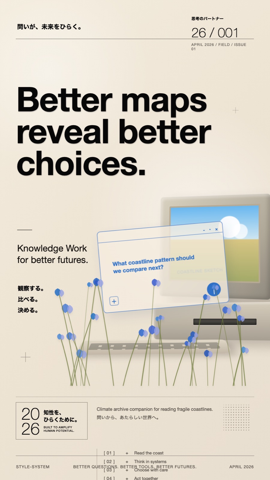
Soft Analog Future Editorial Poster
Brand and marketing designSoft Analog Future Editorial Poster
"Create an image in soft-analog-future-editorial-poster-style. Scene: climate researcher is supported by a calm analog-future system that helps them compare field notes, satellite sketches, and future coastline scenarios. The hero prop is cream retro desktop terminal with a translucent map-analysis panel placed in quiet archive desk with paper files and specimen trays. Include thin top rule, issue block, numbered insight list, pressed blue flowers, dotted square, small crosshair mark as restrained editorial details. If people are visible, wardrobe and styling should be neutral field jacket, soft gray shirt, practical research clothing. Typography: set the main headline as very large black neo-grotesk type reading "Better maps reveal better choices.". Add "観察する。比べる。決める。 / 01 + Read the coast / 02 + Think in systems" as tiny editorial microcopy, numbered list text, date/issue style labels, or bilingual captioning. Use bracketed numbers and a tiny crosshair star as a sparse graphic mark. Visual treatment: warm cream paper background, strict grid layout, thin rules, soft daylight, tactile matte materials, gentle paper grain, pale-blue translucent interface panel, botanical foreground accents, and quiet negative space. Keep the design premium, readable, and editorial. Avoid: watermark, logo, creator ID, QR code, platform UI, copied brand mark, glossy cyberpunk, dark sci-fi, neon gamer interface, childish mascot, busy collage, unreadable text, and cluttered typography."
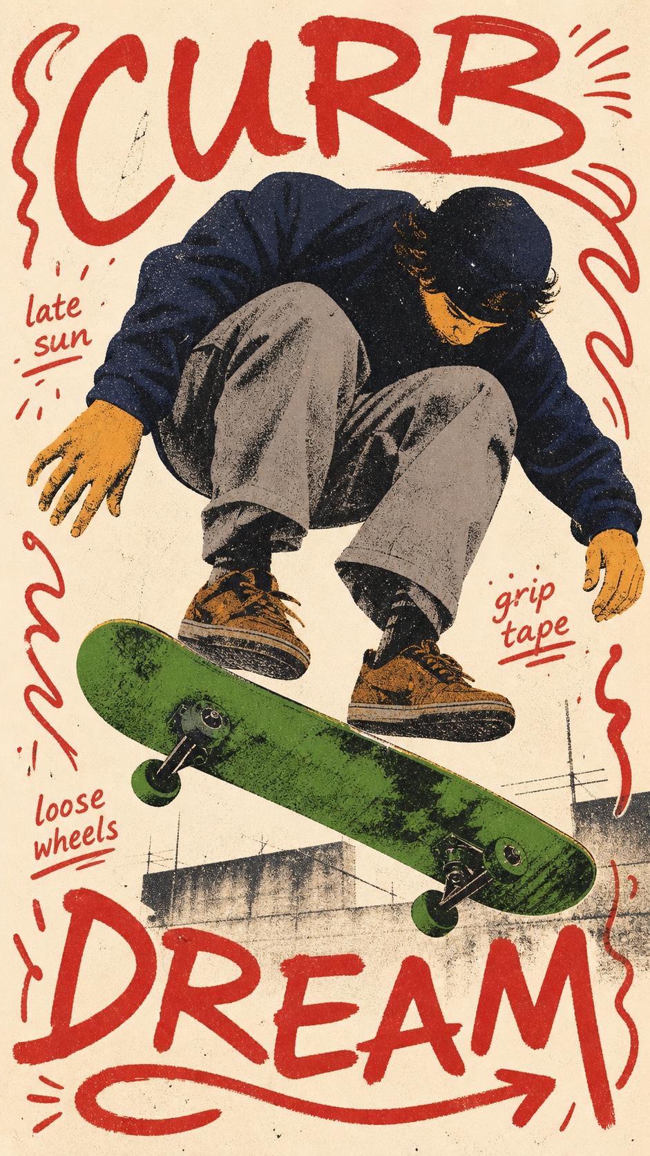
Teenage Skate Scribble Screenprint Poster Style
Illustration and artTeenage Skate Scribble Screenprint Poster Style
"Create an image in Teenage Skate Scribble Screenprint Poster style. Scene: a young rooftop skateboarder folding into a deep crouch while catching a kickflip with green skateboard with black trucks and rough ink wheels at open cream paper poster field with hints of rooftop concrete. Place the subject as one oversized central posterized cutout with a compressed crouching or skating pose. Use oversized deep navy sweatshirt, dusty gray baggy pants, ochre hands, brown skate shoes, rough posterized fabric. Build the composition on a warm cream paper field with a green skateboard, rail, board, or long prop sweeping across the lower third. Wrap loose red hand-lettered border words reading "CURB DREAM" around the edges, add small handwritten fragments reading "late sun / grip tape / loose wheels", and include red looping arrow under the board. Add red hand-lettered border words, looping arrows, rough paper grain, and scattered screen-print speckles. Use rough duotone screen-print texture, deep navy clothing, dusty gray pants, mustard ochre skin, dry black speckle, halftone dirt, paper grain, ink skips, imperfect registration, and handmade indie skate zine energy. Avoid watermark, username, creator ID, QR code, platform logo, app UI, exact copied reference phrase, clean vector illustration, polished corporate sports poster, glossy 3D text, chrome, neon gradient, luxury editorial lighting, smooth airbrush shading, sterile studio background, perfect typography, long paragraph text, photorealistic clutter, anime, comic superhero style, and skateboard brand logo."
Visual OS 051 — Freeze the Gear
Brand and marketing designVisual OS 051 — Freeze the Gear
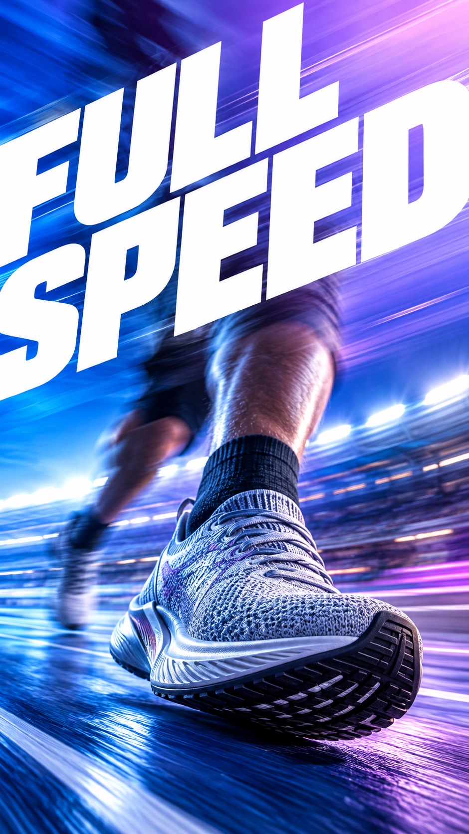
"Create a premium full-bleed future-sport campaign poster. [CORE] Make one sport object razor-sharp and freeze it as the only stable visual anchor; all supporting action, people, surfaces and lights streak with directional motion blur. [CORE] Use a luminous saturated gradient field with a clear directional light sweep, rich color separation and a softly photographic sports-campaign finish. [CORE] Set one giant white geometric sans-serif slogan in uppercase, cropped or angled through the frame as an active compositional shape; keep all other copy absent or microscopic. [CORE] Compose full-bleed edge-to-edge posters with an oversized foreground object, aggressive perspective and a readable path of motion from one side of the frame to the other. [CORE] Preserve tactile material realism on the frozen anchor: rubber, leather, textile, metal, wood or composite surfaces must remain crisp while the surrounding world smears. [FLEX] Let each case use its own saturated color atmosphere and sport context while preserving the one-anchor, giant-type, motion-trail grammar. [FLEX] Rebuild the composition for portrait and landscape; do not crop a portrait poster into landscape or repeat the same camera angle across cases. Frozen anchor object: one original unbranded performance running shoe in a close low-angle three-quarter view, the knit, outsole ribs and laces perfectly frozen. Motion environment: a runner's legs, track markings, stadium lights and air stream rushing laterally behind the shoe into long blue-violet speed trails. Gradient and lighting: electric cobalt at the lower left blending into ultraviolet and cool lavender toward the upper right, with a bright white-blue horizon streak. Exact giant display text, render verbatim as uppercase: FULL SPEED. Use one heavy geometric white sans-serif slogan only; no extra paragraphs. Concept direction: Portrait: shoe dominates the lower center and giant FULL SPEED sweeps diagonally behind it. Landscape: shoe drives from left toward right across a wide luminous track corridor; keep the typography spanning the upper third without covering the shoe. Build a high-end sports photograph with one sharply frozen foreground gear object, strong foreshortening and a directional corridor of optical motion trails behind it. Keep the anchor's material, edge and contact detail razor-sharp while people, surfaces and lights around it streak. Make the gradient luminous and saturated, not flat. Recompose specifically for the requested aspect ratio. Do not copy any reference-specific person, crop, logo or layout. Exclude: the exact reference people, faces, poses, skatepark, boxing scene, type treatment or image crop; Nike, Reebok or any other brand marks, logos, swooshes, product names, watermarks or copied campaign copy; more than one equally sharp object, duplicated gear, malformed hands, extra limbs or an anchor hidden by blur; flat backgrounds, muted catalog lighting, generic collage grids, tiny unreadable paragraphs or muddy all-over blur. Generate as an ultra-high-resolution raster image. Preserve the specified reference-style texture, edge character and intentional softness at their described scale, intensity and locations. Avoid artifacts that are absent from the intended style; do not automatically denoise, sharpen, polish or distress the image."
Soft Analog Future Editorial Poster
Brand and marketing designSoft Analog Future Editorial Poster
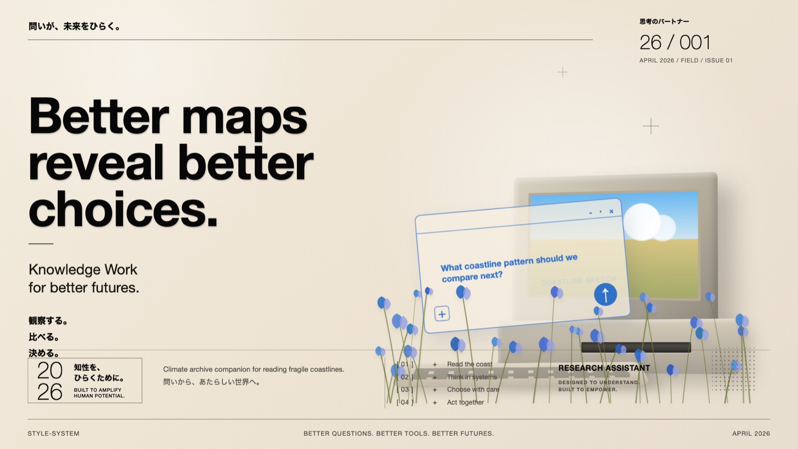
"Create an image in soft-analog-future-editorial-poster-style. Scene: climate researcher is supported by a calm analog-future system that helps them compare field notes, satellite sketches, and future coastline scenarios. The hero prop is cream retro desktop terminal with a translucent map-analysis panel placed in quiet archive desk with paper files and specimen trays. Include thin top rule, issue block, numbered insight list, pressed blue flowers, dotted square, small crosshair mark as restrained editorial details. If people are visible, wardrobe and styling should be neutral field jacket, soft gray shirt, practical research clothing. Typography: set the main headline as very large black neo-grotesk type reading "Better maps reveal better choices.". Add "観察する。比べる。決める。 / 01 + Read the coast / 02 + Think in systems" as tiny editorial microcopy, numbered list text, date/issue style labels, or bilingual captioning. Use bracketed numbers and a tiny crosshair star as a sparse graphic mark. Visual treatment: warm cream paper background, strict grid layout, thin rules, soft daylight, tactile matte materials, gentle paper grain, pale-blue translucent interface panel, botanical foreground accents, and quiet negative space. Keep the design premium, readable, and editorial. Avoid: watermark, logo, creator ID, QR code, platform UI, copied brand mark, glossy cyberpunk, dark sci-fi, neon gamer interface, childish mascot, busy collage, unreadable text, and cluttered typography."
Sunburst Fisheye Bubble Type Poster Style
Brand and marketing designSunburst Fisheye Bubble Type Poster Style
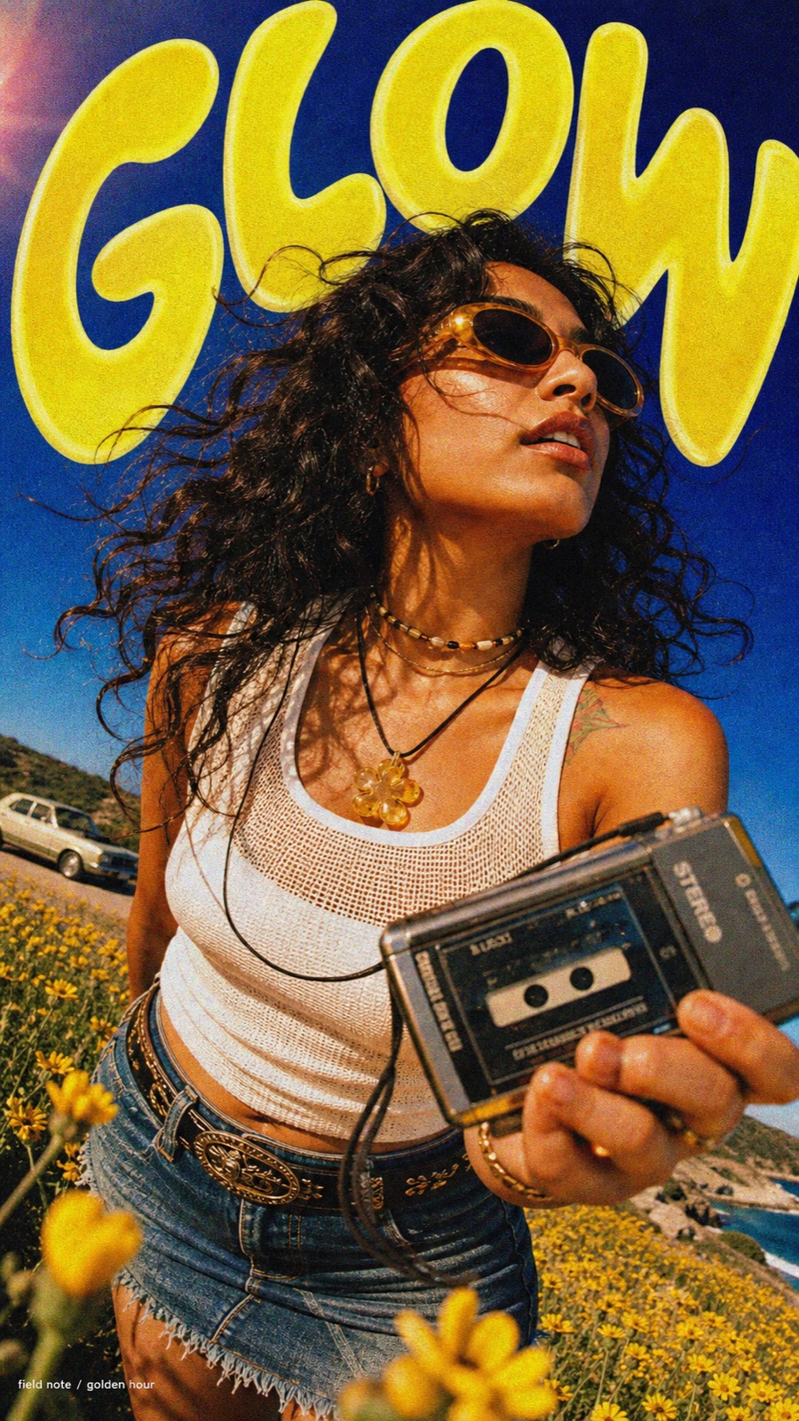
"Create an image in sunburst-fisheye-bubble-type-poster-style. Scene: adult East Asian woman with a short copper bob haircut, a roadside fashion traveler leaning toward the fisheye camera and looking above the lens, using or wearing cobalt wraparound sunglasses and a small film camera, in a desert roadside pullout. Include cobalt sky, distant white van, dusty hill, sun flare, and low wildflowers. Style the subject with white ribbed tank, checker trousers, hoop earrings, black cord necklace, and Y2K road-trip styling. For a multi-case set, give every case a visibly different face, hair, body language, and styling details. Photography: ultra-wide fisheye, action-camera barrel distortion, low-angle close portrait. Place the camera below the subject looking upward, very close to the body and face. Preserve realistic skin, fabric, hair, accessories, and daylight reflections. Use harsh sunny lighting, saturated cobalt sky, warm skin highlights, crunchy shadows, and a spontaneous summer travel feeling. Layout: make the subject large and cropped, with the face near the upper-middle for vertical layouts or dominant center-left/center-right for horizontal layouts. Build the poster around a huge arched bubble headline reading "DAWN" in lemon yellow across the top and side edges. The letters should feel inflated, hand-painted, warped by perspective, and partly cropped by the frame. Use golden orange edge shading, cream shine slashes, and cream shine slash and lens flare dots. Texture: add heavy film grain, color bleed, halftone speckle, compressed social poster finish, slight lens flare, color fringing, and analog poster compression. Add "route 08 / early light" only as tiny editorial microcopy if it stays clean and unobtrusive. Avoid: watermarks, usernames, creator IDs, QR codes, platform logos, app marks, copied reference person, copied reference outfit, copied exact pose, copied exact text, repeated same face across a sample set, chrome lettering, glossy 3D balloon type, corporate minimal layout, muted pastel palette, night cyberpunk mood, and crowded small text."
Velocity Type Sport
Brand and marketing designVelocity Type Sport
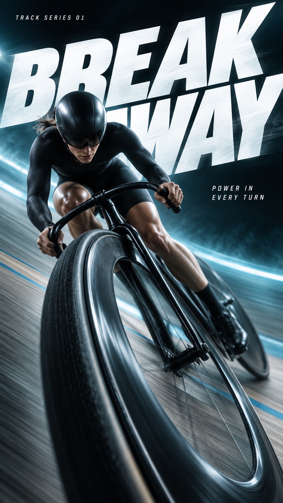
"Use case: ads-marketing. Create one finished premium sports campaign poster as a full-bleed raster. The visual system is extreme near-to-far athletic photography, monumental white oblique typography and dark-to-luminous colored atmosphere. Prioritized visual anchors: [CORE] Photographic athletic action uses an extreme near-to-far scale jump: one physically connected piece of equipment or body part dominates the foreground while the athlete recedes into depth. [CORE] Monumental white heavyweight oblique sans-serif typography cuts through the composition; the athlete occludes selected letter areas without destroying the exact headline. [CORE] A near-black edge field opens into a luminous single-hue atmospheric band behind the action, producing sharp white-type contrast and dark sculptural human form. [CORE] Directional photographic motion softness and colored atmospheric streaks carry the force vector while the critical contact point or equipment retains selective detail. [FLEX] Let each sport determine the spatial structure: circular banked wheel, vertical gripping tension, lateral water crossing, or needle-like fencing thrust; avoid one interchangeable athlete layout. [FLEX] Place, rotate, stagger or stretch the type around the movement; protect complete headline comprehension while allowing scale, selected edge cropping, and controlled overlap. [FLEX] Choose one dominant hue per case, with dark and pale related tones; hues may vary across the family. [FLEX] Recompose subject, title and negative space independently for portrait and landscape, preserving the same case concept rather than cropping the other ratio. Subject and action: An adult female track cyclist in a plain black skinsuit and unmarked aerodynamic helmet, banking a real track bicycle into a high-speed turn. Near-camera focal evidence: The near front wheel of the bicycle forms a huge oblique elliptical rim in the lower foreground. Fine rubber and carbon detail remain visible along the sharp leading section, with rotational blur on other sections. The frame, fork, handlebar and rider remain physically coherent. Design intention and ratio planning: Use the near wheel as a curved spatial gate. The rider and back wheel recede above it; the letter masses cut diagonally behind the rider and can be glimpsed through the spokes. Portrait: the wheel anchors the lower two fifths and the banked rider climbs up the central diagonal. Landscape: the wheel fills the right foreground while the rider sweeps toward it from upper left; preserve a generous upper-left title zone. This is the dynamism of a banked circular turn, not a runner with a swapped prop. Palette: Petroleum black, luminous icy cyan and silver-white; a soft cyan velocity band behind the banked wheel. Render exactly three text strings, each once, with no quotation marks: large headline "BREAK AWAY"; small series label "TRACK SERIES 01"; small supporting line "POWER IN EVERY TURN". The headline must remain completely readable with correct letter order; choose line breaks and bounded overlap to serve the action. Keep small copy clear and comfortably inside the canvas. Image treatment: Clean commercial photographic compositing with no added paper grain or halftone. Keep microtexture on the focal tire, chalked skin, wet hand or woven fencing glove; use broad soft motion streaks in the direction of travel and luminous mist only around passing surfaces. Preserve intentional peripheral blur and dark facial detail instead of sharpening everything. Use dramatic sculptural lighting and physically plausible connected anatomy/equipment. There are no logos on clothing, products or helmets. No extra words or symbols. Source content to replace entirely: The source Nike swoosh, Nike wordmark, JUST DO IT slogan and any recognizable sportswear brand logo.; The PEGASUS42 or PEGASUS 42 model wording and the reference advertising paragraph.; The white running shoe with a teal swoosh as a giant foreground product.; The exact front-facing male runner, lifted knee, grey long-sleeve top and black shorts combination.; The source arrangement of fragmented PEG, S42 and giant brand letters; do not trace its composition. Deliver a polished, sparse campaign image with a clear sport-specific design contribution, not a mockup on a wall."
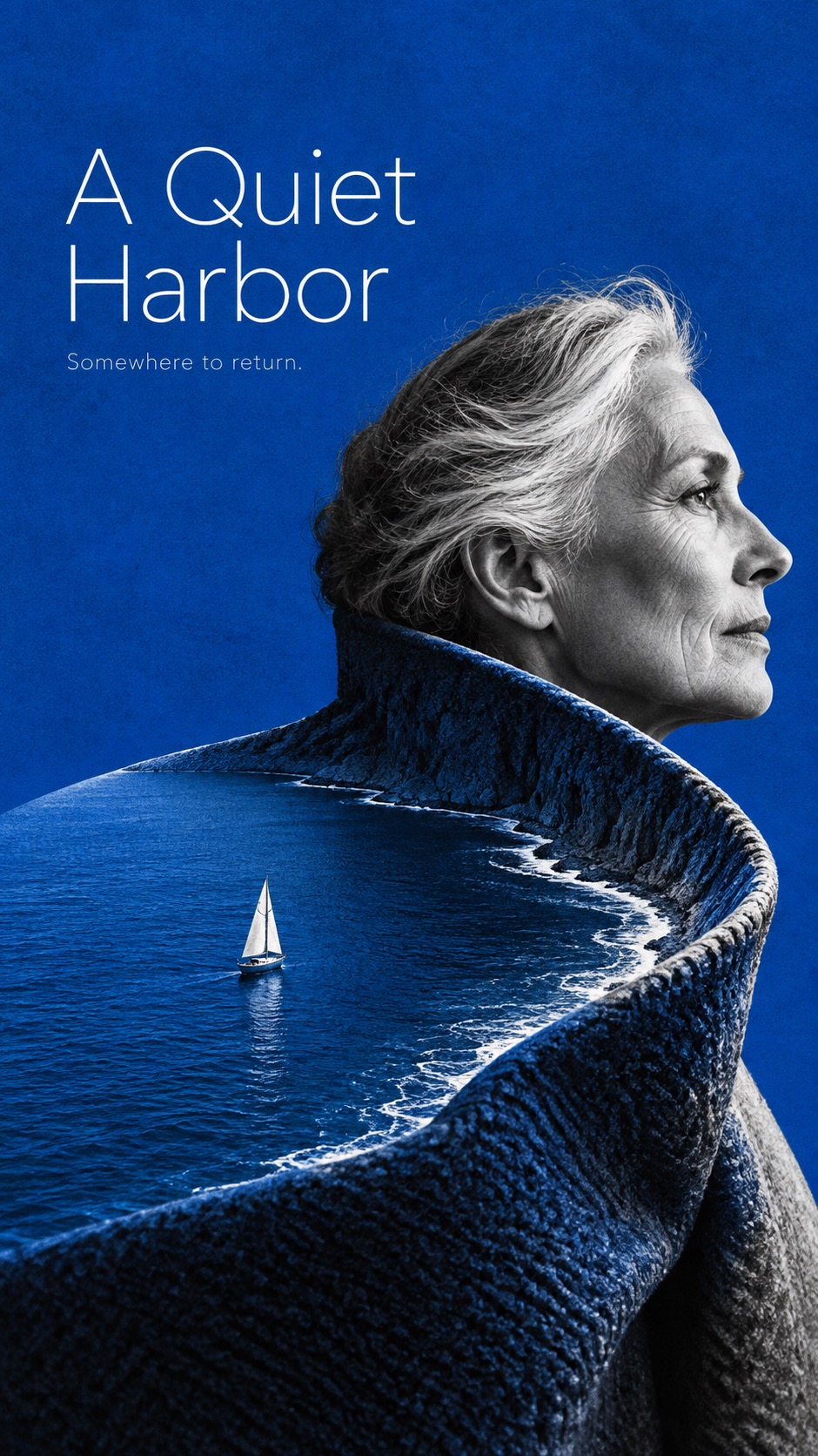
Portrait as Terrain
Illustration and artPortrait as Terrain
"Create a finished art-film poster. Visual language: monumental human landscape illusion, spare sophisticated editorial design. [CORE] A high-contrast black-and-white photographic human fragment merges into one oversized tangible form that also reads as a landscape; both readings must be visible. [CORE] A tiny legible traveler or participant inhabits that landscape, creating a dramatic human-scale contradiction. [CORE] One saturated spot color dominates broad negative space and the transformed terrain, against deep black and paper-white portrait tones. [CORE] Spare editorial typography uses light or regular clean sans serif, with a large readable title and very small supporting line; typography leaves the visual metaphor clear. [FLEX] Choose crop, direction and placement from the story; face visibility is optional and the carrier may be body, garment or hair. [FLEX] Recompose portrait and landscape formats independently, keeping spacious fields and one dominant contour rather than squeezing one layout. [FLEX] Spot hue may vary by theme; surface detail must explain the material-to-terrain transformation. Invented subject: Black-white side profile of an invented older woman wearing a broad sculptural folded coat collar. Single continuous visual metaphor: The upturned collar is simultaneously woven fabric and a steep coastal bay, curved seam becoming shoreline; one tiny sailboat floats within the collar-bay. Keep cloth edge joining her neck visibly. Spot ink: saturated cobalt blue Title exactly: A Quiet Harbor Small subtitle exactly: Somewhere to return. Design intention and format adaptation: Portrait: profile low right, collar curves broadly left into empty blue; title upper left. Landscape: head cropped at right, collar-bay extends left across lower two thirds, title above the bay. Texture: fine dry print grain in color fields, coarse high-contrast black-white photographic human tones; moderate material-specific striations in transformed region, not dirty paper. Hard coherent directional light. Only the two requested text strings. Exclude source content: The Fall title and source film credits; Original actor likenesses and named cast; Wide-brim cowboy hat becoming orange desert dunes; Horse rider and original adventure premise. No separate picture windows, no transparent double exposure, no unrelated floating scenery, no credits, no logos."
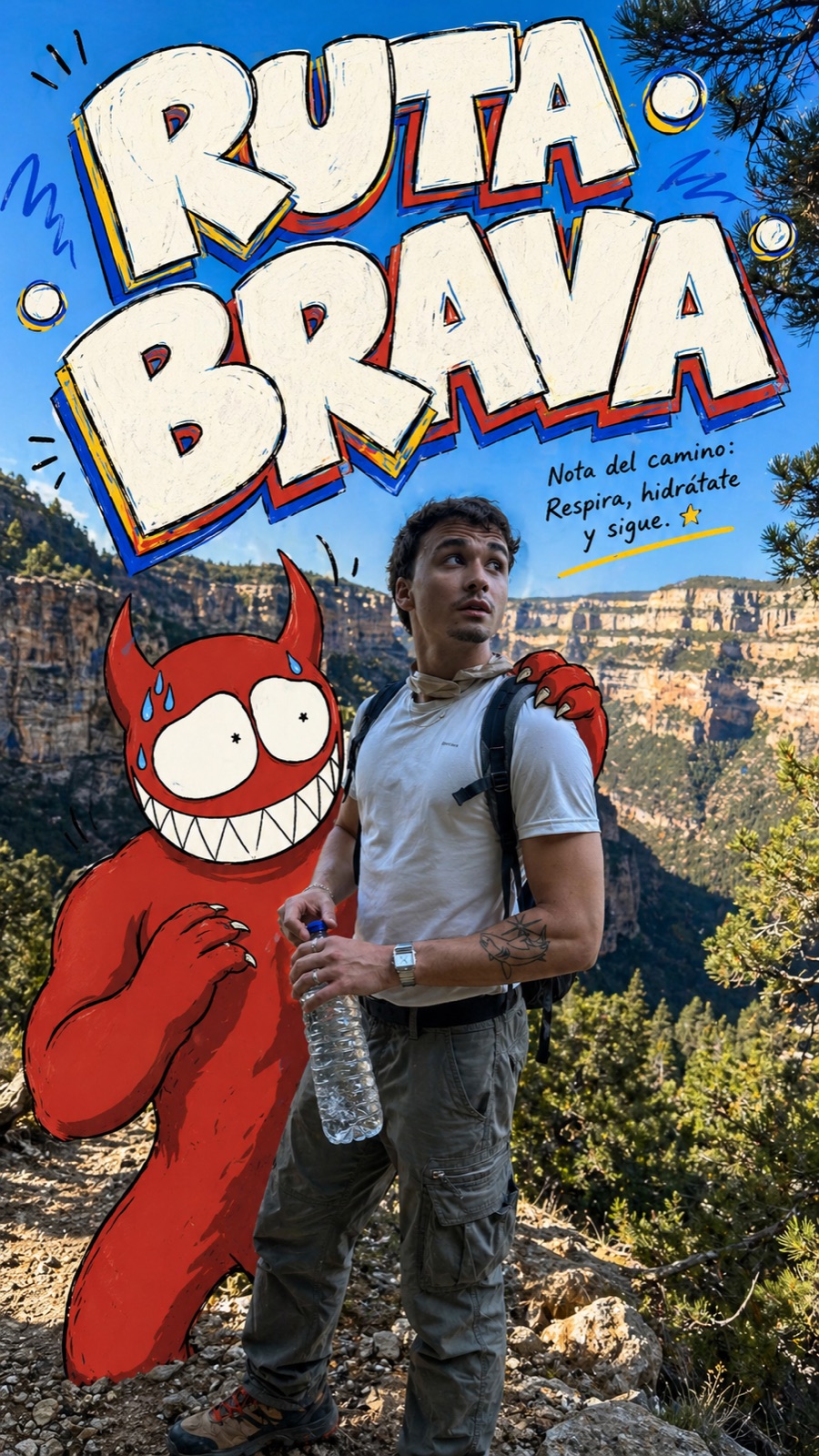
Mountain Trail Monster Doodle Poster Style
Illustration and artMountain Trail Monster Doodle Poster Style
"Create an image in the "Mountain Trail Monster Doodle Poster" style. Subject: a hiker in a sun hat beside a giant turquoise doodle creature. Subject action: sharing a water bottle during a canyon rest stop. Product or prop: clear hiking bottle with sticker labels. Location: bright red-rock canyon trail. Background elements: dusty switchbacks, distant cliffs, black marker loops, splash marks, Spanish comic notes, and sun doodles. Main text: AGUA YA. Secondary text: mile 7. Accent symbol: orange splash burst. Wardrobe or visual styling: casual outdoor layers with backpack straps and hand-drawn monster companion. Use a realistic candid outdoor hiking photograph as the base layer, with natural daylight, real mountain or trail detail, trees, sky, rocks, and a believable person in practical outdoor clothing. Keep the person photographic and naturally integrated into the landscape. Overlay one flat hand-drawn red cartoon monster companion beside the person. The monster should have thick black contour lines, brick-red fill, simple dark red shadow shapes, oversized white eyes, tiny pupils, sharp white teeth, pale blue sweat drops, and simplified claw hands. Let one arm or claw physically interact with the person, backpack, bottle, map, trail sign, or prop. Add oversized irregular comic lettering across the upper sky or mountain area. Use off-white letter fill, black outline, yellow/red/cobalt offset shadows, light inner scribbles, uneven scale, and a playful Spanish travel-poster feeling. Add a tiny handwritten note near the headline and a few sparse squiggles, arrows, underlines, or motion marks. Avoid watermark, username, creator ID, platform logo, QR code, app UI, realistic demon, horror, blood, violence, 3D mascot, plush toy, full cartoon background, corporate layout, minimalist typography, dense text, studio portrait, and low-detail mountains."
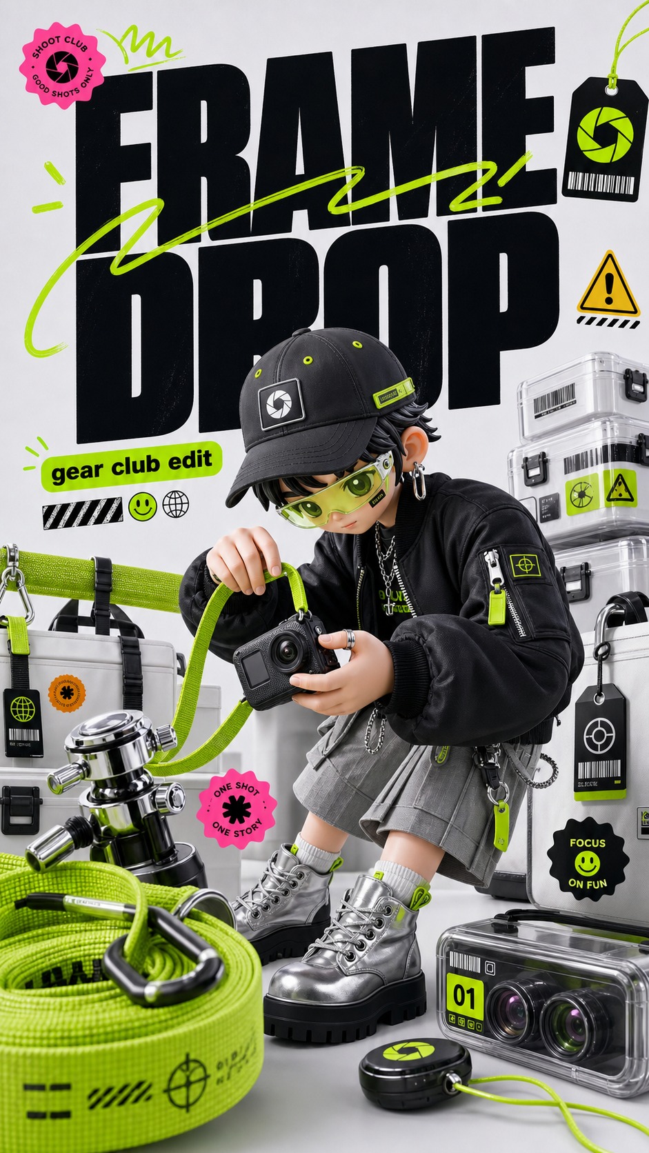
Acid Lime 3D Streetwear Type Poster Style
Brand and marketing designAcid Lime 3D Streetwear Type Poster Style
"Create a finished raster image in the Acid Lime 3D Streetwear Type Poster Style. Subject: a stylized 3D skate mechanic avatar with rounded toy-like proportions. Action: kneeling beside a custom board while tightening a glowing wheel module. Prop/Product: an acid-lime skate tool kit, black rubber wheel, chrome axle parts, and a translucent parts tray. Location: a pale studio pop-up repair floor. Background elements: stacked blank shoeboxes, lime mesh fabric, tiny warning stickers, barcode strips, coiled cables, and small black hang tags. Main text: FIX THE FLOW. Secondary text: street lab drop. Accent symbol: bolt seal. Wardrobe/styling: cropped black utility vest, silver cargo shorts, chunky gloves, lime hair clips, and glossy black knee pads. Style fidelity anchors: Pale cool-gray or off-white studio background with large empty breathing space around a dense central campaign cluster. Glossy C4D character or product rendering with smooth plastic skin, simplified doll-like features, tactile fabric, chrome, and black rubber surfaces. Low wide-angle camera perspective that makes foreground shoes, tools, bags, or props feel oversized and close to the viewer. Heavy black condensed block headline typography acts as a massive graphic object, stacked and slightly compressed rather than quiet caption text. Acid-lime green is the main accent, appearing as fabric fields, marker signatures, object trim, sticker dots, tags, and thin energetic strokes. Small sticker-badge grammar surrounds the scene: warning triangles, smiley dots, barcode marks, capsule labels, scalloped seals, and tiny black tags. Neon marker scribbles slash across or under the headline as deliberate graphic rhythm, not random background decoration. Fashion editorial prop styling with shopping bags, stacked boxes, soft fabric rolls, brushes, cables, sunglasses, headphones, straps, and tactile accessories. Commercial studio lighting is bright, clean, and synthetic, with soft shadows, glossy rim highlights, and no gritty analog texture. Palette proportions stay disciplined: pale gray/white field, large black typography, acid lime as dominant accent, with tiny pink, yellow, cyan, and orange sticker sparks. Composition balances a large left or upper type mass with a right or lower 3D subject cluster, leaving the type and character clearly legible. Mood is youth-fashion, pop-up campaign, playful tech-beauty energy, and polished collectible-toy advertising.. Source content to avoid: Do not recreate the original platform name, logo, watermark, handle, campaign slogan, carousel counter, or any exact text from the reference.; Do not copy the original white-haired seated young woman, sunglasses, headphones, makeup compact, lipstick, folding chair, exact crossed-leg pose, or facial identity.; Do not recreate the original beauty tutorial story, beauty-app premise, green crop top, gray flared pants, black platform shoes, tote bag, or exact prop layout.; Do not reuse the same stack of branded boxes, green fabric strip, warning triangle placement, barcode placement, flower charm, sticker seals, or handwritten signature mark.; Do not include real brand marks, social usernames, QR codes, platform UI, creator signatures, or app icons.; Avoid copying the same Chinese headline composition or the same phrase structure, even with altered wording.; Do not preserve the exact character anatomy, hairstyle, pose, seat height, or right-side chair silhouette from the source.; Do not turn the samples into flat vector posters, photoreal fashion photography, anime cel art, watercolor, grunge zines, or minimalist product shots.. Apply these style rules: pale cool-gray or off-white studio floor and wall, one huge mass of deep black condensed block headline typography, acid-lime marker scribbles and underlines crossing the type, glossy C4D toy-like 3D character or product rendering, low wide-angle front three-quarter perspective, oversized foreground prop or footwear-scale object near the lens, tactile fashion props, stacked boxes or bags, chrome and black rubber surfaces, soft textile weave, semi-translucent acrylic details, controlled sticker-badge clusters, warning triangles, barcode strips, smiley dots, scalloped seals, tiny black tags, small hot pink and yellow accents, clean high-key commercial studio lighting, soft shadows, crisp specular highlights, polished high-resolution poster finish., stack the black headline above or beside the central subject and crop a foreground prop along the lower edge., place the headline as a left-heavy type block and stage the 3D subject cluster on the right with lime accents bridging the center. Important content rule: match the visual style first, then change the source content completely with a new subject, new action, new prop, new location, new headline, new microcopy, and no copied brand identity."
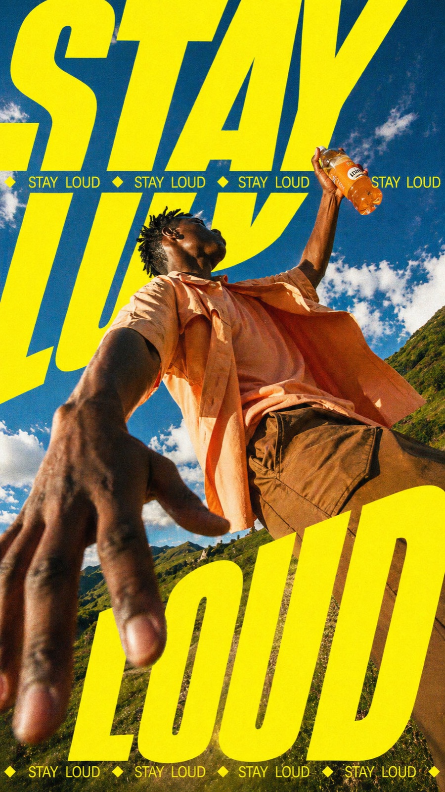
Neon Kinetic Typographic Poster
Brand and marketing designNeon Kinetic Typographic Poster
"Create a poster in the "Neon Kinetic Typographic Poster" style. Main subject: a street dancer holding a chilled citrus can. Action: jumping toward the lens from a sunlit court. Prop or product: neon citrus drink can with condensation. Location: outdoor basketball court below a blue sky. Background elements: low-angle pavement, motion blur, warped neon type, lens flare, and film grain. Wardrobe or styling: oversized windbreaker, sporty shorts, bright socks, and reflective sunglasses. Use an extreme low-angle wide-angle camera perspective, as if the camera is near the ground looking upward. The subject should feel large, energetic, and close to the viewer. Add oversized warped neon yellow typography using the main text "BURST". The letters should be ultra-bold, condensed, stretched, slanted, and partially cropped by the canvas edges. The typography should wrap around the composition and sit behind or partially around the subject. Add a thin repeated uppercase text band reading "cold energy", separated by "electric pink underline" symbols. The secondary text should run horizontally across the image like a campaign graphic stripe. Use electric neon yellow graphics, warm sunlit photographic tones, blue sky contrast, visible film grain, analog print texture, hard shadows, and an energetic youth-culture campaign poster mood. Avoid clean corporate design, small typography, flat illustration, pastel colors, luxury minimalism, and symmetrical static layout."

Clean Triptych Travel Vlog Thumbnail Style
Content coversClean Triptych Travel Vlog Thumbnail Style
"Create a image in the "Clean Triptych Travel Vlog Thumbnail" style. Subject: a solo traveler in a black coat and sunglasses. Subject action: walking through a bright city street while glancing sideways. Product or prop: unbranded iced citrus drink held close to the camera. Location: Seoul cafe district and palace garden route. Background elements: close-up cafe drink, glassy city avenue, palace roofline, garden wall, blue sky, and warm evening sidewalk. Main headline text: "seoul". Secondary text: "3 days in / korea vlog / are we staying out late". Accent symbol: small white hand-drawn heart and short dash marks. Wardrobe styling: black city coat, relaxed trousers, sunglasses, tote bag, and clean walking shoes. Use a clean three-panel travel-vlog thumbnail composition. Divide the frame into three equal vertical photographic panels with hard edges and no visible border. Make the left panel a close-up lifestyle or cafe moment, the center panel a city-stroll scene with the traveler, and the right panel a landmark, scenic viewpoint, skyline, garden, gate, harbor, or destination proof point. Place a huge lowercase destination headline in pure white across the center of the whole image, crossing all three panels. Use an extra-bold rounded geometric sans-serif, smooth and friendly, with no outline and minimal shadow. Put small italic white panel labels near the top, a small day-count line above the headline, a parenthetical vlog subtitle below it, and one tiny bottom-corner diary note. Add only sparse white hand-drawn accent marks: a tiny heart, dash, underline, corner stroke, sparkle, or loose bracket. Keep the photo treatment warm, candid, soft, lightly grainy, and phone-camera realistic. The mood should feel modern, clean, travel-diary-like, and ready for a video thumbnail. Avoid watermark, username, creator ID, platform logo, QR code, app UI, readable real brand logo, brand name, celebrity likeness, cluttered sticker collage, scrapbook overload, neon poster, grunge texture, luxury travel ad, corporate brochure, colorful headline, heavy drop shadow, outlined text, illegible destination text, plain single-photo background, and dark muddy image."
Velocity Type Sport — Part 2
Brand and marketing designVelocity Type Sport — Part 2
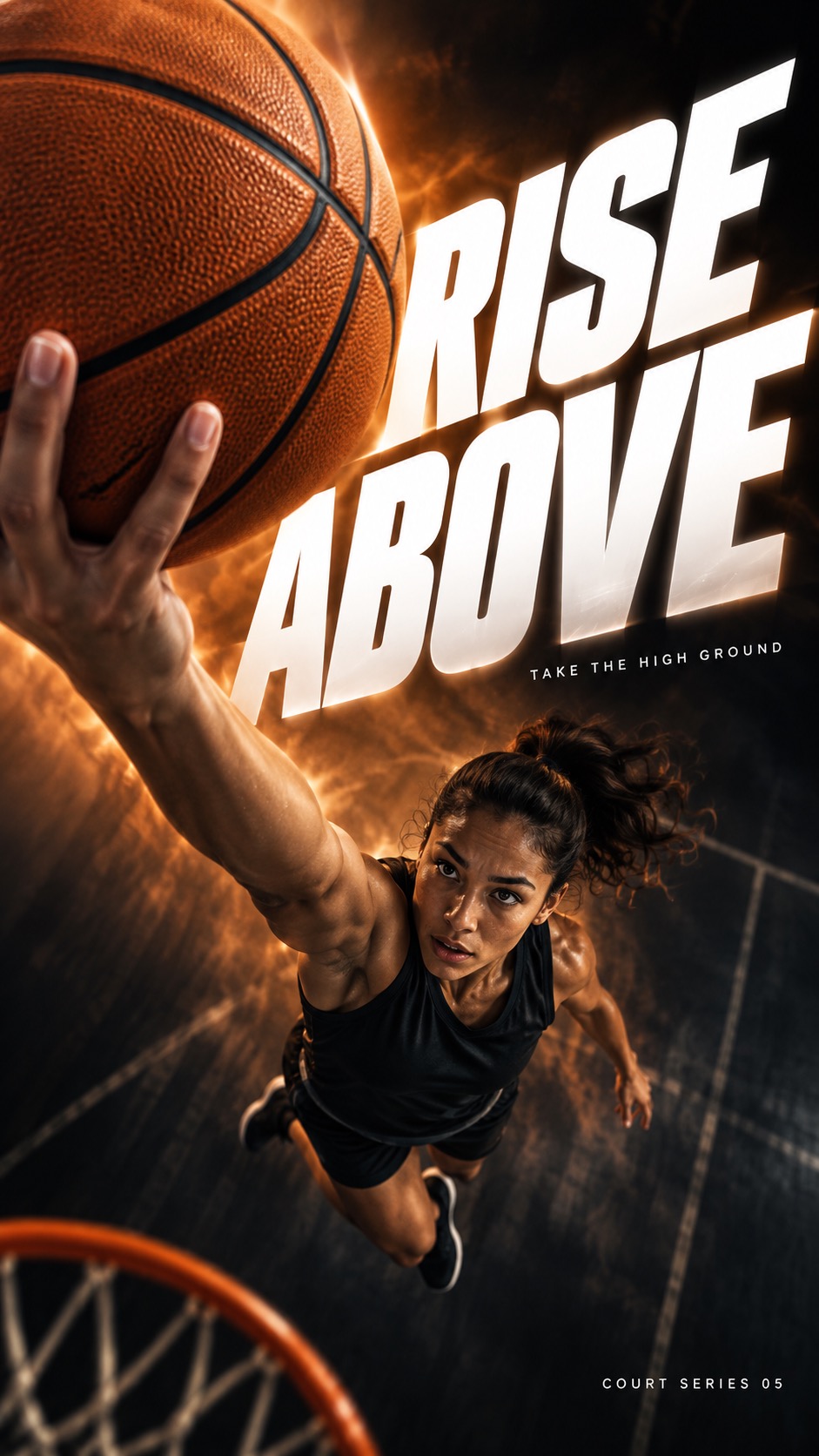
"Use case: ads-marketing. Create one finished premium sports campaign poster as a full-bleed raster. The visual system is extreme near-to-far athletic photography, monumental white oblique typography and dark-to-luminous colored atmosphere. Prioritized visual anchors: [CORE] Photographic athletic action uses an extreme near-to-far scale jump: one physically connected piece of equipment or body part dominates the foreground while the athlete recedes into depth. [CORE] Monumental white heavyweight oblique sans-serif typography cuts through the composition; the athlete occludes selected letter areas without destroying the exact headline. [CORE] A near-black edge field opens into a luminous single-hue atmospheric band behind the action, producing sharp white-type contrast and dark sculptural human form. [CORE] Directional photographic motion softness and colored atmospheric streaks carry the force vector while the critical contact point or equipment retains selective detail. [FLEX] Let each sport determine the spatial structure: a spherical basketball raised above a receding jumper, a broad snowboard underside passing overhead, a paddle slicing a luminous water wedge, or a compact boxing fist crossing the frame. Keep the established series language while changing its content and force geometry. [FLEX] Place, rotate, stagger or stretch the type around the movement; protect complete headline comprehension while allowing scale, selected edge cropping, and controlled overlap. [FLEX] Choose one dominant hue per case, with dark and pale related tones; hues may vary across the family. [FLEX] Recompose subject, title and negative space independently for portrait and landscape, preserving the same case concept rather than cropping the other ratio. Subject and action: An adult female basketball player in a plain black sleeveless basketball jersey and plain shorts, leaping high with one arm extended overhead carrying a single orange basketball. A sparse dark indoor basketball space recedes below her; no other players. Near-camera focal evidence: The single near-camera basketball and the visibly connected hand become a huge textured sphere in the upper foreground. Correctly formed fingers spread naturally around one side of the ball. The connected straight arm, torso and bent jumping legs recede far below it. No detached ball and no duplicate ball. Design intention and ratio planning: Shoot from an extreme overhead close view beside the lifted ball, looking down the foreshortened arm toward the airborne player: the ball reads as a rising planet and the body falls away into dark depth. Use the oversized white words as two staggered planes around the ball and body rather than an identical top headline block. Portrait: near ball high-left, athlete receding down-right, RISE can occupy upper-right open space and ABOVE the lower dark field. Landscape: ball dominates left third with athlete receding to lower center, giant title across the right half. Protect all letters from the ball and fingers. Palette: Near-black charcoal, burnt orange and warm white, with a broad amber-orange illumination halo around the spherical foreground and faint directional haze beneath the jumper. Render exactly three text strings, each once, with no quotation marks: large headline "RISE ABOVE"; small series label "COURT SERIES 05"; small supporting line "TAKE THE HIGH GROUND". The headline must remain completely readable with correct letter order; choose line breaks and bounded overlap to serve the action. Keep small copy clear and comfortably inside the canvas. Image treatment: Clean commercial photographic compositing without paper grain or halftone. Keep tactile microtexture on the near basketball, snowboard base, wet paddle blade or boxing leather. Put broad soft directional motion into passing surfaces and colored atmosphere; preserve purposeful peripheral softness. Snow and water appear only as physically motivated spray near the action, never random decorative particles. Use dramatic sculptural lighting and physically plausible connected anatomy/equipment. Clothes and equipment are plain and unmarked: no logos, emblems, patches, numbers or decorative pseudo-lettering on jerseys, gloves, board bases, boats, helmets or balls. No extra words or symbols. Source content to replace entirely: The source Nike swoosh, Nike wordmark, JUST DO IT slogan and any recognizable sportswear brand logo.; The PEGASUS42 or PEGASUS 42 model wording and the reference advertising paragraph.; The white running shoe with a teal swoosh as a giant foreground product.; The exact front-facing male runner, lifted knee, grey long-sleeve top and black shorts combination.; The source arrangement of fragmented PEG, S42 and giant brand letters; do not trace its composition.; Part 1 content: track bicycle wheel, chalked climbing hand on rock, freestyle swimming hand, fencing blade, and the headlines BREAK AWAY, HOLD FAST, CUT THROUGH and STRIKE FIRST. Deliver a polished, sparse campaign image with a clear sport-specific design contribution, not a mockup on a wall."
Kinetic Editorial Photo Collage
Brand and marketing designKinetic Editorial Photo Collage
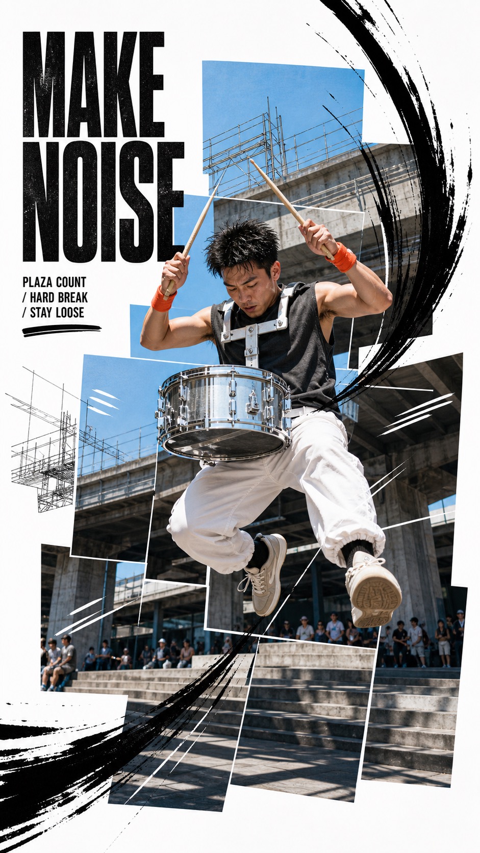
"Create a poster image in the Kinetic Editorial Photo Collage visual style. Subject: a skateboarder. Action: launching a high ollie over a painted curb. Prop/Product: a teal skateboard with orange wheels. Location: a sunlit rooftop parking deck. Background: low concrete barriers, pale blue sky, thin line-art railings, distant blocky buildings. Main text: OWN THE AIR. Secondary text: street session / noon deck / clean landing. Accent symbol: short slash. Wardrobe/styling: black shorts, white tee, signal-red socks, no logos. Style fidelity anchors: White poster canvas remains visible around and between layered photographic panels rather than becoming a full-bleed single photo. The scene is assembled from staggered rectangular photo tiles with slight offsets, overlaps, and uneven collage edges. A single realistic action subject sits near the center and feels cut into or lifted from the photo-panel stack. The action is frozen at a decisive airborne, twisting, leaning, or reaching moment with a clear diagonal line of movement. Large black extra-condensed uppercase typography sits in the upper-left zone, stacked in two or three compact lines. Loose black hand-drawn ink speed marks arc around the subject and sweep in from the frame edges with visible brush variation. Thin monochrome line-art architecture, scaffolding, railings, or city silhouettes sits behind the photo subject as a graphic overlay. Realistic daylight photography provides the base, while the drawn marks stay flat black and visibly hand-rendered. Color is restrained: mostly sky blue, concrete gray, field or street green, white, black, and one saturated wardrobe or prop accent. The composition feels commercial, youthful, athletic, and editorial without using real logos, team marks, or platform identifiers. The graphic density is energetic but still sparse enough that white negative space remains a major part of the design. Motion overlays behave like inked annotation and speed grammar, not comic halftone, stickers, neon trails, or 3D effects. Source content to avoid: Do not recreate a young soccer player kicking a ball in midair. Do not include soccer balls, footballs, ball trails, or ball-as-projectile graphics. Do not use the words PLAY LIKE YOU OWN IT or any close paraphrase of that slogan. Do not include Nike, swoosh marks, real sportswear logos, team crests, watermarks, creator IDs, or platform marks. Do not duplicate the rooftop soccer-field scene, turf foreground, skyline placement, or exact panel arrangement from the source. Do not copy the source athlete's face, red sleeveless uniform, body pose, leg angle, or expression. Do not repeat the exact three flying illustrated ball forms or their curved streak paths. Do not reproduce the small black brand mark at the bottom edge or any recognizable identity mark. Do not use a sports-brand campaign premise where a lone soccer athlete owns the field. Apply these style rules: use a clean white poster canvas with visible negative space; assemble the scene from staggered overlapping rectangular daylight photo panels with uneven collage edges; place one realistic action subject near the center, frozen in a decisive diagonal movement; add black hand-drawn dry-brush speed arcs, scratch marks, sweeping edge slashes, and thin white motion cuts over the panels; add faint monochrome line-art architecture, racks, rails, or skyline details behind the subject; set the headline in the upper-left corner using tall compressed black uppercase sans-serif type with tight leading; keep color restrained to white, black, daylight sky blue, concrete gray, muted environment tones, and one saturated accent on the prop or wardrobe; keep the finish clean, commercial, editorial, energetic, and unbranded. Avoid real logos, watermarks, platform marks, soccer balls, copied slogans, copied people, and any direct recreation of the source image. Important content rule: preserve the collage typography, ink-motion grammar, panel layering, and white-space density first, then change the subject, action, prop, scene, and text."
Impact Burst Halftone Comic Poster Style
Illustration and artImpact Burst Halftone Comic Poster Style
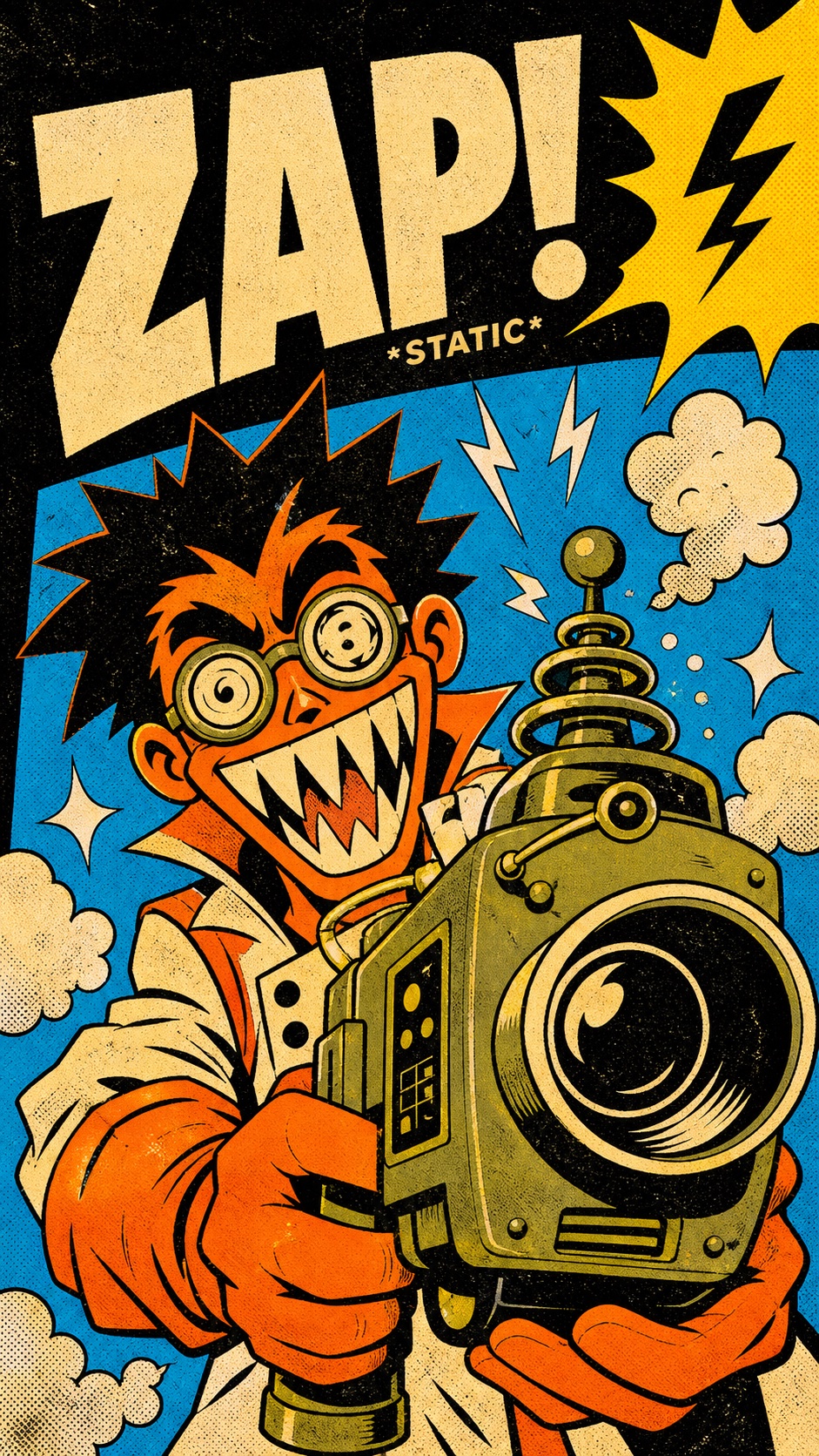
"Create an image in impact-burst-halftone-comic-poster-style. Scene: a manic orange-and-cream comic inventor with spiky black hair grinning in shock while testing a sputtering device, interacting with oversized muted-olive retro ray camera with a huge black lens, in flat cyan poster window under a black impact field. Include yellow jagged corner speech burst, off-white smoke puffs, small sparkle marks, rough paper speckles. Style the subject with flat orange jacket, cream negative-space highlights, black ink hair and eyebrows. Layout: use a bold cropped comic-poster composition. Put a huge condensed cream block-letter headline reading "ZAP!" across the upper band, with "STATIC" as tiny impact microcopy if it stays clean. Place the main subject large in the lower two-thirds and let the oversized prop cut diagonally across the body or foreground. Add white four-point sparkle and tiny lightning slash as a graphic impact mark. Style: thick uneven black contour lines, flat hot-orange and aged-cream character shapes, saturated cyan backdrop, lemon-yellow speech-burst corner, muted olive prop color, small gray accent, distressed screen-print texture, halftone dots, paper grain, rough ink edges, and slight print misregistration. Avoid: watermark, username, creator ID, platform logo, QR code, app UI, artist signature, copied reference character, copied exact pose, copied exact text, brand logos, licensed characters, photorealism, 3D, glossy gradients, soft airbrush shading, clean vector polish, crowded paragraphs, and muted corporate design."

Vermilion Photocopy Tension Editorial
Illustration and artVermilion Photocopy Tension Editorial
"Create an image in the "Vermilion Photocopy Tension Editorial" visual style. Style fidelity has first priority: one monochrome photographic subject fills almost the entire inner poster field at monumental scale and is aggressively cropped by multiple edges. The photograph uses harsh near-binary black-and-white tonal separation with crushed blacks, chalky highlights, and very few smooth midtones. Coarse photocopy dust, halftone speckling, toner breakup, and uneven analog print grain cover the photograph without becoming digital glitch noise. A single vivid vermilion-red ink color is reserved for every typographic and graphic intervention; no other chromatic accent appears. An oversized heavy condensed uppercase headline forms a vertical rail along one outer edge and is cropped or compressed by the frame. Three compact editorial annotation blocks occupy the opposite upper quadrant with tight leading and pronounced headline-to-microcopy scale contrast. Typography sits directly on the photograph without boxes, cards, outlines, shadows, or translucent panels. One sharp diagonal vermilion shard crosses a large area of the photograph and directs the eye between subject and headline. A second edge-born vermilion form branches organically like cut paper or flooded screen-print ink, while remaining different from the source geometry. The composition is asymmetric, crowded at the edges, shallow, and poster-flat, with overlap creating tension instead of realistic depth. The overall mood is raw, anxious, urgent, confessional, and culturally adjacent to independent music graphics, punk zines, and experimental editorial design. Literal source content that must not be recreated: the exact screaming person or any recognizable reconstruction of the source face; an open mouth, exposed teeth, and nose arranged in the same monumental close-up crop; the headline WHAT'S THE WORST THAT I CAN SAY? or close paraphrases of it; the headings Mixed emotions, Tracing my problems, and Tired of being still; the original paragraph copy or any source sentence; the exact left-rail and upper-right layout proportions from the reference; the exact three-pronged lower-right vermilion burst and its long spike geometry; the same face, expression, pose, story premise, or emotional outburst; any signature, watermark, username, platform mark, creator ID, QR code, brand logo, or identity mark. Subject: an anonymous track cyclist seen in an extreme close crop of one focused eye, cheek, and helmet edge. Action: leaning decisively into a rain-darkened velodrome turn with lips closed. Prop or tool: a rain-beaded unbranded helmet visor. Implied location: a covered concrete velodrome during a night practice. Sparse background clues: one blurred lane stripe, a cropped safety rail, and a few rain flecks. Wardrobe or material styling: a plain ventilated cycling helmet and unbranded dark track suit. Main headline: "BRAKE LATE. STAY AWAKE.". Three annotation phrases: "Rain sharpens focus. / The corner arrives early. / Momentum keeps its own time.". Accent gesture: a forked vermilion speed shard entering from the lower edge. Composition: place one monumental black-and-white photographic subject inside a rectangular inner poster field surrounded by solid black. Crop the subject through at least two edges so it occupies most of the image. Build an oversized condensed uppercase vermilion headline as a vertical rail along one edge; place exactly three compact vermilion editorial note blocks in the opposite upper quadrant. Send one flat vermilion angular shard diagonally across the lower or middle photograph and let one differently shaped branching vermilion form enter from an edge. Do not copy the source geometry or exact spacing. Typography sits directly over the photograph with no boxes, outlines, shadows, or translucent panels. Color is strictly black, dirty white or gray, and one vivid vermilion spot ink. Convert the photograph to near-binary photocopy contrast with crushed blacks, chalky highlights, sparse gray, coarse halftone, toner dust, print skips, and irregular scan abrasion. Keep the subject and headline readable; texture must feel analog, not digitally glitched. Lighting is hard, flat, and posterized. Depth stays shallow and collage-flat. The finished poster should feel raw, anxious, confessional, urgent, and art-directed like an independent culture magazine or punk-zine cover. Avoid full color, extra accent hues, soft gradients, glossy 3D, neon glow, RGB glitch, cinematic scenery, multiple subjects, sticker clutter, brand marks, logos, signatures, usernames, QR codes, platform marks, and watermarks. Important content rule: preserve the visual system first, then use a wholly new subject, action, tool, location, wording, red geometry, and story premise."
Velocity Type Sport — Part 3
Brand and marketing designVelocity Type Sport — Part 3
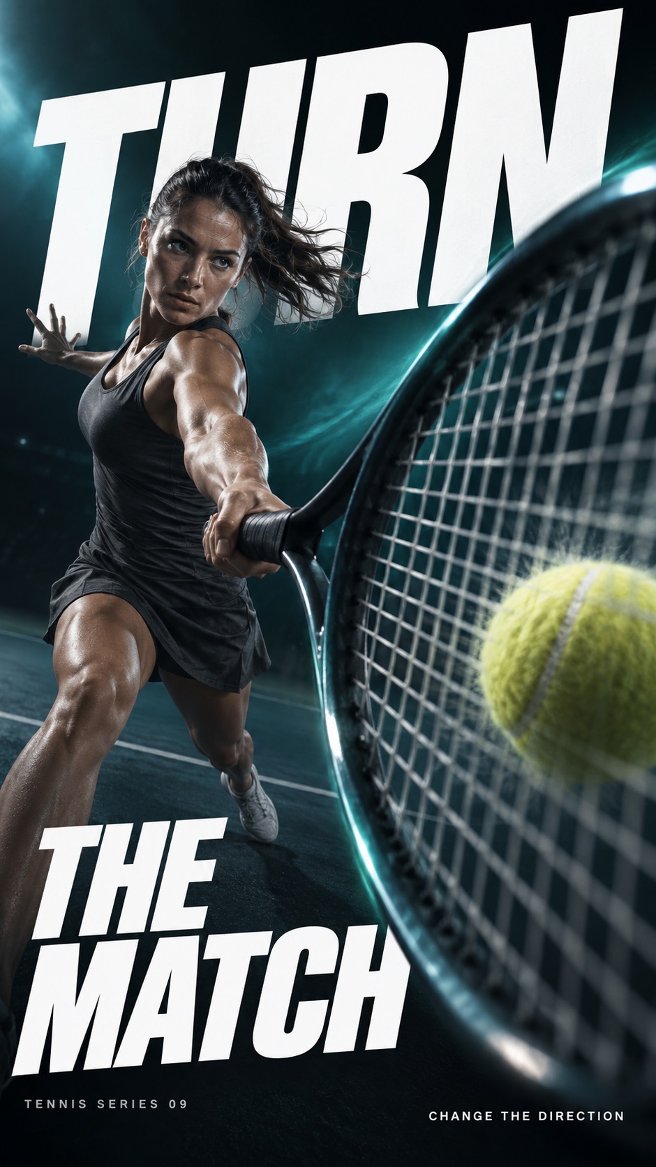
"Use case: ads-marketing. Create one finished premium sports campaign poster as a full-bleed raster. The visual system is extreme near-to-far athletic photography, monumental white oblique typography and dark-to-luminous colored atmosphere. Prioritized visual anchors: [CORE] Photographic athletic action uses an extreme near-to-far scale jump: one physically connected piece of equipment or body part dominates the foreground while the athlete recedes into depth. [CORE] Monumental white heavyweight oblique sans-serif typography cuts through the composition; the athlete occludes selected letter areas without destroying the exact headline. [CORE] A near-black edge field opens into a luminous single-hue atmospheric band behind the action, producing sharp white-type contrast and dark sculptural human form. [CORE] Directional photographic motion softness and colored atmospheric streaks carry the force vector while the critical contact point or equipment retains selective detail. [FLEX] Let each sport determine the spatial structure: a tennis string grid sweeping past the lens, a wooden ring anchoring a receding gymnast, a long thin skating blade slicing an ice plane, or a taut bowstring and recurved bow framing an archer. Continue the established series language while changing content and force geometry. [FLEX] Place, rotate, stagger or stretch the type around the movement; protect complete headline comprehension while allowing scale, selected edge cropping, and controlled overlap. [FLEX] Choose one dominant hue per case, with dark and pale related tones; hues may vary across the family. [FLEX] Recompose subject, title and negative space independently for portrait and landscape, preserving the same case concept rather than cropping the other ratio. Subject and action: An adult female tennis player in plain graphite tennis clothing executing a powerful one-handed forehand, with her free arm used for balance. She holds one unmarked graphite tennis racket; a single yellow tennis ball approaches the string bed. The court is dark and sparse. Near-camera focal evidence: An oversized oval racket head and its taut regular string grid sweep close to the lens on the right foreground. The grip, shaft and player hand remain continuously connected. One yellow ball sits immediately at the string bed with slight plausible impact compression; only one racket and one ball. Keep a broad part of the grid and rim clearly visible. Design intention and ratio planning: Treat the transparent string bed as a spatial window rather than a solid prop; glimpse the receding athlete and white type through the mesh. Portrait: near racket head in lower-right, arm connects back to athlete upper-left; place TURN high and THE MATCH in a lower-left dark area, exact phrase readable in order. Landscape: giant racket at right, athlete reaching from left-middle, enormous three-word headline across the upper field with selected overlap. The racket ellipse and fine grid oppose monumental solid letter shapes. Palette: Petroleum black, vivid electric teal and cool white, with a narrow teal light sweep following the racket arc. The tennis ball is a restrained yellow accent. Render exactly three text strings, each once, with no quotation marks: large headline "TURN THE MATCH"; small series label "TENNIS SERIES 09"; small supporting line "CHANGE THE DIRECTION". The headline must remain completely readable with correct letter order; choose line breaks and bounded overlap to serve the action. Keep small copy clear and comfortably inside the canvas. Image treatment: Clean commercial photographic compositing without paper grain or halftone. Keep focal microtexture on carbon racket and taut strings, polished wood ring and chalked grip, honed skate blade and fine ice grooves, or a matte recurve bow and tensioned string. Broad directional blur belongs to passing surfaces and atmosphere; fine chalk or ice spray is localized to actual contact. Stable strength and aim use atmospheric depth softness rather than invented high-speed motion. Use dramatic sculptural lighting and physically plausible connected anatomy/equipment. Clothes and equipment are plain and unmarked: no logos, emblems, patches, numbers or decorative pseudo-lettering on clothing, rackets, rings, skates, bows, headgear or balls. No extra words or symbols. Source content to replace entirely: The source Nike swoosh, Nike wordmark, JUST DO IT slogan and any recognizable sportswear brand logo.; The PEGASUS42 or PEGASUS 42 model wording and the reference advertising paragraph.; The white running shoe with a teal swoosh as a giant foreground product.; The exact front-facing male runner, lifted knee, grey long-sleeve top and black shorts combination.; The source arrangement of fragmented PEG, S42 and giant brand letters; do not trace its composition.; Part 1 content: track bicycle wheel, chalked climbing hand on rock, freestyle swimming hand, fencing blade, and the headlines BREAK AWAY, HOLD FAST, CUT THROUGH and STRIKE FIRST.; Part 2 content: raised basketball, snowboard underside, kayak paddle, boxing gloves, and the headlines RISE ABOVE, CARVE WILD, DRIVE DEEP and MAKE IMPACT. Deliver a polished, sparse campaign image with a clear sport-specific design contribution, not a mockup on a wall."
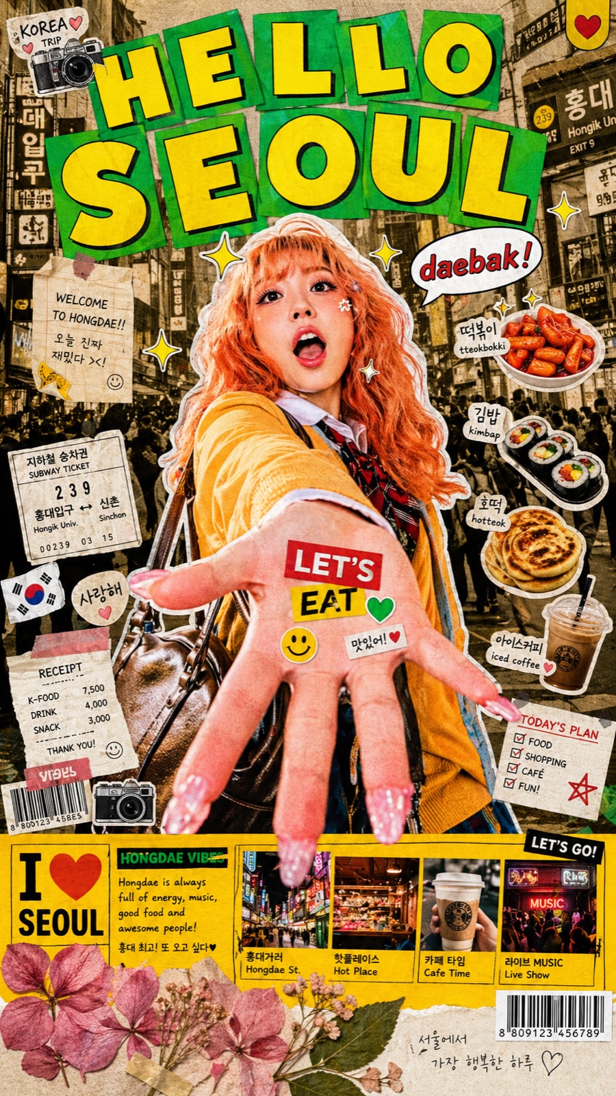
Tokyo Kawaii Travel Collage Poster
Brand and marketing designTokyo Kawaii Travel Collage Poster
"Create a poster in the "Tokyo Kawaii Travel Collage Poster" style. Main subject: a cutout fashion traveler holding a paper skewer tray. Action or pose: posing with one hand toward the viewer. Featured prop, food, or sticker object: tteokbokki cup, fishcake skewer, and cute food stickers. Destination or location: Seoul night market street. City background and botanical elements: black-and-white market crowd photos, neon shop signs, botanical scraps, ticket stubs, halftone texture, and mini photo panels. Main headline text: "SEOUL POP". Secondary or speech-bubble text: "late snack tour". Travel stickers and accent symbols: speech bubble, barcode strip, red star sticker, and arrow labels. Wardrobe and cutout styling: bright streetwear cutout with white sticker edge, layered jacket, and playful accessories. Use a maximalist Japanese travel scrapbook collage layout. Place the cutout subject large in the center with a sticker-like white edge. Put huge playful rounded block letters across the top, each letter on a separate bright paper tile, slightly rotated and overlapping. Use yellow letter fill, green tile blocks, red accents, cream paper textures, and black ink details. Layer the background with black-and-white or sepia city photography, crowd scenes, buildings, street signs, and halftone print texture. Add manga speech bubbles, handwritten notes, tiny captions, food icons, ticket stubs, barcode graphics, mini photo panels, sticker stars, arrows, and travel labels. Add a dense yellow bottom information bar with small photos, captions, travel snippets, barcode, and bold label typography. Mix in watercolor or pressed-flower botanical elements near the lower area. The finish should feel like scanned paper, teen magazine collage, souvenir zine, sticker album, and cute travel advertisement. Avoid minimalism, clean corporate design, luxury travel style, plain backgrounds, low density, and overly polished digital graphics."
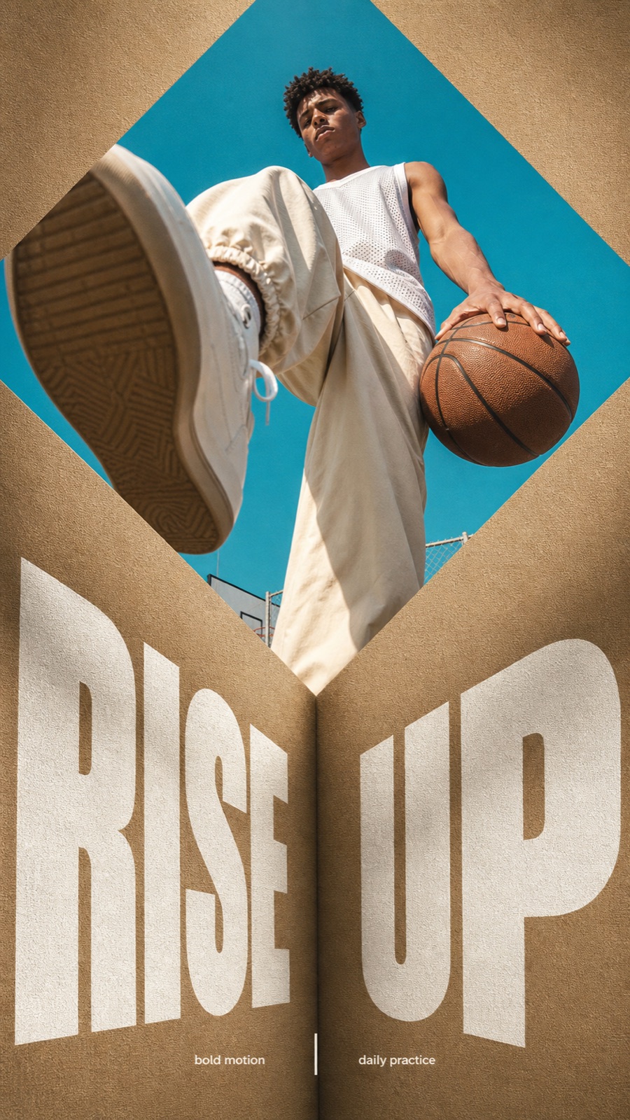
Folded Diamond Perspective Type Poster Style
Brand and marketing designFolded Diamond Perspective Type Poster Style
"Create an image in folded-diamond-perspective-type-poster-style. Scene: a young basketball player stepping over the camera while holding a ball low, interacting with basketball and white sneakers, in an outdoor court under clear sky. Use white mesh jersey, cream track pants, and minimal high-top sneakers. Shoot the subject as a real-photo low-angle hero image with wide-lens foreshortening, strong sunlight, and a bright cyan sky or clean outdoor backdrop. Layout: place the photo inside a large rotated square diamond aperture in the upper half of a tactile folded tan paper or linen canvas surface. Include folded tan canvas paper, a diamond aperture, a central crease, warm shadows, and subtle woven grain. Create a deep central fold or crease running down from the diamond point into the lower poster. Typography: set the main headline "RISE UP" in enormous white ultra-bold condensed sans-serif type across the lower half. Make the type feel printed onto the folded surface, split by the central crease, distorted by perspective, cropped by the poster edges, and lightly textured by the paper grain. Add "bold motion / daily practice" only as tiny clean editorial microcopy using a thin vertical separator. Mood and finish: bold minimalism, streetwear editorial, monumental confidence, warm tan cardstock texture, crisp sunlight, cyan sky contrast, soft shadows, printed-paper grain, sharp geometric photo crop. Avoid watermarks, usernames, QR codes, creator IDs, platform logos, and app marks."
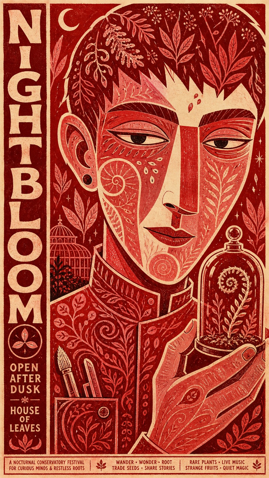
Vermilion Folk Screenprint Character Poster
Illustration and artVermilion Folk Screenprint Character Poster
"Create a poster image in the "Vermilion Folk Screenprint Character Poster" visual style. Style fidelity has priority over content novelty: the finished image must visibly preserve these anchors before introducing new content: One oversized front-facing bust dominates the frame, cropped firmly at the lower torso and nearly touching multiple edges. The face is flattened into broad interlocking shapes with a long geometric nose, heavy horizontal eyelids, and intentionally lopsided hand-drawn contours. A strict warm palette uses unprinted cream paper plus vermilion, scarlet, brick red, dusty rose, burgundy, and only tiny near-black accents. Dense hand-carved folk motifs fill skin, hair, clothing, and props while leaving the cream paper visible as the line color. Display lettering is chunky, rounded, irregular, vertically stacked or edge-hugging, and treated as an illustrated shape rather than typeset copy. Small secondary lettering forms narrow footer or side bands with uneven baselines, compact spacing, and playful handmade symbols. Ink coverage is tactile and imperfect, with dry-brush edges, screenprint grain, slight misregistration, and variable opacity on fibrous paper. Depth stays shallow and poster-flat: overlaps create hierarchy, but there are no realistic shadows, atmospheric perspective, or volumetric rendering. The composition is dense but controlled, using the large character as the organizing mass and fitting text into remaining edge channels. The mood combines offbeat theatrical gravity, sly humor, and mid-century underground cultural-poster energy. It must not recreate any of this literal source content: A crowned or royal bearded male character presented as a monarch; the exact drooping-eyed face, long rectangular nose, beard silhouette, ear shape, crown, and costume anatomy from the source; any Shakespeare character, Macbeth reference, Globe theatre reference, or royal tragedy premise; the source headline, side copy, dates, ticket price, venue details, signatures, hashtags, or other literal lettering; the exact crown-above-head and beard-below-face arrangement or a near-trace of the original silhouette; any watermark, creator mark, theatre logo, platform identifier, brand mark, or copied signature. Subject: an androgynous midnight botanist with a broad angular face and cropped hair. Action or expression: holding a calm, knowing sideways glance while presenting a rare seedling. Symbolic prop: a small glass cloche containing a curling fern. Implied setting: an imaginary nocturnal conservatory festival. Supporting background motifs: flat leaf silhouettes, seed spirals, two tiny crescent emblems, and narrow paper gaps. Main invented headline: NIGHT BLOOM. Small invented supporting copy: OPEN AFTER DUSK / HOUSE OF LEAVES. Accent emblem: a three-petal seed emblem. Wardrobe and surface styling: a high-collared work smock filled with carved vine, seed, and wave motifs. Compose one monumental front-facing bust as the dominant mass, tightly cropped and nearly touching the frame, with broad interlocking facial planes, a long geometric nose, heavy horizontal eyelids, and intentionally uneven hand-drawn contours., reserve a narrow vertical headline channel and a compressed footer, expand the headline into a large lateral block while keeping the bust dominant. Keep the space shallow and poster-flat, using only overlap, scale, and cropping for hierarchy. Render dense carved folk motifs inside skin, clothing, hair, and the prop using visible cream paper as linework. Use only warm cream paper, vermilion, scarlet, brick red, dusty rose, burgundy, and tiny near-black anchors. Draw the headline as chunky rounded irregular handmade capitals that function as an illustrated shape; keep secondary lettering condensed, uneven, newly invented, and confined to an edge band. Simulate a hand-pulled screenprint on fibrous uncoated stock with restrained ink grain, minor misregistration, variable ink opacity, sparse pinholes, and dry-brush edges. Use flat even value separation with no modeled lighting. Preserve the offbeat theatrical gravity, sly humor, dense simplification, and mid-century underground cultural-poster energy. Ensure all displayed text is exactly the supplied invented wording or omitted if it cannot be rendered cleanly. Avoid photorealism, 3D rendering, gradients, glossy highlights, realistic shadows, depth of field, cool colors, full-spectrum palettes, clean corporate type, perfect vector symmetry, excessive digital noise, heavy grunge, random glyphs, illegible pseudo-text, watermarks, signatures, logos, platform marks, or any copied identity. Important content rule: match the specified style first, then make the subject, prop, scene, text, and story visibly new."
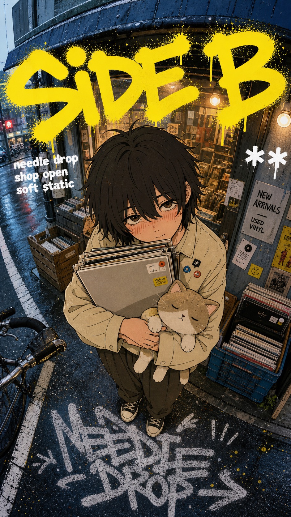
Yellow Graffiti Fisheye Manga Street Poster Style
Illustration and artYellow Graffiti Fisheye Manga Street Poster Style
"Create a image in the "yellow-graffiti-fisheye-manga-street-poster-style" visual style. Subject: an adult laundromat attendant with tired eyes and a canvas laundry bag Action: hugging the laundry bag to their chest while stepping onto a wet sidewalk Prop/Product: canvas laundry bag, receipt strip, and a small detergent box with no brand text Location: narrow late-night laundromat entrance on a side street Background: round washer windows, cool fluorescent window glow, curb stripes, puddled asphalt, taped paper notices, and bent street railings Main text: SPIN LATE Secondary text: wash all night / cold street / last load Accent symbol: !! Wardrobe/styling: oversized cardigan, cuffed work pants, canvas sneakers, simple apron, and soft anxious manga expression Style fidelity anchors: Cool blue-gray fisheye street-photo base with wide-angle distortion, slight horizon tilt, storefront machines, curb lines, road markings, and compressed urban detail. One oversized manga cutout subject sits in the foreground, centered and close to camera, with a large head and upper body, small foreshortened feet, and top-down lens exaggeration. Manga rendering uses clean dark brown and black linework, simple shaded clothing folds, soft peach skin, blush hatching, and muted emotional facial expression. The photo background remains realistic and desaturated while the subject is flatter, warmer, and inked, creating a clear collage contrast between real street and drawn figure. The upper third carries a huge sprayed yellow graffiti headline, thick and loose, with rounded strokes, drips, dot overspray, and partial overlap behind the subject. Small white block captions sit across the midline like compact street-zine type, using bold simple lettering with slight roughness and limited word count. The bottom foreground includes a large chalky white pavement tag or painted ground mark following the fisheye perspective. Palette behavior is mostly cool concrete blue, vending-light gray, asphalt charcoal, warm cream clothing tones, peach skin, electric yellow paint, and white caption accents. Lighting is natural overcast street light with vending or storefront glow; contrast comes from color blocking and ink outlines rather than cinematic shadows. The mood is intimate, awkward, urban, and poster-like, mixing candid street photography, youth manga cover emotion, and informal graffiti culture. Edges should feel like a finished digital collage poster, with the drawn subject cleanly integrated over the photographed environment without glossy 3D depth. Source content to avoid: Do not recreate the original young girl, bashful fists pose, exact face, brown hair shape, orange hair clip, cream blouse, necktie, or pleated skirt. Do not recreate the same vending-machine corner, drink rows, road layout, curb placement, sign positions, or photographic background arrangement. Do not reuse the original yellow graffiti word shape, exact white Japanese captions, bottom pavement text, watermark, username, or signature. Do not use recognizable manga franchise names, copied characters, school-uniform romance framing, or a shy character standing directly in front of vending machines. Do not include platform marks, QR codes, creator IDs, brand logos, real beverage labels, or exact storefront signage from the source image. Do not copy the original top/bottom text placement exactly; preserve the type grammar while changing words, marks, and layout details. Apply these style rules: - Composition: Create a hybrid street poster with a cool fisheye urban-photo background, one oversized centered manga cutout subject in the foreground, a large top-band yellow spray-paint headline, short white caption hits near the middle, and a chalky white pavement tag or painted ground mark at the bottom. Keep the subject close to camera with top-down scale distortion, large head and hands, smaller feet, and street lines bending into the fisheye perspective. - Typography: Use loose hand-sprayed yellow graffiti for the main headline, with rounded thick strokes, drips, dot overspray, and uneven baseline. Use compact white block captions as short street-zine callouts. Use chalky or spray-painted ground lettering for the bottom mark. Make all text graphic and brief, not clean corporate typography. - Color: Keep the background mostly cool blue-gray, concrete gray, asphalt charcoal, vending-light white, and muted storefront color. Render the subject in warmer cream, tan, peach, muted browns, and black or dark brown ink. Use electric yellow as the loud accent and white as secondary caption paint. - Texture and lighting: Use realistic asphalt grain, storefront reflections, compressed street-photo detail, smooth manga ink contours, simple cell shading, blush hatch marks, spray-paint speckle, rough pavement paint, and flat overcast daylight with subtle machine glow. Avoid cinematic shadows, glossy 3D depth, and heavy blur. - Graphic elements: Add yellow overspray dots, small sticker-like marks, white caption hits, curb stripes, road paint, vending or storefront glow, concrete seams, and a bottom pavement tag that follows perspective. Avoid: photoreal-only portraits, pure anime backgrounds, 3D render, glossy vector poster, clean corporate layout, dense tabloid collage panels, luxury minimalism, heavy gradients, bokeh blur, real brand logos, watermarks, usernames, QR codes, platform marks, creator signatures, exact source text, copied character, copied pose, copied vending-machine composition, and any source-specific franchise identity. Important content rule: match the reference style first, then change the source content. Use new subjects, new scene details, new props or products, and new text, while preserving the style fidelity anchors."
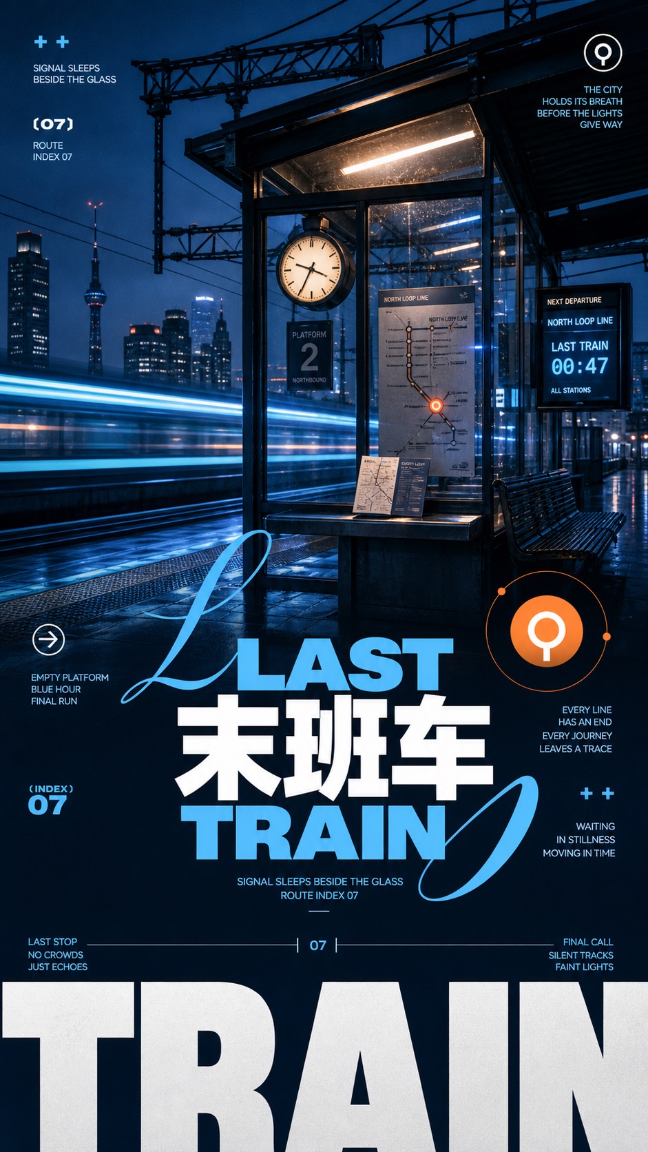
Dusk Cyan Layered Type Poster Style
Brand and marketing designDusk Cyan Layered Type Poster Style
"Create a "Dusk Cyan Layered Type Poster Style" image. Subject: a compact street food kiosk glowing under a single paper lantern canopy Action: standing quiet after rain while steam rises softly from the counter Prop/Product: stacked ceramic bowls, blue receipt slips, and a small enamel menu tile Location: empty urban night market alley at blue hour Background: dark shop silhouettes, reflected puddles, distant electric signs as soft bands of light, low mist Main text: NIGHT MARKET Secondary text: quiet neon after rain / small hours index 04 Accent symbol: circled cross with paired plus marks Wardrobe/styling: no people, object-led scene with crisp poster text and clean prop styling Style fidelity anchors: Full-bleed dusk or blue-hour photographic background with a dark silhouette mass anchoring the lower half. Central-to-lower oversized title stack, including one huge cropped bottom word near the frame edge. Bright cyan and clean white typography over deep navy shadows, with one small warm orange or peach accent. Mixture of extra-bold geometric sans type and one expressive script-style swash or cursive letterform. Dense poster hierarchy with large title, mid-size label text, tiny all-caps microcopy, small numerals, and compact side captions. Flat vector overlays on top of the photo: circles, thin orbital arcs, plus marks, arrows, bracket labels, and simple icon silhouettes. High contrast between pastel warm glow areas and cool shadowed foreground. Slight analog print grain and matte poster texture while preserving crisp text and clean edges. Asymmetric diagonal or stepped background silhouette that creates movement behind the type. Depth created by scale, overlap, transparency, and contrast rather than 3D rendering or heavy perspective props. Source content to avoid: No coastal sunset, ocean bay, mountain ridge, wave scene, or sun setting behind mountains. No reuse of the words Sunset, Serenity, the original bilingual phrases, the year marker, or visible carousel/page-count UI. No recreation of the exact central title arrangement, lower giant Sunset crop, or mountain-inside-sun badge. No platform controls, watermarks, usernames, QR codes, app UI dots, screenshot navigation arrows, or brand marks. No preservation of the original quiet mountain-sea contemplation premise. No same orange sun placement, same mountain icon, or same left/right coast silhouette. Apply these style rules as concrete visual design constraints: - Composition: full-bleed photographic dusk or blue-hour background, dark navy mass in the lower half, oversized title stack through the center and lower third, one huge cropped bottom word near the frame edge, small caption clusters at corners, and one circular icon badge or warm orb near the main title. - Typography: extra-bold geometric sans headline in cyan and white, a sweeping script-style swash crossing the title, tiny all-caps microcopy, bracketed numbers, plus marks, clean side captions, and short readable poster text. - Color: deep navy and blue-black base, bright cyan and ice white type, soft peach haze, one restrained orange accent, high contrast between warm glow and cool shadow. - Texture and lighting: backlit blue-hour atmosphere, soft haze, matte analog print grain, crisp type edges, clean vector overlays, no uncontrolled digital noise. - Graphic elements: thin orbital arcs, small dots, circled marks, simple arrows, bracket labels, and a flat icon silhouette related to the new subject, not mountains. Important content rule: match the style fidelity anchors first, then change the source content. Use the new subject, new scene details, new prop, new headline, and new icon. Do not recreate the source landscape, original text, source title layout, platform UI, watermark, or mountain-sun symbol."
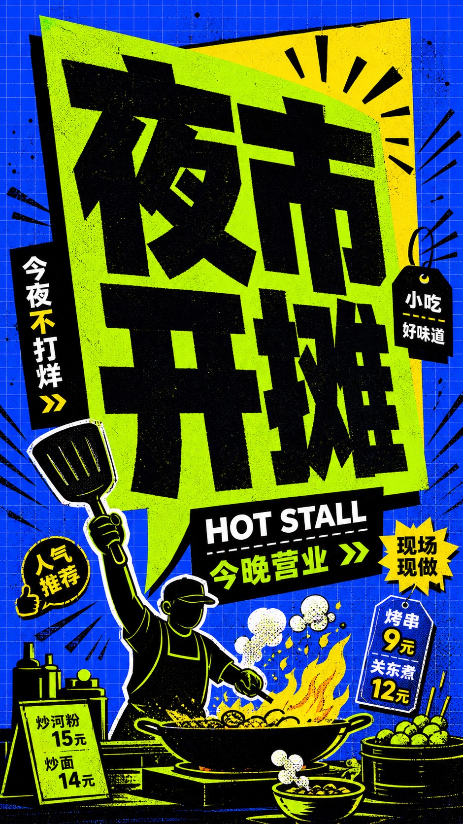
Blue Lime Kinetic Comic Type Poster Style
Illustration and artBlue Lime Kinetic Comic Type Poster Style
"Create a raster poster in the Blue Lime Kinetic Comic Type Poster Style. Preserve these style anchors first: Electric-blue background fills the canvas and carries a faint square grid, like printed graph paper. A giant neon-lime speech-bubble or banner panel dominates the center with a sharp triangular tail or cutout. A flat yellow geometric back plate peeks from behind the lime panel to create high-contrast poster depth. Massive black block typography is the primary visual mass, cropped tight and packed inside the lime shape. Letterforms feel blunt, heavy, slightly irregular, and comic-like rather than refined or corporate. Small secondary type sits in black rectangular strips or edge zones, creating a stacked poster hierarchy. Black radial action rays, tick marks, arrows, and ornamental separators burst from the headline area. Composition is shallow and graphic, with hard cut paper shapes instead of realistic perspective or lighting. Palette stays highly limited: electric blue, neon lime, warning yellow, dense black, and small white highlights. All surfaces show subtle ink speckles, halftone dots, scan noise, and imperfect printed edges. The layout feels loud, compressed, tilted, and kinetic, with very little empty space around the headline. Any subject or prop must remain secondary to the typographic panel and be simplified into flat poster shapes. Use an electric-blue full-bleed grid-paper background, a huge slanted neon-lime speech-panel or cut-paper banner, a sharp yellow geometric back plate behind it, massive black rough comic-block Chinese typography packed tightly into the lime panel, a black strip or edge zone for secondary text, radial black action rays, small arrow/separator marks, subtle halftone dots, ink speckles, rough printed edges, and flat screenprint color. New content: 一个夸张的夜市小摊招牌和简化摊主剪影 doing 把炉火点亮并把巨大锅铲举到画面边缘, with 一口被图形化处理的巨大铁锅和冒气小碗, located in 蓝色网格纸上的扁平夜市场景. Background details: 黑色放射线、极小价签形状、几枚箭头和少量油墨颗粒. Main headline text: 夜市开摊. Secondary text: HOT STALL / 今晚营业. Accent symbol: 黑色双箭头和短促爆裂线. Wardrobe or subject styling: 黑色围裙轮廓、简化帽子、无真实五官的扁平剪影. Keep the composition shallow, loud, compressed, tilted, and type-dominant. Avoid recreating source content: Do not use the original headline text: 再出发, DEPART, again, GOGOGO, or close variants of the same wording.; Do not recreate the same restart, departure, leave-again, or go-go story premise.; Do not copy the exact lime speech-bubble silhouette, exact yellow wedge placement, or exact black ray arrangement.; Do not include the small signature-like mark from the lower-left corner of the reference.; Do not use brand marks, platform icons, usernames, QR codes, creator IDs, watermarks, or app logos.; Do not render the output as a clean vector logo, realistic photo, 3D title, manga panel, or polished corporate poster. No watermark, no username, no QR code, no brand logo."
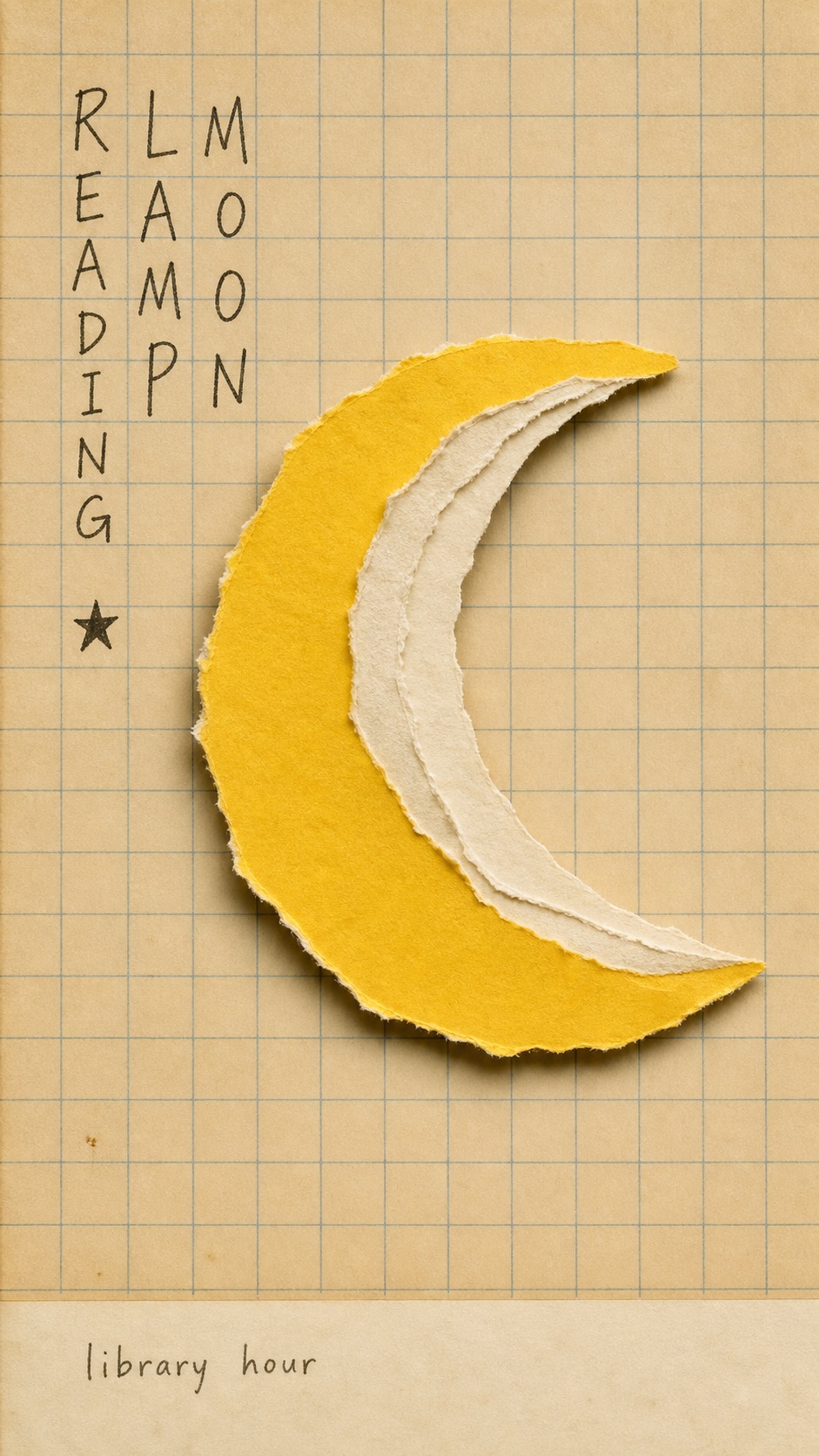
School Grid Paper Cutout Poster
Illustration and artSchool Grid Paper Cutout Poster
"Create a image in the "school-grid-paper-cutout-poster" visual style. Subject: a handmade kite shaped from torn paper Action: floating upward as if remembered from an after-school walk Prop/Product: a red cut-paper kite with cream paper tail strips Location: a flat sheet of warm classroom grid paper Background: mostly empty ruled squares, a tiny pencil dot, faint paper yellowing, and a narrow bottom margin Main text: AFTER SCHOOL WIND Secondary text: small weather note in the bottom margin Accent symbol: tiny generic red seal mark Wardrobe/styling: no human figure, tactile handmade paper only Style fidelity anchors: Warm beige classroom grid paper covers the entire background with thin muted blue-green ruled lines. One oversized handmade paper-collage subject dominates the center and sits slightly right of the left text block. The subject is a simple flat silhouette assembled from torn paper edges, not a rendered or realistic object. Off-white paper layers and one saturated color-paper area create the main figure with very limited color variety. Shallow physical shadows under torn paper edges create low relief while the camera remains front-facing and flat. The layout is sparse, poster-like, and quiet, with generous negative space and no busy surrounding scene. A compact hand-written vertical note appears near the upper-left, with uneven notebook-like strokes. The image keeps a scanned vintage print finish: paper grain, mild yellowing, soft focus, and slight exposure falloff. A narrow pale bottom margin can contain a tiny caption, preserving the old magazine-ad or school-poster feel. Any small stamp or seal is generic and tiny; it must never become a recognizable brand logo. Source content to avoid: Do not recreate a soft-serve ice cream silhouette. Do not use a McDonald's logo, golden arches, brand colors as a logo, or any recognizable restaurant identity. Do not copy the original Chinese vertical headline or its meaning about summer homework. Do not use the exact orange cone plus white cream paper construction. Do not recreate the same school-vacation homework joke or story premise. Do not include the tiny original signature, watermark, or bottom-right brand lockup. Do not place a central dessert product in the same shape relationship as the source. Apply these style rules: - Composition: warm cream classroom grid paper background, straight-on copy-stand view, one oversized torn-paper collage object centered slightly right of the hand-written text block, generous empty grid space, and a narrow pale bottom margin. - Typography: one compact vertical column or two slim vertical columns of loose hand-drawn notebook characters on the upper-left side, dark graphite or faded ink, uneven and human, never clean digital type. - Color: mostly yellowed beige paper with muted blue-green grid lines, cream torn-paper layers, one saturated cut-paper accent color, and tiny dark handwritten marks. - Texture and lighting: real paper grain, deckled torn fibers, slight scan softness, low contrast vintage print finish, soft diffuse overhead light, and shallow physical shadows under lifted paper edges. - Graphic elements: ruled grid structure, torn paper silhouette, optional tiny generic seal-like mark, and a small bottom caption strip; keep all marks generic. Avoid: no ice cream, no soft-serve shape, no cone silhouette, no fast-food branding, no recognizable logo, no original Chinese headline, no source watermark or signature, no dense scene, no glossy product render, no 3D object, no vector poster, no QR code. Important content rule: match the reference style first, then change the source content. Use new subjects, new scene details, new props or products, and new text while preserving the style fidelity anchors."
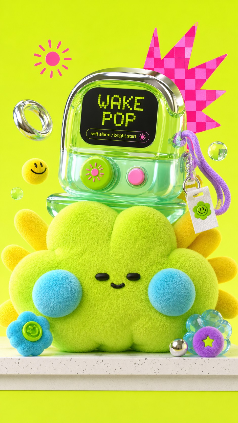
Neon Plush Gadget Pop 3D Style
Brand and marketing designNeon Plush Gadget Pop 3D Style
"Create a finished raster image in the "Neon Plush Gadget Pop 3D Style". Subject: a round mint-green plush moon-bunny kiosk with cyan floppy ear cushions and tiny black bead eyes. Action: leaning forward as if presenting a new drink launch. Prop/Product: an oversized translucent bubble-tea rocket capsule with chrome straw ring and jelly fins. Location: minimal neon studio counter with a pale speckled shelf edge. Background elements: hot-pink starburst behind the capsule, lime checkerboard mini card, floating tapioca spheres, tiny smile sticker, and cyan soft blobs. Main text: BOBA GO. Secondary text: fresh orbit / sweet fuel. Accent symbol: radiating pink sparkle. Wardrobe/styling: plush mint knit body, cyan fleece ears, small white hang tag, lavender cord charm, and rubbery green buttons. Style fidelity anchors: Acid lime or neon yellow-green studio background dominates the frame, with a soft gradient glow rather than realistic scenery. A single oversized plush mascot or fuzzy toy object fills the lower center, cropped close enough to feel tactile and collectible. Surfaces mix fuzzy knitted fabric, soft fleece, glossy molded plastic, translucent jelly material, chrome accents, and rubbery toy parts. The main prop is a chunky toy-like gadget or product object sitting on or hugging the plush subject. Palette uses electric lime as the base with cyan, sky blue, hot pink, lavender, yellow, white, chrome gray, and small black details. Composition is dense but playful: big central toy mass, foreground shelf edge, floating side props, and graphic stickers arranged around it. Graphic elements include hot-pink burst marks, checkerboard panels, lightning or starburst shapes, flower buttons, smiley icons, tags, and tiny labels. Lighting is high-key commercial studio lighting with glossy highlights, soft bloom, gentle shadows, and polished 3D rendering. Camera is close-up front three-quarter product view, slightly low or eye-level, making the toy object feel large and collectible. Text appears as display-card lettering, sticker labels, hang tags, or tiny product microcopy, not as long paragraphs. Mood is hyper-bright Y2K toy pop, cute tech accessory culture, tactile, premium, synthetic, and energetic. Keep forms rounded, pillowy, inflated, and soft even when the subject is a gadget or product. Source content to avoid: Do not recreate a green dragon, dinosaur, monster head, or the same blue snout with nostrils.; Do not place a camera on top of the subject or use a camera as the central product prop.; Do not copy the VIP card, the word VIP, membership wording, unlock/pro/features copy, or any close substitute.; Do not copy the same FILLTER tag, barcode spray can, flower button, pink basketball, exact checkerboard card, or the same object cluster.; Do not reuse the same face layout with two black oval eyes, yellow eye rings, green brows, and purple cord whiskers.; Do not use the same hot-pink lightning burst behind a camera card in the same position.; Do not include logos, watermarks, QR codes, creator marks, usernames, app marks, or brand identifiers.; Do not preserve the original story premise of a plush creature wearing a camera with a VIP subscription display. Apply these style rules: acid lime or neon yellow-green studio background, oversized fuzzy plush main subject, rounded inflated toy shapes, visible knit or fleece texture, chunky gadget or product prop, glossy molded plastic, translucent jelly details, chrome highlights, hot-pink burst graphics, checkerboard cards, sticker labels, tiny tags, playful Y2K icon grammar, foreground shelf edge when useful, high-key commercial studio lighting, soft bloom, polished 3D product-render finish, close front three-quarter product perspective, tactile collectible mood. Important content rule: preserve the style anchors first, then change the original content completely with new subject, prop, display text, colors within the palette, and story premise. Avoid: watermark, username, creator ID, platform logo, QR code, signature, brand mark, app mark, copied source text, VIP, membership card, camera-on-head, green dragon, dinosaur, monster head, blue snout, FILLTER tag, barcode spray can, copied flower button, copied pink basketball, exact checkerboard card, flat vector art, dark cinematic realism, natural landscape, detailed real room, long readable paragraphs, corporate interface."
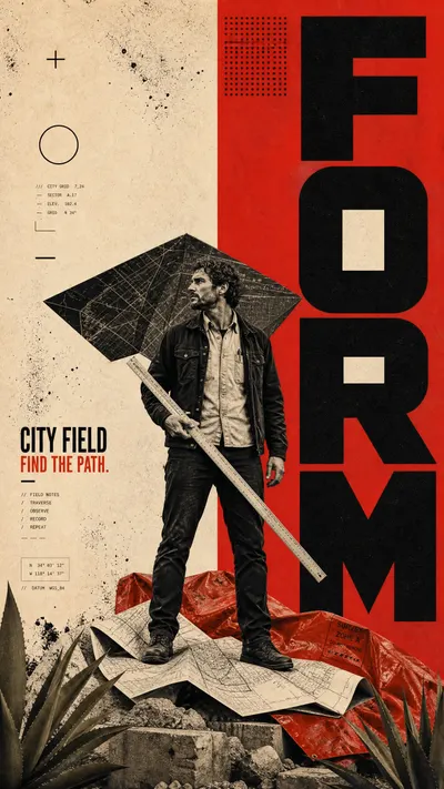
Split Ink Monumental Editorial
Illustration and artSplit Ink Monumental Editorial
"Create a finished editorial poster in the literal Split Ink Monumental Editorial visual system. Subject: an adult urban map maker with short braided hair in reduced-color collage treatment. Action: standing on a stack of folded city plans while measuring a route with a long survey ruler. Prop/product: a plain aluminum survey ruler and folded unbranded paper map. Location: an abstract public-planning archive with no identifiable city. Background: warm-cream/vermilion split field, large black FORM type slabs, angular dark folded map canopy, crumpled red survey tarp, agave leaves and concrete fragments at base. Main text: FORM. Secondary text: CITY FIELD / FIND THE PATH. Accent symbol: PLUS AND HOLLOW RING. Wardrobe/styling: dark canvas jacket, cream work shirt, black practical shoes, no armor or cape. Preserve these observable style anchors: Divide the main field into a hard-edged warm-cream block and a saturated vermilion block, with an intentional vertical or near-vertical seam acting as a primary compositional axis. Use monumental near-black uppercase geometric sans-serif letters as cropped vertical architectural slabs behind and around the subject, not as a small headline above the scene. Let the oversized type alternate between solid black strokes and cream counter-shapes cut out from the vermilion field, so the type becomes part of the background structure. Place one full-body adult subject in a high-contrast monochrome or reduced-color collage treatment, bridging the seam and overlapping the letter architecture. Use a large angular dark folded fabric, canopy, paper sculpture, or industrial tarp behind the subject as a single diagonal silhouette; do not use feathered wings or a character-like body extension. Include one heavy crumpled vermilion textile, map, or material near the subject's lower half, creating a soft irregular counter-shape to the hard giant type. Build a low foreground ledge from generic non-creature forms such as agave leaves, stacked paper, concrete fragments, or abstract rock; it must support or frame the subject without copying monster heads. Add a compact black halftone-dot matrix in one upper vermilion zone and one or two sparse geometric symbols such as a plus, short rule, or hollow circle in the cream zone. Use tiny black technical microcopy blocks as texture in cream pockets, kept secondary and not intended as readable narrative prose. Apply visibly distressed ink, grain, ink-splatter erosion, rough screenprint edges, and photocopy wear to red fields and black letterforms. Keep the palette limited to warm cream, vermilion red, near-black, off-white highlights, and at most a muted olive/stone foreground accent; avoid full-color scenes. Do not recreate these source-specific elements: The source's winged armored warrior, sword, feathered black wing, flowing red cape, and recognizable fantasy-character silhouette. The crocodile or reptile creatures, their heads, scales, teeth, and the original monster-versus-warrior narrative. The source headline and all original black letter forms, vertical word arrangement, microtext, dot positions, and symbolic mark locations. The exact red-and-cream split proportions, exact central figure pose, paper folds, weapon diagonals, and lower-creature framing. Any source franchise, character name, logo, watermark, artist credit, username, or copied fantasy-world context. The original armor, wing anatomy, cape styling, weapon shape, creature design, and historical-fantasy battle setting. Any direct recreation of a heroic winged fighter standing over green monsters. Build a hard-edged warm-cream and saturated vermilion split field. Use enormous cropped near-black uppercase geometric sans-serif letter slabs as architecture around the subject, including cream counter-shapes within the vermilion type field. Place one full-body adult collage subject bridging the split. Add a large angular dark folded tarp, canopy, paper sculpture, or fabric silhouette behind the upper body and a crumpled vermilion non-cape material around the lower body. Establish a low generic non-creature platform made of plant leaves, stacked paper, concrete, or stone. Add one black halftone-dot matrix, one or two simple geometric symbols, faint microtype, and rough screenprint distress. Preserve a limited palette of cream, vermilion, black, off-white, and minimal muted olive/stone. Create a new non-fantasy story, new prop, new action, and new type arrangement. Avoid wings, armor, swords, capes, reptiles, monsters, teeth, scales, source character, source words, source glyph layout, franchise marks, watermarks, 3D fantasy art, glossy rendering, blue/green/metallic bright colors, dense labels, malformed limbs, or unreadable text."
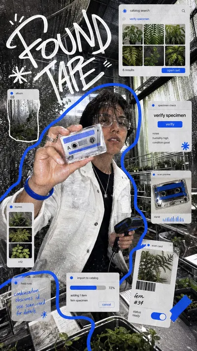
Y2K Mirror UI Scribble Collage Style
Illustration and artY2K Mirror UI Scribble Collage Style
"Create a gritty Y2K flash-photo UI collage in the Y2K Mirror UI Scribble Collage Style. New content: a night-shift electronics repair student is kneeling beside an open portable synthesizer on a laundromat floor with a cobalt-blue soldering pen and scattered translucent keys in a cramped fluorescent laundromat with stainless washer doors. Supporting scene and collage details: washer reflections, taped receipts, tiny fictional repair-ticket windows, thumbnail strips of circuit boards, one cropped flash-photo inset. Wardrobe and styling: oversized charcoal hoodie, silver chain, blue latex fingertip covers, worn black cargo pants. Use a real photographic wide-angle phone-camera base with hard flash, blown highlights, reflective surfaces, heavy grain, sharpened digital noise, rough scan texture, and casual off-axis cropping. Layer fictional, unbranded desktop/mobile-like UI fragments over the photo: translucent rounded panels, tiny image thumbnails, simplified alert cards, small blue action buttons, and generic microcopy reading select clean signal. Add a large irregular white hand-drawn graffiti headline reading NOISE FIX, plus a thick electric-blue marker outline or path wrapping the subject, and include the accent symbol /// as a small drawn/sticker mark. Preserve these style anchors: A wide-angle flash-photo base layer with exaggerated close foreground scale and compressed room depth. Very high visible grain, digital noise, sharpened edges, and slightly dirty scan texture across the whole image. A dense collage layout where photo fragments, translucent UI windows, pop-up cards, and small panels float over the scene. One thick electric-blue hand-drawn outline or route line wraps around the main subject or cuts through the composition. Large white graffiti-like handwritten headline lettering sits near an upper corner, irregular and brushy rather than typographic. Small desktop or mobile interface fragments use simplified generic UI chrome, rounded white panels, pale gray shadows, and blue action accents. The palette is mostly gray, white, black, and skin or object neutrals, interrupted by saturated cobalt/electric blue accents. Photo cutouts have rough edges, slight mismatched scale, and snapshot-collage logic rather than clean editorial placement. The scene feels personal, improvised, noisy, and screen-native, like a late-2000s desktop diary pasted over a flash photograph. Lighting is harsh and direct with blown highlights, mirror-like reflections, and metallic or tiled surfaces catching glare. Change the content and avoid these source details: Do not recreate a young man taking a phone mirror selfie in a bathroom or elevator-like room. Do not use the exact phone, toothbrush, striped shirt, headset, AirDrop card, Finder folder window, dock, or puzzle captcha layout. Do not copy the original handwritten names, studio signature, January calendar, app icons, brand marks, or operating-system logos. Do not reproduce the same blue outline silhouette path, same character pose, same mirror crop, or same right-side stacked panels. Do not create a recognizable real person, celebrity, username, watermark, QR code, or platform-specific logo. No real logos, no real app icons, no watermark, no QR code, no copied names, no recognizable celebrity, no exact source layout."
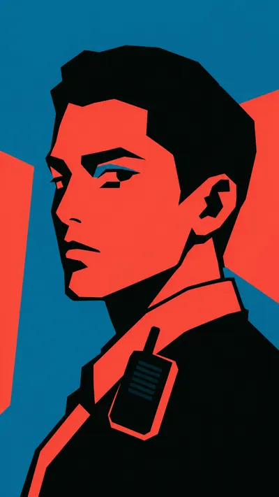
Tri Color Hardcut Portrait Poster Style
Portraits and avatarsTri Color Hardcut Portrait Poster Style
"Create a image in the "Tri Color Hardcut Portrait Poster" style. Scene: a commuter with cropped bob hair staring forward while holding one hand near the cheek with small over-ear headphones reduced to black and coral shapes against flat teal poster field with abstract transit-like coral wedges. Use black bob haircut, coral face plane, black cheek shadow, coral collar, and simplified jacket planes. Build the image from only three flat colors: teal background #0E819E, coral red #FF5447, and near black #000805. Composition: one oversized cropped portrait or upper-body subject, heavy black hair, hood, helmet, clothing, or shadow mass, coral face and body planes, hard teal negative-space slashes, large coral side wedges, teal negative-space cuts, cropped black hair silhouette, and angular shadow blocks, and thin teal slash cutting through the hair mass. Keep the subject close to the frame and let some silhouette edges crop off the canvas. Typography: no visible text by default. If text is explicitly required, use "none" as a very short block headline outside the face area and "none" as a tiny supporting mark. Do not add text otherwise. Finish: clean flat vector-like poster, stencil portrait, screen-print simplicity without grain, blunt cutout shapes, high contrast, no gradients, no outlines, no photorealistic rendering. Avoid watermark, username, creator ID, QR code, platform logo, app interface, exact copied reference identity, exact copied face, photorealism, painterly blending, airbrush, soft shading, extra colors, thin line art, detailed background, paper texture, halftone, noisy distress, glossy 3D, anime style, comic paneling, long text, and brand logo."
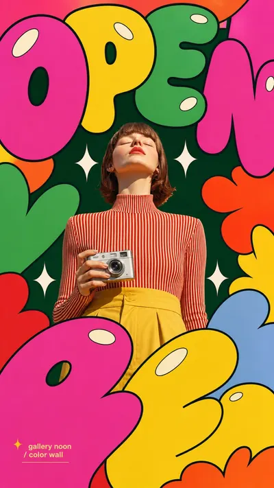
Pop Bubble Letter Photo Poster Style
Brand and marketing designPop Bubble Letter Photo Poster Style
"Create an image in pop-bubble-letter-photo-poster-style. Scene: a young gallery host standing calmly with chin lifted toward sunlight, interacting with or carrying a compact silver camera, in a painted outdoor gallery wall. Style the subject with red-and-cream striped mockneck, golden trousers, and clean mod styling. Use real photographic portrait detail for the subject: low-angle editorial framing, bright direct sunlight or clean studio light, crisp skin and fabric texture, saturated wardrobe, calm confident expression. Layout: center the subject on the vertical axis and surround them with deep evergreen negative-space panel, huge cropped hot-pink and candy-yellow bubble letters, white sparkle marks, oval shine highlights. Build the poster from oversized flat bubble-letter forms spelling or suggesting "OPEN". Crop the letters hard against the frame edges. Layer some letter shapes behind the subject and some in the foreground over the lower frame while keeping the face and main gesture unobstructed. Graphic language: thick black outlines, smooth flat fills, hot pink, candy yellow, leaf green, tangerine orange, tomato red, powder blue, deep evergreen negative space, cream-white oval shine highlights, and white four-point sparkle separators. Keep the bubbles bold, rounded, inflated, vector-like, and pop-art. Text: use "OPEN" as the large bubble-letter graphic word. Add "gallery noon / color wall" only as tiny editorial caption text if needed. Do not include watermarks, usernames, creator IDs, QR codes, platform logos, or app marks."
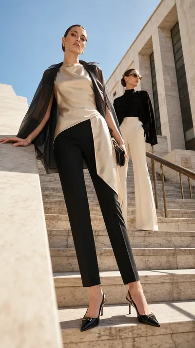
Sunlit Architectural Fashion Editorial
Portraits and avatarsSunlit Architectural Fashion Editorial
"Create a polished outdoor high-fashion editorial photograph in the Sunlit Architectural Fashion Editorial style. Subject: two poised fashion models on broad pale marble museum steps, one closer to camera and one offset higher in the background. Pose or movement: the near model rests one hand on a stone balustrade while the second model stands upright with a controlled sideways glance. Prop or accessory: small black lacquer clutch and thin brushed-gold sunglasses with no visible logo. Location: sunlit contemporary museum entrance with marble steps and a civic stone facade. Background elements: pale blue sky, bronze railings, long stair shadows, narrow facade seams, and a few distant unreadable plaques. Wardrobe and styling: champagne silk sleeveless tunic over black tailored cigarette trousers, paired with a charcoal organza cape jacket and patent slingback heels. Internal editorial mood labels only, not visible text: MUSEUM HEAT; summer editorial series. Subtle photographic accent: one small gold hardware glint on the sunglasses. Preserve these style fidelity anchors: Outdoor luxury fashion editorial photography with believable high-end campaign realism. Low camera position or slight wide-angle perspective that elongates legs, coats, and architectural scale. Warm stone, concrete, plaster, or masonry surfaces used as large tactile foreground or side planes. Hard sun, high sky exposure, crisp cast shadows, and a controlled warm lens flare or glint. Elegant neutral palette led by ivory, sand, taupe, stone gray, black, camel, tobacco, and muted metallics. One or two poised models with sculptural posture, calm unsmiling expressions, and deliberate hands. Layered luxury wardrobe with tailored coats, capes, suiting, silk, linen, leather, or crisp monochrome separates. Minimal premium props such as structured handbags, clutches, travel cases, sunglasses, or polished shoes with no logos. Architectural background depth from facades, arcades, steps, transit lines, windows, or colonnades. Fine graphic linework from overhead wires, railings, long shadows, seams, or facade grids crossing the sky or walls. Editorial asymmetry: one subject nearer to camera or stronger in scale, the other offset deeper in space. Clean magazine-grade color grading: sun-washed highlights, detailed skin and fabric texture, restrained contrast, no heavy retouch blur. Avoid this source content: Do not recreate the exact two women, faces, makeup, expressions, body silhouettes, or pose relationship from the source. Do not copy the beige cape trench, white sleeveless vest, beige wide-leg trousers, black pointed pumps, or exact wardrobe combination. Do not reuse the same stone column, tram-wire plaza, old building facade, graffiti wall, suitcase placement, or urban corner composition. Do not duplicate the left model leaning against the column with one bent leg or the right model holding a coat with palm raised. Do not include real fashion brand logos, monograms, store names, watermarks, creator IDs, QR codes, or social media UI. Do not turn the image into a studio poster, collage, illustration, catalog e-commerce shot, or nightlife streetwear scene. Use a low camera position, slight wide-angle fashion perspective, elongated silhouettes, hard Mediterranean daylight, bright pale sky, warm stone or plaster texture, crisp cast shadows, natural lens flare or glint, refined neutral color grading with black or tobacco anchors, visible fabric and leather detail, calm unsmiling luxury-campaign posture, and sparse premium props with no visible logos. Do not add overlay typography, watermarks, readable brand names, QR codes, social media UI, price tags, crowds, fantasy costumes, cartoon rendering, collage, vector graphics, or studio poster design."
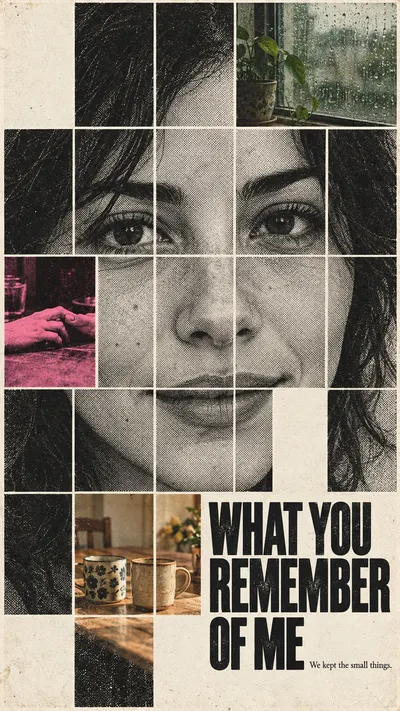
Memory Fragment Portrait
Illustration and artMemory Fragment Portrait
"Create one finished art-house editorial poster, expressing a person remembered through shared experiences. Priorities: [CORE] At a glance the dominant picture is ONE coherent recognizable human face, divided into aligned rectangular photo tiles by narrow off-white gutters. The facial tiles are crops of one continuous portrait, not different portraits or randomly rearranged features. [CORE] Replace a small minority of face-grid cells with discrete photographs of shared everyday memories. These memory photographs occupy whole cells inside the facial mosaic, never as a separate moodboard beside the face and never as translucent double exposure. [CORE] Leave selected grid cells completely empty as warm off-white paper. These absences interrupt the portrait meaningfully while enough eye, nose and mouth information remains to recognize a face. [CORE] Dominant facial tiles use harsh black-and-white coarse newspaper halftone dots and slightly broken xerographic ink. Memory inserts use muted faded analog color, with exactly one small fluorescent pink-and-black memory tile as an emotional anchor. [CORE] Use tactile off-white printed paper, visibly structured halftone and restrained wear; strong black grotesk lettering shares the grid and occupies a missing or merged-cell space instead of floating as an unrelated caption. [FLEX] Choose grid density, portrait angle, missing-cell placement and title scale to express the particular relationship. Preserve contiguous facial landmarks and clear reading order. [FLEX] Recompose portrait as a tall interrupted face and landscape as a broader off-center facial field with a title entering an intentional gap; neither crop nor simply shrink the portrait version. [FLEX] Memory fragments, their chromatic warmth and the direction of the missing area can change by story. Keep only a few specific fragments, with one pink anchor and generous blank paper. Single invented portrait: An invented woman around thirty, dark shoulder-length hair, front-facing quiet gaze and a slight almost-smile; face close-up, no hands on face. Memory replacement cells: Three memory cells: a faded amber kitchen table with two mismatched ceramic cups side by side; a muted green window with rain streaks and a small plant; one pink-black duotone cell showing two hands gently touching across a table, cropped cleanly at wrists with plausible fingers. Exact main title: "WHAT YOU REMEMBER OF ME". Exact small supporting sentence: "We kept the small things.". Specific narrative and ratio direction: Warm intimacy rather than melodrama. Place two cups near the lower cheek region and rain-window near a temple; the pink touching-hands cell is near the opposite cheek. Preserve both eye contours, nose and enough mouth. An empty cell beside the smile suggests something unsaid. Portrait: close face fills upper and middle grid, title steps into a merged-cell opening along lower-right face contour. Landscape: face occupies left-center, a wider blank gap at right of the cheek holds the title; three memories stay within the face-grid field. Source exclusions: The four women at the restaurant and the exact dining scene in the first reference; The identifiable woman, biography and HER wording in the second reference; FORK, source tagline, names, film credits and the hanging fork symbol; Repeated pink eye illustrations copied from the first reference; Creator usernames, platform marks, logos or watermarks. Use coarse structured black newspaper halftone on the face, softer grainy faded color on the everyday memories, one pink-black duotone memory cell, warm off-white paper and narrow consistent gutters. The portrait must read as one face from afar, the memories become legible up close. Integrate the title into an intentional blank or merged-cell region. Do not generate a presentation mockup or a sheet of multiple posters. No extra text."
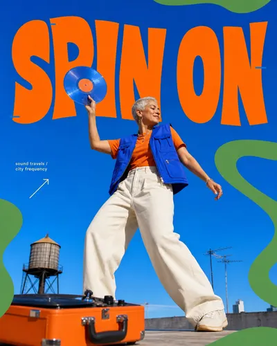
Cobalt Pop Cutout Editorial
Brand and marketing designCobalt Pop Cutout Editorial
"Create a editorial poster in the "Cobalt Pop Cutout Editorial" visual style. Style priority: preserve these observable anchors before introducing new content: A saturated cobalt-to-sky-blue field fills nearly the entire frame, with only restrained environmental details allowed near the lower edge. One crisp full-body photographic cutout dominates the center at roughly 55 to 70 percent of the frame height. The camera sits below waist level with a mild wide-angle upward perspective that makes the subject and foreground anchor feel monumental. A single oversized warm-orange headline spans the upper third, using solid-fill, chunky, hand-warped display letters on an uneven baseline. The photographic subject overlaps and obscures part of the headline so type and portrait read as one layered composition. Large flat botanical-green ribbons or amoebic blobs enter from two or more frame edges and behave as a loose organic border. Tiny warm-cream or yellow arrow symbols and compact sans-serif microcopy occupy the side margins as sparse editorial callouts. Thin cobalt registration bars, short underlines, or tiny geometric cuts interrupt selected orange letter edges as secondary accents. The palette stays near 60 percent blue, 18 percent green, 17 percent orange, and 5 percent cream, with very high saturation and no neutral wash. The photo treatment uses crisp cutout edges, punchy daylight contrast, saturated cool shadows, and warm highlights without heavy grain or halftone. The layout remains sparse and poster-like: one subject, one foreground anchor, one headline, and no more than three micro-callout clusters. The overall mood is upbeat, irreverent, youthful editorial street culture expressed through clean digital compositing rather than distressed zine texture. Do not reproduce any of this literal source content: The identifiable young Black man from the reference, including his face, cap, beard, expression, or body silhouette. A person seated astride a large yellow or orange fire hydrant or any hydrant used as a pedestal. The head-resting-on-hand pose, dangling seated posture, and legs framing the central pedestal. The specific green crewneck sweater, baggy cobalt trousers, white crew socks, and white sneaker outfit combination. The exact outdoor utility-street setting with the same power poles, overhead wires, and sky arrangement. The exact orange headline letterforms and wording shown across the upper half of the source image. The phrases ICONIC VIBES, The title doesn't matter Colors matter, and Dimensions are more important And the picture is art. The source image's precise green squiggle paths, arrow placements, blue letter tabs, and microcopy coordinates. Any watermark, username, creator signature, platform logo, brand mark, QR code, or identity mark. Subject: a middle-aged woman DJ with close-cropped silver hair. Action: stepping forward while lifting a translucent vinyl record above one shoulder. Prop or visual anchor: a compact orange portable turntable case resting low in the foreground. Location: a sunlit rooftop listening party. Background details: one distant water tower and two simple antenna silhouettes near the lower edge. Main headline: SPIN ON. Supporting microcopy: sound travels / city frequency. Accent symbol: a small rising arrow. Wardrobe: a cobalt utility vest over an orange tee with wide cream trousers. Build a sparse, high-impact hybrid photo-and-graphic poster. Fill nearly the entire frame with a saturated cobalt-to-sky-blue field. Place one crisp photoreal full-body subject centrally at 55 to 70 percent of the frame height, photographed from a low 24 to 30 millimeter equivalent viewpoint with mild upward perspective and believable anatomy. Use one foreground prop low in the frame to create depth. Set one enormous warm-orange headline across the upper third or upper half in chunky, solid-fill, hand-warped uppercase display lettering with swollen and tapered strokes, uneven widths, and an irregular baseline. Let the subject overlap selected letters while keeping the short headline inferable. Add only a few tiny cobalt registration tabs or short rules on letter edges. Introduce two to four broad, flat botanical-green ribbons or amoebic blobs from the outer edges as an organic frame; they must not cover the face, main gesture, or headline. Add one compact warm-cream sans-serif microcopy block and no more than three tiny cream arrow, chevron, rule, or sparkle accents. Maintain a palette near 60 percent blue, 18 percent green, 17 percent orange, and 5 percent cream. Keep solid graphic fills clean and let visible texture come chiefly from the sharply graded daylight photograph. For a image, emphasize a tall central stack and a strong bottom crop. For a image, widen the headline and use the side margins for sparse callouts while retaining one centered subject. The mood is confident, playful, colorful editorial street culture with clean digital compositing. Match the visual system first, then change the subject, action, prop, setting, text, and story. Avoid: no source identity or wording, no fire hydrant, no seated head-in-hand pose, no crowded collage, no multiple people, no torn paper, no ransom type, no halftone, no photocopy grit, no heavy film grain, no paint splatter, no spray paint, no 3D render, no illustration-only subject, no extreme fisheye, no soft cinematic bokeh, no muted palette, no rainbow colors, no logos, no watermark, no username, no QR code, and no signature."
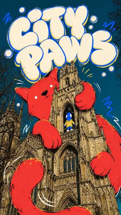
Gothic Cat Doodle Photo Collage Style
Illustration and artGothic Cat Doodle Photo Collage Style
"Create an image in the "Gothic Cat Doodle Photo Collage" style. Subject: an oversized flat black cat mascot floating above a stone cathedral stairway. Subject action: leading a tiny parade of doodled bells and ribbon banners. Prop or small secondary element: a miniature brass bell and folded city map. Location: a gothic cathedral plaza shot from a low tourist-photo angle. Background elements: arched windows, stone columns, cloudy sky, marker loops, sparkle bursts, and loose black doodle trails. Main text: NIGHT PARADE. Secondary text: cathedral notes. Accent symbol: white starbursts and crooked arrow marks. Wardrobe or visual styling: flat cartoon fur shape with chunky outline and simple sticker-like face. Use a realistic low-angle architectural photograph as the base layer. Keep the facade detailed, recognizable, and photographic, with dramatic vertical perspective and a saturated teal sky. Overlay one oversized flat cartoon creature in saturated tomato red or another bold color, with rough black marker contours, simple expressive features, cropped limbs, and small yellow edge highlights. Make the creature interact physically with the building, wrapping around arches, towers, windows, or rooflines. Add huge cream-white bubble graffiti lettering across the top of the frame, with thick cobalt blue outline, warm yellow offset shadow, chalky glow, and imperfect hand-drawn spacing. Add small doodle circles, swooshes, sparks, motion curves, and tiny secondary cartoon figures in windows or doorways for scale contrast. Avoid watermark, username, creator ID, platform logo, QR code, app UI, realistic 3D mascot, plush toy texture, full cartoon background, clean corporate layout, dense text, and low-detail architecture."
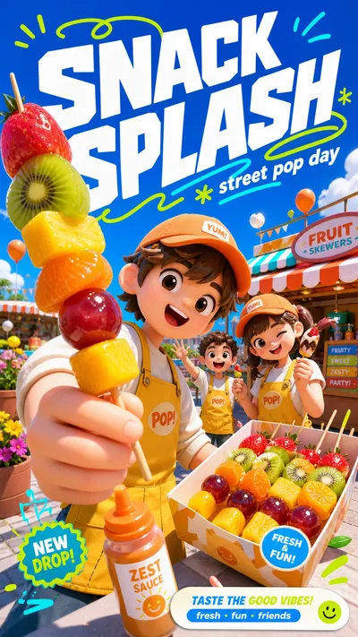
Sunny 3D Avatar Campaign Style
Brand and marketing designSunny 3D Avatar Campaign Style
"Create a high-energy social campaign poster in Sunny 3D Avatar Campaign Style. Preserve these style anchors: Glossy stylized 3D avatar rendering with smooth doll-like faces, rounded hands, soft plastic skin, and simplified expressive eyes. Extreme sunny outdoor campaign lighting with crisp highlights, clean shadows, and a clear vacation-day atmosphere. Deep saturated sky-blue upper field balanced by vivid green or fresh outdoor color in the lower field. Wide-angle near-camera perspective with the lead avatar or prop cropped large in the foreground and secondary elements stepping backward. Oversized bold white headline typography, angled slightly, stacked over the sky area with a dimensional poster feel. Neon green or cyan hand-drawn swoops, loops, underlines, and motion strokes weaving around the headline. Playful commercial density: many visible props and background details, but arranged in clear foreground, midground, and headline zones. Rounded consumer-campaign graphic language: sticker labels, search-bar-like captions, small badge blocks, and clean rectangular callouts. High-chroma palette with white typography, electric blue sky, lime/cyan accents, warm orange or yellow focal clothing, and soft neutral props. Slight fisheye poster composition that feels like a mobile social ad, with the main character close enough to feel immersive. Avoid this source content: No platform logo, app watermark, username, creator mark, QR code, or social platform search branding. Do not recreate the original Chinese summer-party headline or any exact source wording. Do not use the same camping-chair lawn scene, tent, lantern, suitcase, drink cup cluster, or identical picnic story premise. Do not copy the two original avatar identities, facial styling, hats, sunglasses, poses, clothing combinations, or foreground peace sign. Avoid palm-leaf frame placement that duplicates the reference layout exactly. Avoid using white bird silhouettes and the same airplane motif in the same position as the source. Do not preserve the source's exact foreground sitting pose, raised hand, or cup-holding action. Do not imitate any distinctive brand campaign lockup from the reference image. Scene content: two cheerful toy-like 3D avatars is unboxing a compact smart planter while leaning toward the viewer with a glossy mint-green smart planter with sprouting herbs in a sunny rooftop garden above a clean modern city. Include soft skyline shapes, bright umbrellas, tiny herb labels, white clouds, and floating pollen-like sparkles. Wardrobe and character styling: one avatar in warm coral utility vest and bucket hat, one in cream knit top and sporty shorts. Composition: bright saturated sky-blue upper field reserved for huge angled bold white headline typography; wide-angle low camera perspective; oversized foreground subject or prop cropped close to camera; supporting details recede into the midground; lower campaign callout label. Typography: set the main replacement headline as "GROW MODE" in large bold white slanted geometric display letters, with smaller supporting text "fresh kit drop" in rounded sans-serif. Graphic accents: add neon lime and cyan hand-drawn loops, swoops, underlines, and the accent symbol "+" around the headline without using any real platform logo. Rendering: glossy stylized 3D avatars, smooth toy-like faces and rounded hands, tactile fabric and prop textures, crisp sunny outdoor lighting, vivid blue-green commercial palette, polished high-resolution raster finish."
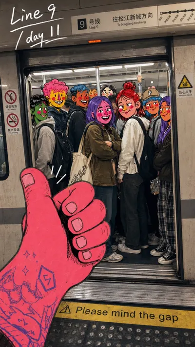
Metro Doodle Snapshot Diary
Illustration and artMetro Doodle Snapshot Diary
"Create a image in the "Metro Doodle Snapshot Diary" style. Subject: a packed group of young commuters and friends. Subject action: standing shoulder to shoulder inside a subway train doorway. Foreground prop or product: a giant hot-pink illustrated thumbs-up hand entering from the lower-left. Location: crowded Shanghai metro platform and train doorway. Background elements: Line 9-style station signage, metal train doors, fluorescent car lighting, handrails, platform gap warning strip, crowd, reflections, and phone-camera grain. Main handwritten text: "Shanghai Line 9". Secondary handwritten text: "day 11". Accent symbol: underlines, route circle, and small spark marks. Wardrobe style: casual streetwear, hoodies, backpacks, jackets, caps, tote bags, sneakers. Use a realistic candid phone-photo as the base layer. The scene should feel like a real public transit or dense city moment: visible doors, rails, signs, floor markings, lights, scuffed surfaces, reflections, crowd density, practical clothing, and imperfect handheld framing. Draw playful comic-marker doodles directly on top of the photo. Add saturated cartoon face overlays to selected people, thick black sketch outlines, red cheeks, exaggerated noses, messy hair, small sparks, arrows, underlines, and rough marker fill. Add one oversized illustrated foreground hand, ticket, transit card, phone, bag, food item, or gesture that overlaps the lower frame. Place loose white handwritten diary text in natural negative space, usually near the upper-left. Keep the text personal, uneven, and marker-like. The final image should feel like a real city snapshot that someone humorously annotated afterward. Avoid watermarks, usernames, platform logos, creator IDs, app marks, QR codes, clean vector-only illustration, fully illustrated backgrounds, polished ad layout, empty transit scenes, luxury lighting, perfect symmetry, branded mascots, identifiable celebrities, and tiny unreadable text."
How It Works in 3 Intuitive Steps
Modify what you want, preserve what you love — without tedious layer masking.
Upload & Anchor Photo
Drop in your original image. It serves as the baseline composition and identity reference for inpainting, outpainting, or atmospheric restyling.
Prompt the Edit & Engine
State what should change in natural language — remove background, warm the light, swap scenes, or erase objects — then choose your AI model and resolution.
Refine, Branch & Export
Take the generated edit and iterate again. Branch alternate variations on the infinite canvas without losing your original photo.
Engineered for Surgical Photo Retouching
Move beyond destructive filters. Every edit respects pixel geometry, lighting angles, and texture grain.
Pixel-Perfect Generative Inpainting
Select any area and articulate the transformation. The model strictly replaces the masked region while locking the surrounding skin texture, focal depth, and light temperature into place — zero seams, zero blurred boundaries.
Volumetric Relighting
Add golden hour warmth, moody rim lighting, or studio softbox fills. The engine calculates 3D surface normals to realistically cast shadows across your subject.
Distraction & Crowd Erase
Erase photobombers, power lines, and unwanted background objects. Rather than smudging pixels, AI synthesizes plausible background architecture and textures.
Up to 4K Ultra Lossless Detail Restoration
Sharpen soft focus, suppress high-ISO grain, and reconstruct micro-textures. Generative upscaling predicts realistic detail — individual eyelashes, fabric weave, and architectural stone — rather than bicubic pixel stretching.
Engine Capability Matrix
We don't lock you into a single proprietary generator. Every model declares its real, unadulterated runtime capabilities directly in the cockpit.
| Model Engine | Reference Limits | Aspect Ratio Options | Specialized Strength | Studio Direct |
|---|---|---|---|---|
SenseNova U1.5 Litesensenova-u1.5-lite | Up to 4 refs | 39 dimensionsSquare, landscape & portrait | Frontier general-purpose visual synthesis | Try |
GPT Image 2gpt-image-2 | Up to 9 refs | 39 dimensionsSquare, landscape & portrait | Frontier general-purpose visual synthesis | Try |
Gemini 2.5 Flash Imagegemini-2.5-flash-image | Up to 4 refs | 3 dimensionsSquare, landscape & portrait | Frontier general-purpose visual synthesis | Try |
Grok Imaginegrok-imagine-image | Up to 1 refs | 3 dimensionsSquare, landscape & portrait | Frontier general-purpose visual synthesis | Try |
GPT Image 2.5 Flaregpt-image-2-5-flare | Up to 9 refs | 39 dimensionsSquare, landscape & portrait | Frontier general-purpose visual synthesis | Try |
GPT Image 2.5 Sunburstgpt-image-2-5-sunburst | Up to 9 refs | 39 dimensionsSquare, landscape & portrait | Frontier general-purpose visual synthesis | Try |
S Seedream 5.0 Flashseedream-5-flash | Up to 10 refs | 22 dimensionsSquare, landscape & portrait | Frontier general-purpose visual synthesis | Try |
Nano Banana 2 Litenano-banana-2-lite | Up to 14 refs | 10 dimensionsSquare, landscape & portrait | Rapid concept iteration & layout sketching | Try |
Nano Banana Pronano-banana-pro | Up to 14 refs | 30 dimensionsSquare, landscape & portrait | Extreme multi-reference consistency & character identity | Try |
Nano Banana 2nano-banana-2 | Up to 14 refs | 30 dimensionsSquare, landscape & portrait | High-fidelity photorealism & composition fidelity | Try |
Nano Banana 2.1nano-banana-2-1 | Up to 14 refs | 30 dimensionsSquare, landscape & portrait | Frontier general-purpose visual synthesis | Try |
Grok Imagine Image 2.0grok-imagine-image-2 | Up to 3 refs | 18 dimensionsSquare, landscape & portrait | Frontier general-purpose visual synthesis | Try |